An advice to theme developers (well, more than one):
try it under daylight (sunlight coming from nearby windows) and during night using table lamps (e.g. one of those beautiful green ones, the ones you see in movies about libraries);
if you have short-sighted people available, have them check things (a low contrast can be completely readable for a perfectly sighted person, it becomes too low when the image is slightly blurred);
check with online tools that your monitor is at least decently calibrated (e.g. on deviantArt I see lots of very dark Blender renders: it is because people who create them have highly un-calibrated monitors; for them, the image looks right, for everybodies else is too dark).
P.S.: I like also rrtk theme, it is quite Softimage-ish (Taps playing in the background…)
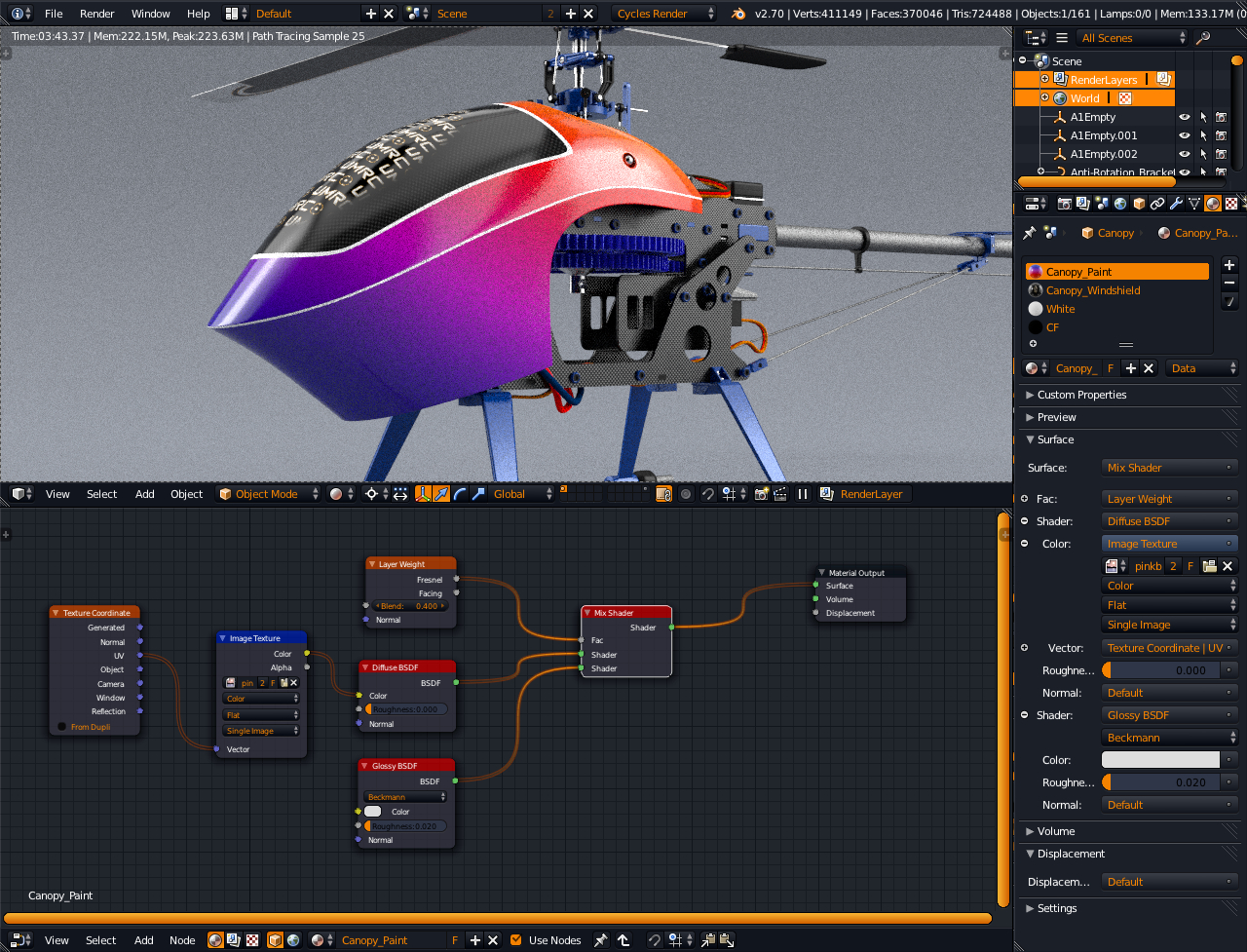
Anyway I been using Maya 2013 for a while when last February I wanted to change my theme so started some theme test, this one was the most appealing to me, of course it depends on the person. Here is my entry " Science Lab "
Edit 1 : Updated to latest “Pie” version, Fixed 3d view spline colors so they match graph editor.
update to Softimage, I’m gonna go through the entire theme, today I sat with the pie menues. (I also started on a Unity pro theme, which I once worked on but Im gonna save it for later especially if I can afford a pro license it will be easier to nail the colors)
I updated the checkboxes also, I think the 3d viewport is a bit off in the repo I will check into that also. I really want to make them more flat and brighter colors.
Great theme, yii7! I like how everything is clear, especially the active tab. I’ve been looking for a great looking theme that also clearly distinguishes the tabs (which for some reason lots of other themes don’t really care to).
There’s a couple of things I would tweak, but it’s very close to my ideal theme. =) Is there a thread to give feedback?
hi all, I’m really please with the entries so far.
Thanks!
There’s only a few days left for us all
Please finalize your themes over the next few days so I can begin testing.
Testing will take approximately 1 week & during this time I will PM all the theme Authors with minor changes & results.
After all updates are done, I’ll release the list of winners here.
My considerations are this:
With release themes, we put together the best list we could at the time. Now that themes have matured & been around for a while & there’s need to update for new themed ui elements, the time is right to make changes. With contrib themes it was/is similar.
@ [URL="/u/riveter
Just wanted to let you know that the theme is not quite working right in rendering modes, i.e. “Image editor”[/B] window or the “new window” mode. Hard to see text. Colors are different also.
Thanks again for the easy to read theme.
What I’m trying to figure out is how can I control the background color or the “band” in the headers in the properties panel on the left and right panels such as Transform, View, Edit, Display, Shading, Render, Dimensions, Performance, etc. I just want it darker, that’s all.
here’s my entry, in a minimalist style, I like my theme to stay out of the way, but provide clear information in an easy to view manner.I’ve tried to minimize distractions, but used color coding for quick identification on nodes and channels.
Sorry if this is a little offtopic, but I think Graph should definitely be among the defaults. It’s a very nice theme to work with, and the developer is actively working on it to keep it up to date with newer versions…