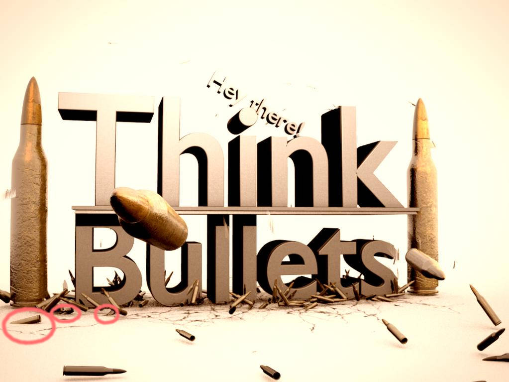
This is an image i made yesterday and fixed a bit today, and i think it finished now but i wanna hear your honest critics and i hope you could give me some advice to improve it!
And once again, im not sure but, sorry if my english sucks ![]()
This is an image i made yesterday and fixed a bit today, and i think it finished now but i wanna hear your honest critics and i hope you could give me some advice to improve it!
And once again, im not sure but, sorry if my english sucks ![]()
Arska97, a few thoughts
On my screen the light is much too bright blowing out the top of the image. The bump mapping on the bullets looks a little too rough, I would expect a smoother surface. For the text I would hive a little more bevel to it so it could pick out some highlights around its edge so that it doesn’t looks too flat. It may look better with more of a metalic finish to match of the bullets. The shadows in the text look too dark, maybe a little environment lighting will make it look less stark.
Richard
Thanks! that is just what i wanted!
What Richard said + all those flying bullets grave for motion blur!
WOOO MOTION BLUURRR!!.. I was gonna say that
Good scene with nice bump mapping. 
Still, you got a few issues:
-A very bright background with tons of lighting. The ‘Hello there’ blends into the background, making it look weird.
Experiment with lighting and material settings to fix this.
-Your bullets are all static. If they are soppused to be moving, animate them and add motion blur through the nodes system.
A good tutorial on this can be found here: http://www.blendercookie.com/2010/11/19/vector-motion-blur/
-The text is kind of… double-sided. With the lighting setup, the top part ot the ‘T’ blends into the background. On the other hand, your shadows are pitch black, causing some of the text parts to be pitch black as well.
Fix the brightness by changing the lighting setup.
For the shadows:
Method 1: Add an area lamp, scale 10, positioned near the bottom left direction of the camera and pointing to the center of the text. Adjust the distance of that area lap so that it is right in the middel of the area lamp and the text object (you can see this from the dotted line that emits from the area lamp.). Adjust energy and distance (distance not too much) until you get a good result. DISABLE SHADOWS on the area lamp.
Method 2: Try playing with the EMIT value of the text object material. This value easily bangs up your image, so be careful and do NOT overdo it.
-Your 2 large bullets (left and right of the text) are standing, even though it looks like their bottoms are rounded. Is that true or are my eyes fooling me?
That’s all I can find… for now ;).
Happy blending!
Acro
Haha - motion blur - thats what I was gonna say. Aaaaaand the bullets(s?) disappearing into the ground
Please attempt to give more-detailed information when posting to Focused Critique.
Post # 5,555
Thanks guys! Acromatsu, hose bullets already have vector blur in them, but i guess motion blur looks a lot better than vector blur, so i’ll fix that. And Gregzaal, it is because lightning is so strong and those bullets are so small :DD
oh stupid me, motion and vector blur are same thing …
do you know how to make those bullets not to ge trough ground?
A couple of things about the cartridges themselves, from a casual shooter:
First, outside diameter of the bullet (the copper part) should be smaller than the outside diameter of the case (the brass part). Check this image for exact dimensions of a .308 Winchester cartridge, and you’ll clearly see what I mean: //http://en.wikipedia.org/wiki/File:Cartridge_308.PNG
Second, the cartridges in your image have an extreme amount of pitting. I would NOT use any ammunition that looked that bad! Of course, I have no idea what your intentions are for this image, but IF you intend to depict a usable round of ammunition, I suggest you consider less extreme weathering.
The main thing I notice in the image is the lighting is to intense, and if you want to put bump mapping on the case etc it should be very subtle you shouldn’t be able to see it from far away just enough to affect how the light spreads across the surface.
Also, you might want to consider changing the font on the text. The Blender default font is pretty obvious to this crowd.
My only suggestion would be that the line “Think Bullets” blends in a little too much with everything, maybe a contrasting gun-metal type shade would fit there, or perhaps make the background more of a grey/black colour instead of the text.
If you made the backgroud darker perhaps light shafts/rays could be seen shining through inbetween the letters (Due to a strong light source behind the “Think Bullets” slogan, possibly). That would also enhance the effect of bullets being sent flying outwards in every direction from the centre.
how on earth do you spend over a month on a single simple image???
@Gregzaal He hasn’t actually posted for over a month, people just keap semi-ressurecting the thread. Probably because of the “interesting” title.
