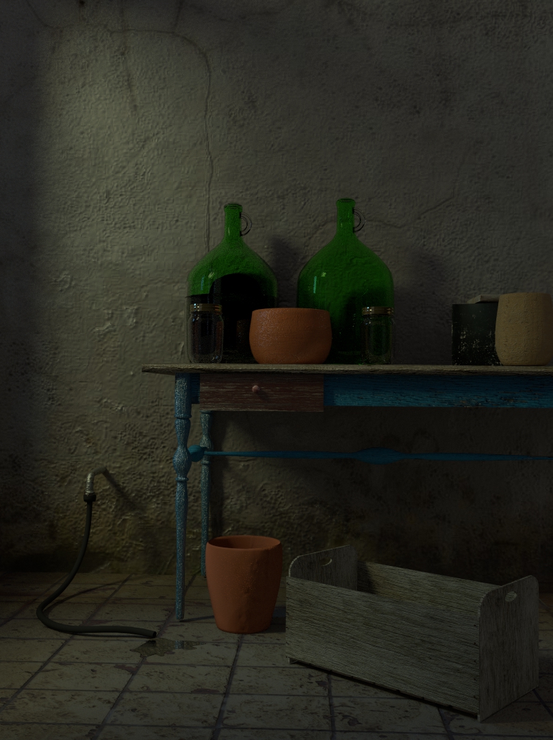
Looking for some feedback either good or bad. Tear it apart as it were. I have been addicted to Blender for a little over a year. I am striving for Photorealism, I feel this is the closest I have gotten thus far.
This was modeled on 2.68 R, cycles at only 100 samples. Just added a soften and Bright/contrast in compositing.
So once again please point out what sucks about it and what it good about it. I just want to become a better modeler and artist. With this project I was realling working on getting my textures to look like they had a surface to them.’’
Looks good. However, sometimes you can go overboard with texturing. Decide where the focus should be (I like the play of light and shadow on the wall) and tone down the textures elsewhere so they don’t distract.
Little over a year and ur making that!? Damn that is impressive. You must have some drive or natural talent. Not that its hard to learn that much in a year. Just most ppl, myself included, don’t have that kind of motivation. Good job.
Now to the critique: After some time looking at the picture I really can’t find any real flaws. Ur toolbox wood is too ruff. Maybe you could add some dust particles in the air. That clay pot on the ground doesn’t fit. Not sure why, but it stands out as different than all the other objects in the scene. Might just be the horrible state of any image after this forum smashes them down. I don’t know if this image is underexposed or if that is preferable here. I’m still not that good at judging such things.
Really impressive work for someone so new to Blender. You stick with this and you’ll be one of the greats soon.
@BrentNewton, Actually I have a job where I sit for 10 hours a night fortunatly I am able to use my laptop, so essentially for 10 hours four days a week I am working with Blender. There are many that I would thank for learning what I have. Mostly tuts by Andrew Price and Johnathan Williamson.
I tinkered with the texture on the toolbox for quite a long time, I agree, but I couldn’t get it where I was totally happy with it. I may try another texture at some point. The Vase on the floor, I had to laugh at that. It started in the tool box, then the floor then the tool box, then the foreground. I wanted it in there because there is two of every other vase, bottle, jar. Maybe a different texture there too?
I think it’s really good! only a few details like the green bottle holders they seem to miss the green glass color, also the wooden box maybe a little more of width. I liked a lot the lighting. Maybe some green? like a grapevine or something, your image get me a feel like a little french villa or something. Good job!
Very good, I like it a lot Only small thing - your tool box, on the forward facing plank - there are nail heads there like they are into a board there, but behind the nails are nothing, but there should be some strips of wood there vertically behind that would be nailed into from both front and side, since the wood is so thin.
I like the tone and the values, but maybe you could light something as a focal point?
But if you want nit-picking…
The first thing I notice is that the wall in the background looks unnaturally smooth.
The toolbox on the lower right looks a little bit too pristine: too flat and cubic (Perfect 90degree corners)
The water on the ground doesn’t seem drop down into the space between tiles, If you made the tiles on the floor lifted slightly, it would solve that.
Overall looks really good though, I like the green glass jugs and everything on the table.
Contrary to Brent, I think the clay pot on the ground looks like it belongs.
@ 3 point edit, thank you year I noticed that after I finished it and I was like. I m not going to deal with it. Truth is I couldn’t figure out what to put on that portion of the wall. I started with a broom, and tried several different things. Thought a mirror would look good there and it did, just didn’t match the scene.

 Only small thing - your tool box, on the forward facing plank - there are nail heads there like they are into a board there, but behind the nails are nothing, but there should be some strips of wood there vertically behind that would be nailed into from both front and side, since the wood is so thin.