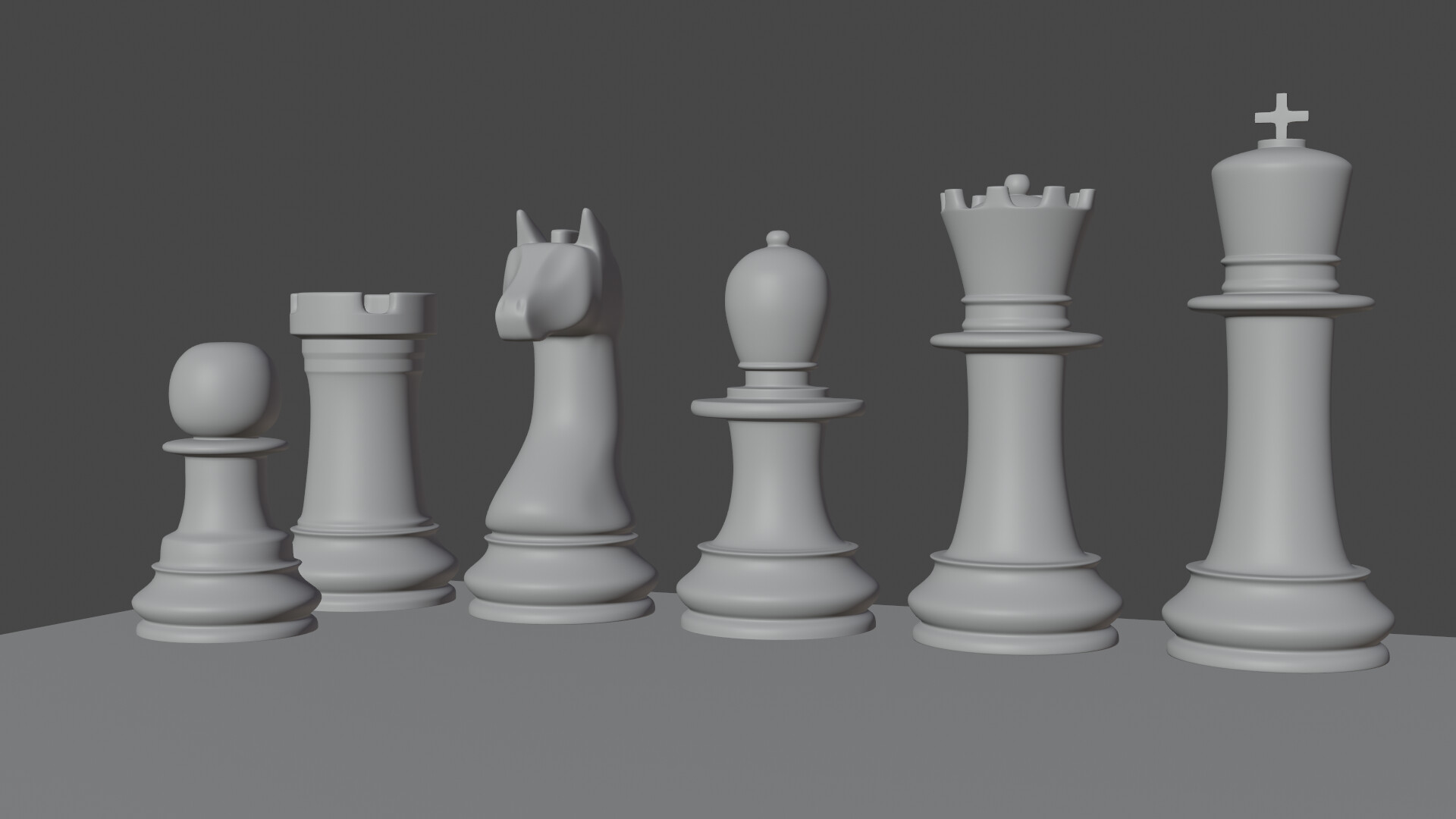
I think the cross on the king needs to be about twice as big/thick and the top of the rook about twice as high. I might make the pawn a little taller and rounded on top. But every chess set is different and I don’t play much.
I might make the knight’s face a little less smooth and more chiseled, but those are the ones I have seen.
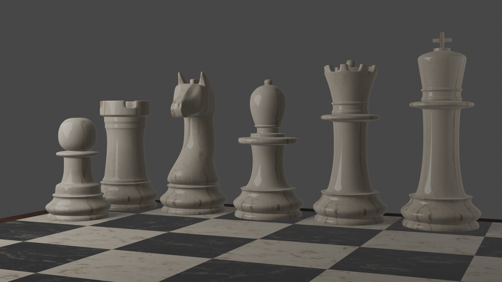
I think the shape seems fine. And yes, it would feel more intuitive to have King and Queen quite large as @Boder said. But for me the more glaring problem would be the texture looks really stretched. Maybe it needs additional UV mapping or apply scale.
inspired by queen’s gambit? i’m doing also anya taylor from that serie
I frankly think that it is customary to have a little more similarity.
• The king and queen should be the same height, and their “horizontal discs” should be at exactly the same level.
• The bishop, knight, and rook should also be at the same height, slightly lower than the royals.
• The pawn, which should be shortest of all, looks fine.
The overall design of each piece, other tha the relative proportions as noted, is good. Although maybe you could improve the king’s head …?