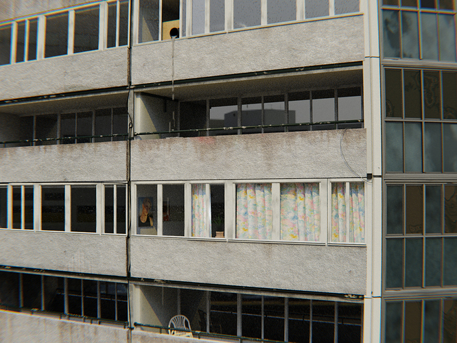
Ignore the fluid sim its still very much in prog. But mostly the building and lighting… thanks!
Going for film look, hence grain
Looks great overall! I think the the facade materials are quite good, lighting and grainy look is very convincing. I liked the rotated chair and cables, gives a natural feeling to the scene. Maybe you can spend more time on the objects interior (plant and picture frame looks artificial comparing to scene).
Very good job !
I think the camera curve effect is too much here, can you reduce it ?
And even if we can’t see much of others balconies, it would be great to add objetcs, as well as all the interiors. For now, i feel like all the bulding is empty except one flat.
Keep up the good work ! 
Thanks! good suggestions. Added curtains and blinds to other windows. Playing with distortion effect now.
facade is quite different between the two sides of the building - almost looks like to different buildings. As a minimum (and more believable representation) the terrace balcony lines would continue through on the other side)
ah yes good suggestion. Maybe moving the white side bars down to match the balcony lines would help? This is the image Im ‘sort of’ basing it off.
Except on mine ive done an angled corner to the building… not sure if it looks alright though.
Your material is concrete and not pebbles on the balcony and walls. Hence why it looks wrong. If it’s concrete it would be brighter as the sun is strong.
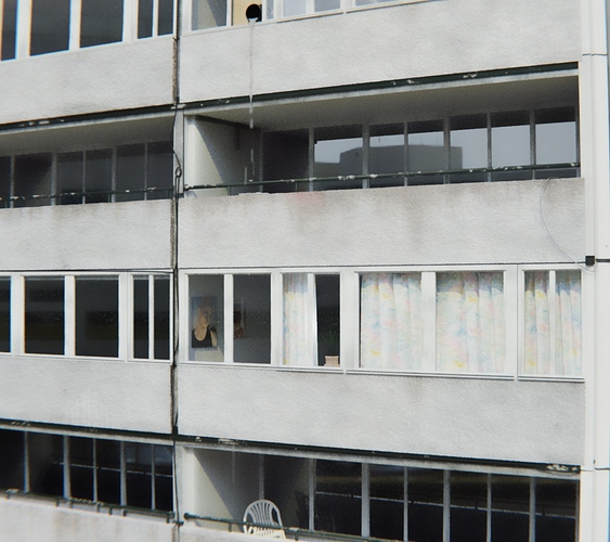
Ah yes your colour correction does look a whole lot more realistic already! good idea thanks… Ill update soon
The main thing that struck me was the dripping pipe and the sameness of the reflections in the windows.
The stuff coming out of the pipe would be so thick and congealed to look like it does. Kind of odd. The windows should all be very slightly angled differently to produce more natural reflections. Window reflections are never that perfectly even.
Actually, to my eye, this looks very plausibly like an actual building on a typical cloudy-bright day. Even the first image looks very convincing to me. “You did it!” 
P.S. In the “color corrected” image, be careful of overexposure. The detailed texture of the concrete is much different betwen the two, and details like “rust has dripped down from the banisters onto the front facing” are lost. It’s entirely your artistic decision – both versions are good.
To me, probably the most-important aspect is “tonal range.” Typically, a bell-shaped “histogram” curve. Highlights aren’t blown out, and shadowed areas can be clearly seen into. You’ve got that. Little details such as artwork on inside walls and chairs on the balcony are the “little” details that can mean a whole lot.
Thank you all for your responses and feedback. I haven’t had much time to work on it but here’s an updated image. any more pointers before I begin rendering the animation would be great! thanks.
As I’ve said, perhaps except for the “digital garbage” that seems to be in the window surfaces along the right edge of the frame, this looks very convincingly like a real, dirty, building on a cloudy-bright day. On to the animation!
You have taken really great effort. It looks very convincing. At first glance it doesn’t looks like it’s made in CG. But I think chair is looking like it’s floating in air. Otherwise all the elements looks awesome.
Great thanks for that. Ill start rendering the animation… can correct colouration and things in post im thinking too. !
The chair: should be either fallen or sitting straight.
The painting near the window. I think you put many paintings side-by-side. Placing it more realistically will make it more believable, but this is just nitpicking.
ah yes its actually a chair stacked on another chair and is askew… but maybe this isnt evident enough and looks odd.
I wouldn’t quibble about the chair. In fact, the “oddity” adds a little believability. Nothing’s perfect in a real world. Move on to the animation.


