Three Cubic Meters. Comic in progress

New year, new project.

I come to present to you the new comic in which I am now immersed: Three cubic meters.

This is a comic set in the Russo-Ukrainian war. As you will see, this is a big change from my previous work (specifically a jump of more than 2,400 years) but I wanted a change of scenery.

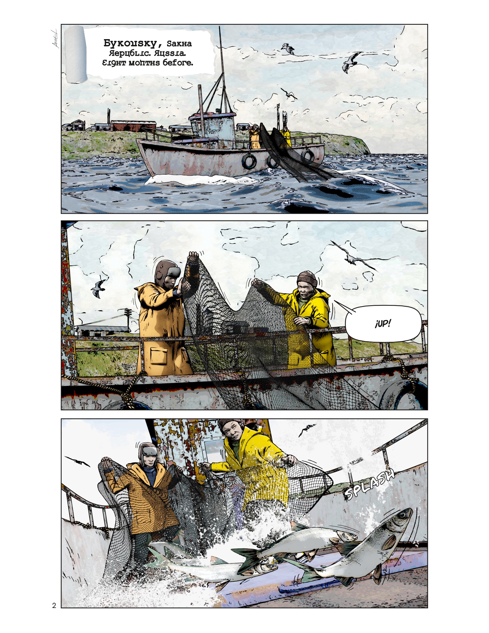
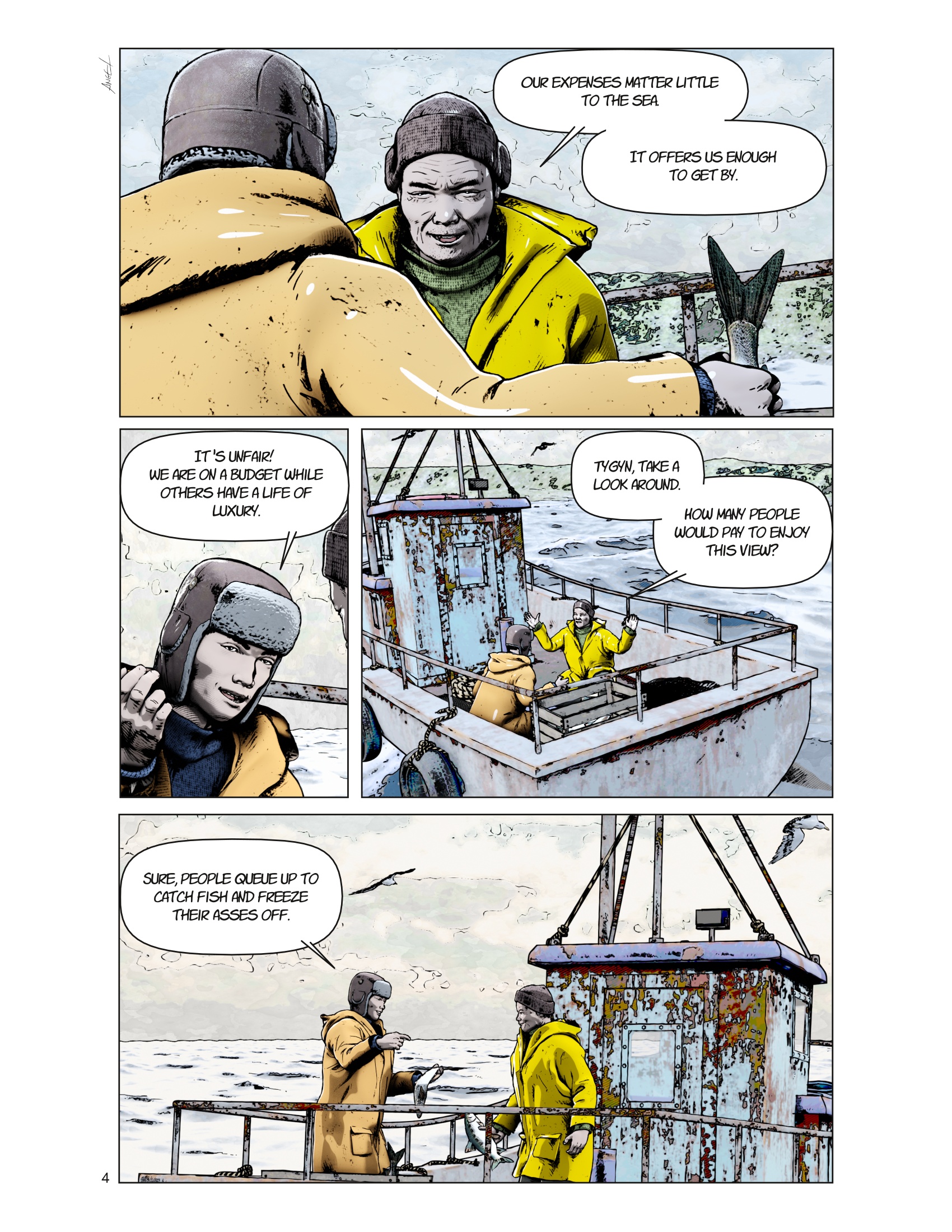
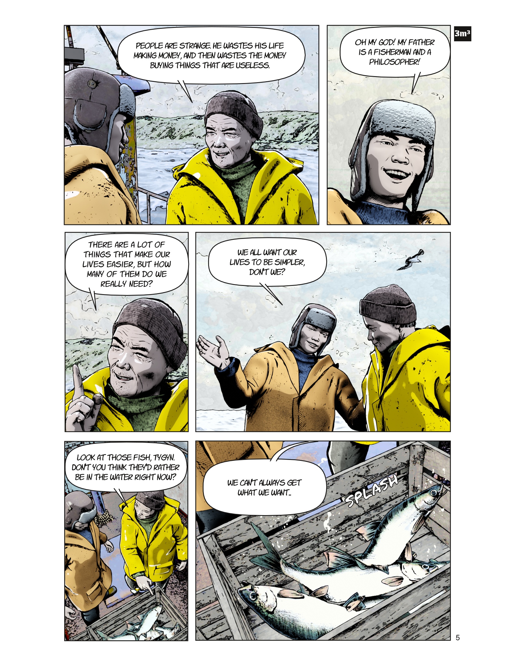
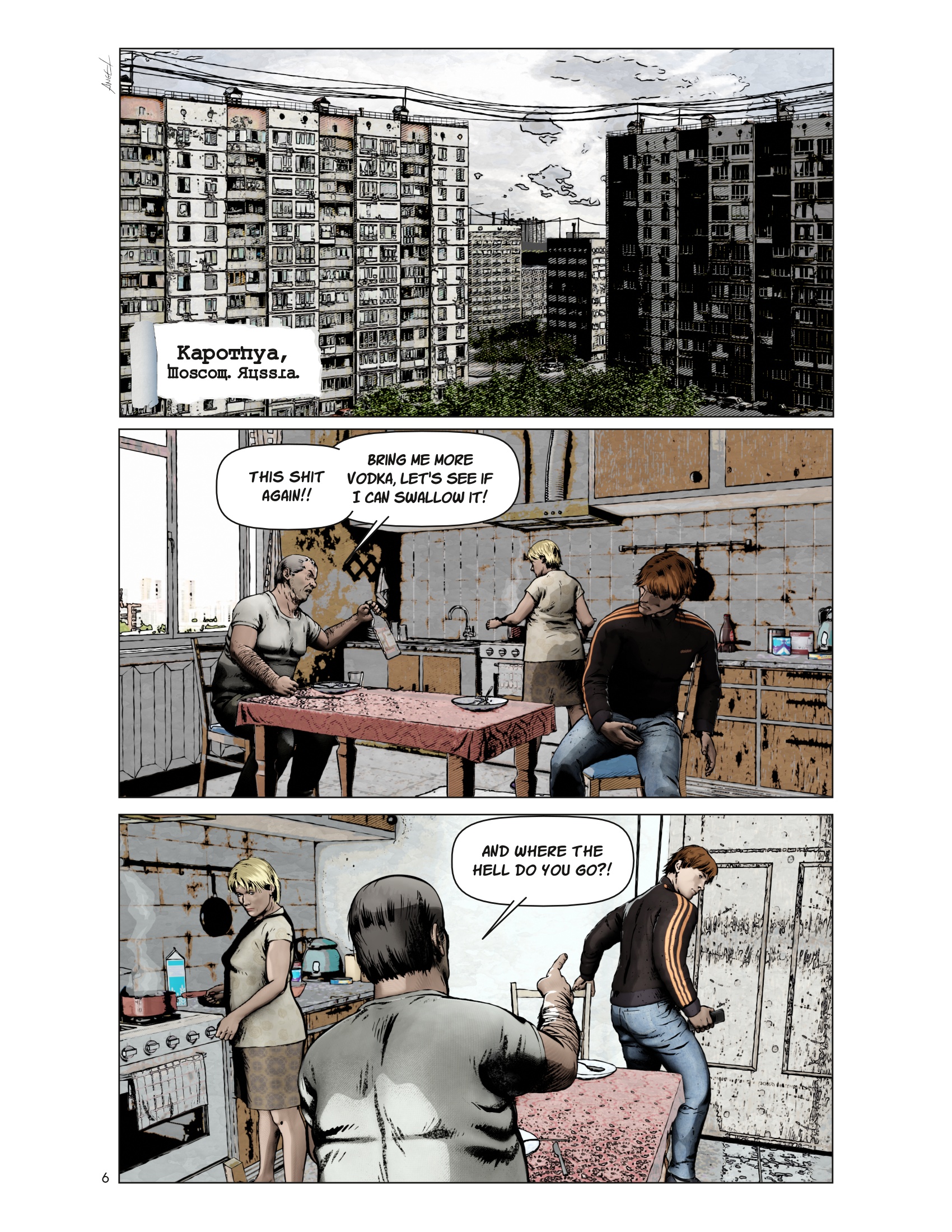
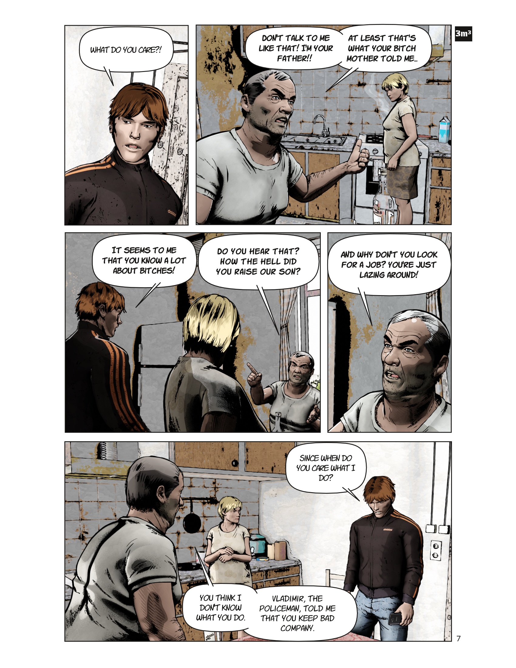
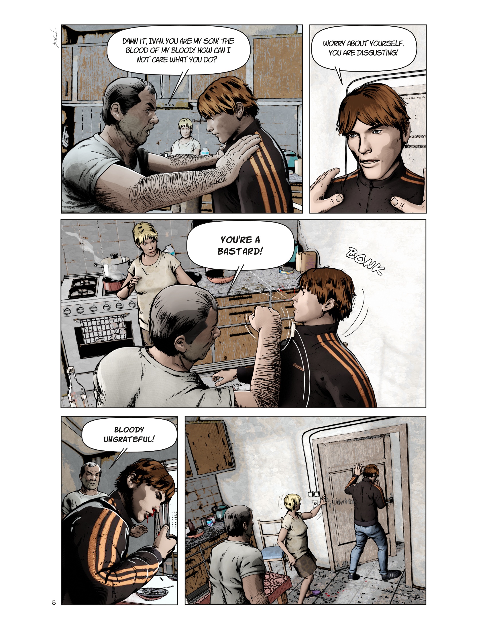
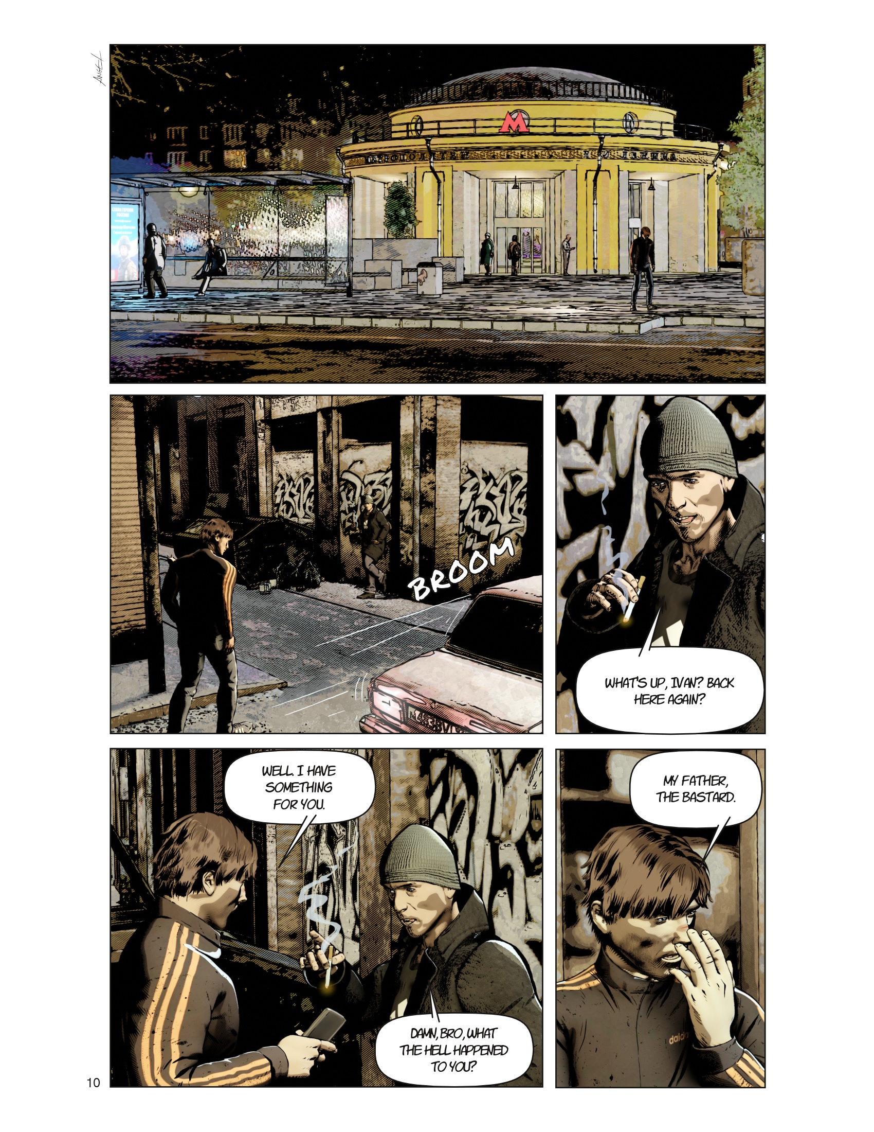
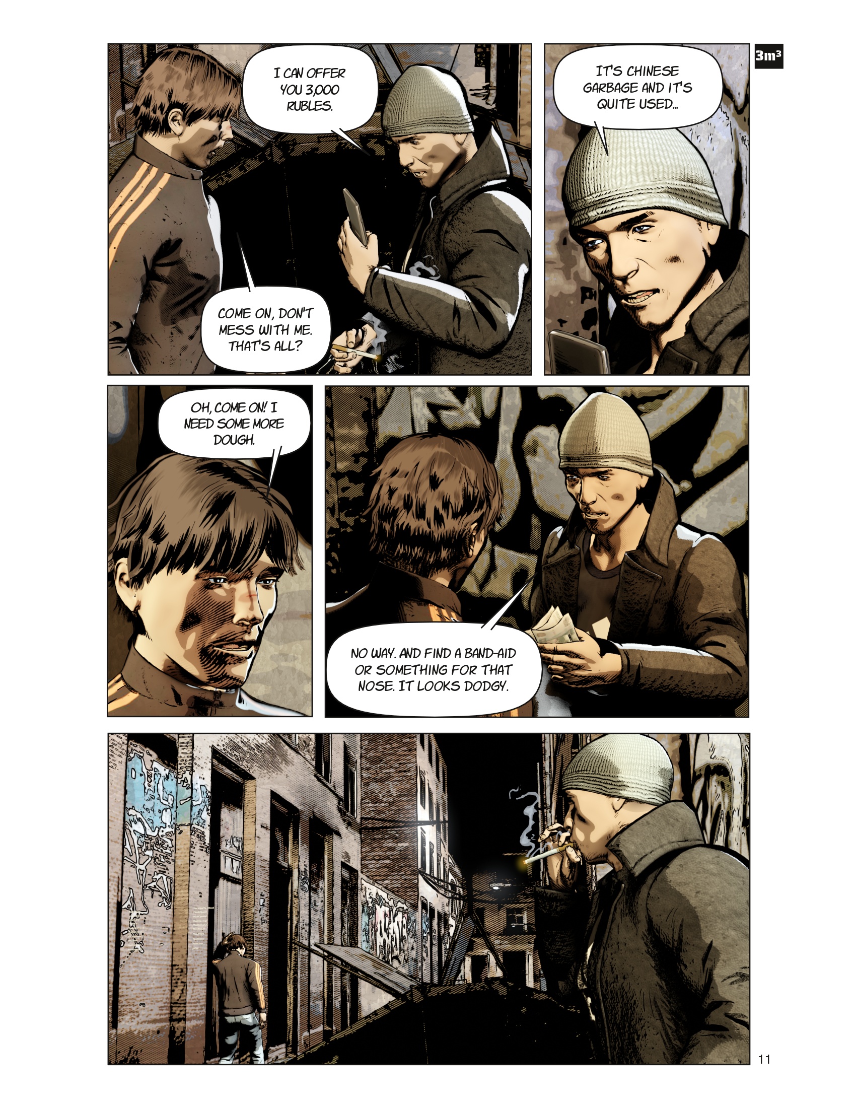
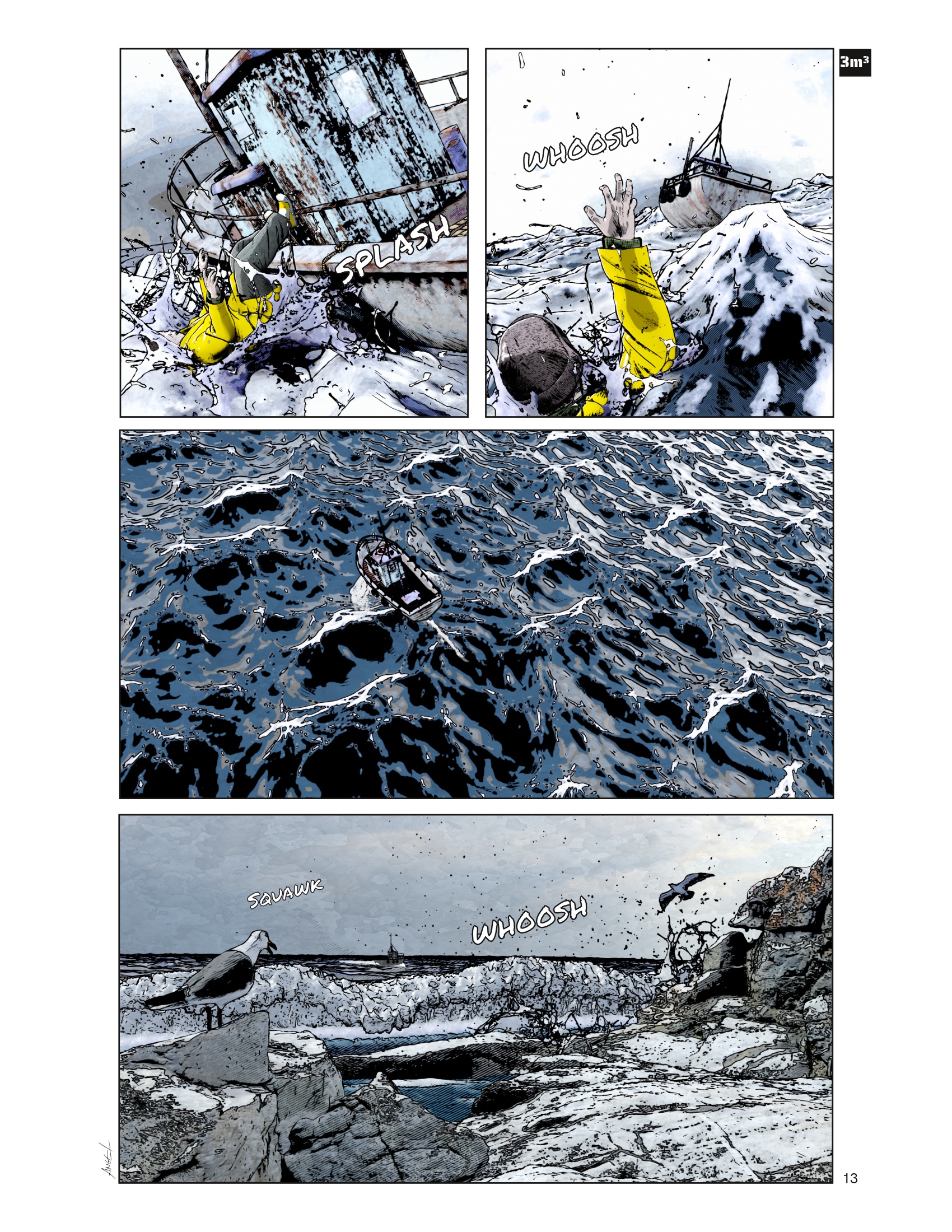
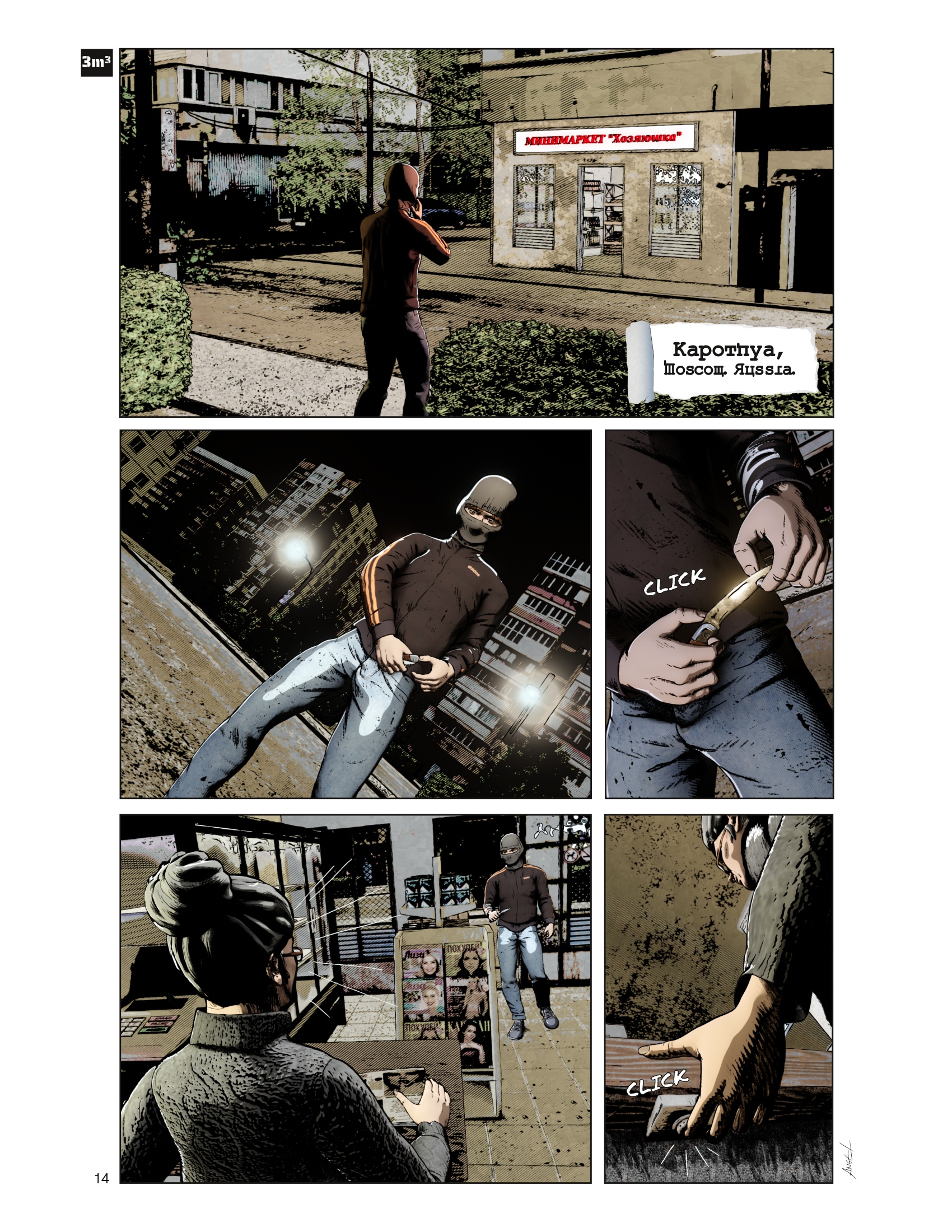
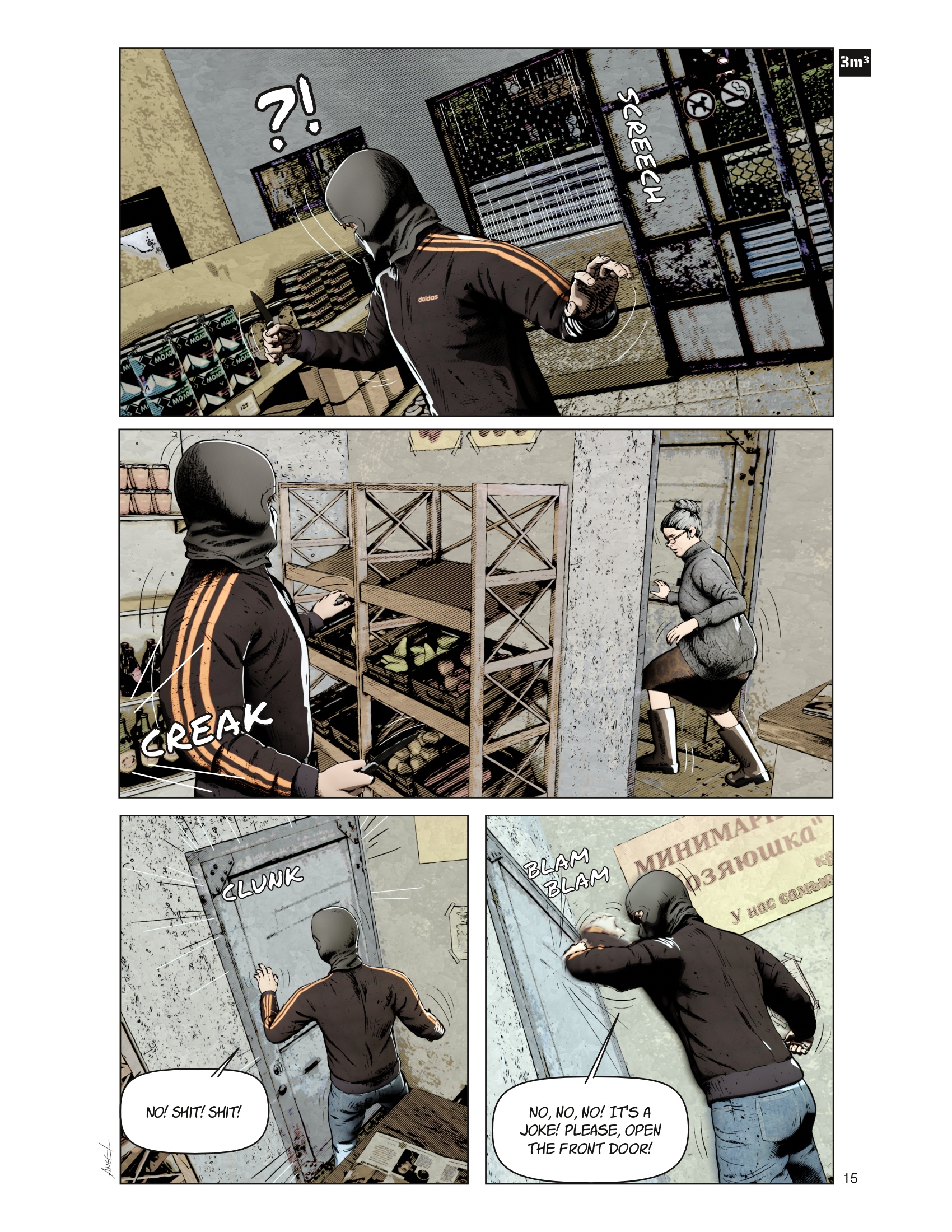
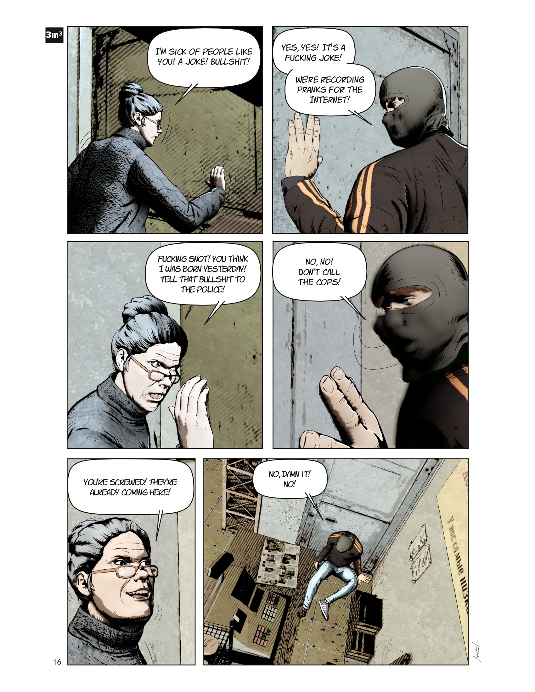
The main action is set within the Ukrainian counteroffensive in Kharkiv that took place in September 2022 and has as protagonists two young Russians who, due to different circumstances, end up immersed in this battle. This gives rise to a story where, among others, some questions for reflection are addressed, such as: What reasons push someone to participate in a war? Are they worth it? Does war dehumanize the soldier? Are current soldiers prepared to face new weapons such as drones?

In fact, the title ‘Three cubic meters’ refers to the volume of earth that an average human grave has. Because that is what the intervention of a large majority of participants in these contests boils down to. Many of them are used as cannon fodder in tactics of dubious effectiveness and are frequently overwhelmed by the use of new weapons that make them easy targets.

But the changes are not only reduced to the theme of the comic, but also to the workflow and techniques used. After digging through the abundant information on NPR techniques in Blender and doing a lot of testing, I finally decided to try doing all the design/drawing work in Blender.

My intention in this new project is to reduce the use of Gimp and Inkscape as much as possible (only editing textures and images) and completely design/draw the vignettes in Blender. Obviously, the work of layout and composition of the pages continued to be carried out in Scribus.

However, integrating all the drawing work into Blender does not necessarily mean that the process has been simplified: It is the result of a combination of shader, node composition, ‘freestyle’ and ‘grease pencil’ techniques. Each of the elements in the scene (backgrounds, elements, characters and effects) are found in several ‘render layers’ to which different effects or techniques are applied:

  • For the backgrounds, I tried to simulate with the Node Compositor the ‘watercolor’ filters that he had previously created with Gimp and GMIC.

  • The secondary components simulate another filter (similar to watercolor), also made with the Node Compositor.

  • The characters use a combination of ‘NPR shaders’ (color and black ink) that are integrated through node composition and later retouched with ‘grease pencil’.

One of the biggest headaches is the use of contour lines and black ink. For the time being, I have decided to use a combination of techniques: contours and lines integrated into shaders, ‘freestyle’, and specially ‘grease pencil’.

At this point I would like to thank Sophie Jantak for her great video tutorials on drawing with ‘grease pencil’. If you are reading me here, I want you to know that you are an excellent artist and communicator and your videos have helped me learn a lot about this tool.

Grease pencil allows me to simulate more natural strokes in the drawing, similar to what I did in Inkscape, although I am still getting used to it. In this way I am trying to overcome some of the limitations I find when using ‘Freestyle’. The drawback of this method is that it requires more manual work and would certainly be less efficient in animation.

I won’t bother you anymore, here are the proofs of the first pages and I’ll try to upload updates. I hope you like the result.

For the rest of the pages (there are about 100 in total), wish me strength and a lot of patience.

Add images


12 Likes

These look amazing. Very professional work :grinning: Im looking forward to future updates.
Oh and I really like the title.

1 Like

A museum curator with a degree in history and ‘occasional illustrator’ - I’m jealous :grimacing:

As an avid collector - fan since childhood, I’d previously thought comics were wholly the purview of nerdy kids or those older in vintage having an akin sensibility. However largely through patronage of the late great Stan Lee, they’ve recycled around once again, capturing legions of new adherents mostly at the box-office albeit re-imaged via VFX rather than an old school ink press on newsprint or toner cartridge or wielding a tablet stylus.

Anyway goes without saying, intrigued I’ll standby keeping an eye out for those additional proposed content also btw good luck with that, foresee a ton of work ahead…

1 Like

Indeed. I think that the wide range of themes in adult graphic novels brings together a fairly diverse audience, and there are also some very good works that take you to a level of introspection similar to reading books.
And yes. There’s still a lot of work to be done and I don’t have as much time as I’d like, but I’m going to try to keep moving forward. :smile:

1 Like

Here’s another preview.
The comic continues with the beginning of the story arc of Ivan, another protagonist of the novel.
The scene is moved from Bykovsky in northern Russia to the Kapotnya district near Moscow.

3 Likes

Just saw this for the first time. Great work - watching your thread. :slight_smile:

1 Like

It is certainly very impressive what is now possible to be done . . .

(Sigh …) I just have to reconcile with the fact that “the ‘ability to draw’ gene” was never installed in my cranial computer.

1 Like

It is true that an innate ability to draw is a great advantage, but even without it, what really makes the difference is experience. The more you draw, the more you will find that you gain fluidity and confidence in your strokes. You gain a sense of composition and even perspective. I myself notice a lot when I put my pen down for a while: dedicating time to it is necessary to progress… ahh, but the problem is that time is a scarce commodity…

2 Likes

“Meanwhile, I found other ways to compensate for my inability to draw ‘pre-viz.’” Nonetheless, this is a very impressive work, and a demonstration of what can now be done.

1 Like

Another preview. We continue with Iván’s narrative arc:


4 Likes

I love everything except for the bright white storyboard page (which I find a bit distracting) but I suppose that is necessary for when it goes to print.
The look that you achieved through the use of Blender is mind blowing.

1 Like

Every one of these “comic” pages is graphically stunning.

2 Likes

Well. I am afraid that the issue of page layout on a white background is an unavoidable one. It is true that it is possible to change the background color (to black, for example), but this change is usually related to a certain intention in the narrative: for example, to give more drama to a scene.
The composition in electronic books such as Kindle allows reading through vignettes. This eliminates the background and allows for a friendlier and more comfortable reading experience on electronic devices. But this is not possible on a normal web page.

As for the look, the truth is that it took many hours of experimenting with the Node Compositor and the Shaders, but I think the result was worth it. Sometimes specific adjustments are needed, but it is a big step forward to be able to do everything with Blender :smiley:

1 Like

I’m glad you liked the art on the pages. I have a lot of extra work in this job because there are multiple locations and I try to maintain a certain level of verisimilitude (in this case, the interior and exterior of the subway station and the dark alley). :sweat_smile:

1 Like

Another preview. The start of problems…


1 Like