macro-shapes first, the big shapes. try and find a motif for the race of the ship you’re working on.
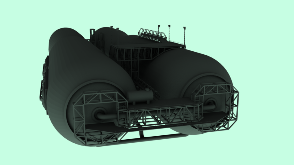
Like in star wars you could always tell the regular rebel ships from the mon calimari ships because the mon calimari had this huge, soft, bubbly type of ship, always long and broad and flat and nodular, like big pieces of drift-wood. They looked organic and watery, like you’d expect.
And you could tell the rebel fighters from the imperial fighters, because the imperials were hard, angular, efficient shapes and bright contrasts, (just google image search ‘shuttle tydirum’, ‘tie fighter’, ‘tie interceptor’, ‘star destroyer’, ‘super star destroyer’) and hugely animal and impersonal in many ways, and rebel ships always had open, visible cockpits with utilitarian doors, and more standard wings. The rebel ships LOOKED like fighters, like you could find something human in them if you tried. The imperial ships looked like autonomous metal blobs with about as much humanity as a jagged piece of metal.
And to that end, much of the imperial stuff looked hugely animal. The shuttle tydirium cockpit is angled down, and has its visor-black window at roughly the same location as a dog would have. The AT-ATs and AT-STs (google image search for these as well) cockpits are all designed on heads, for inspiration, with the AT-ST particularly designed after a human skull. The AT-ST has hollow, blank eye-socket-shaped tinted windows, to give it a skeletal look, and the AT-AT has a heavy, protruding, almost crushingly low brow, to give it the brutish, blindly malevolent look we’d expect out of a thug. It all registers on the sub-conscious at some point.
The rebels stuff, on the other hand, looks totally utilitarian and in a way slightly reminiscent of very, very old war equipment (although not for example in the same way that the quad guns on the millennium falcon, or the cannon batteries on the Death Star and Imperial Star Destroyers do), like old howitzers and what-have-you, and their capital ship shapes are often bulky or lumpy, and slightly unbalanced-looking, (although never actually unbalanced, visually, because they were expertly designed), and this appearance of gently lumbering inefficiency gives them a very… sympathetic look. Very underdoggy.
It all registers on the sub-conscious sooner or later, so get your concept ideas right first and everything else will just fall into place.
Once you have some concept ideas, I’ll tell you a bit about shape balance, proportions and silhouettes, if you don’t know about that already.