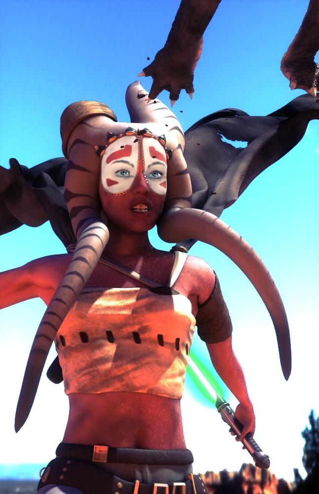
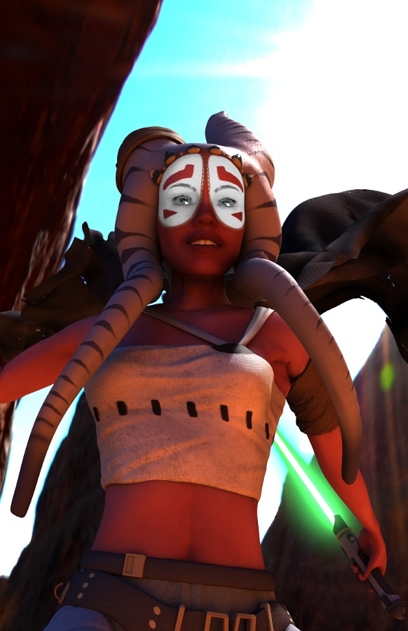
Hi all. This is an original character I’ve been working on for a while, I did a previous post on the forums with it, but I didn’t think the last render I made did the model justice given the time I spent on it.
Of course this is a Star Wars fan-art, so “original” in this case means just the character design - the alien race is established in Star Wars Cannon, (Togruta).
Looking for serious critiques to make this as good as possible.Things I’m unsure about:
-Facial expression
-Eyes (it’s always the eyes)
-Is the skin realistic enough?
anything else anybody thinks can be improved. Any comments or critiques would be wonderful.
Information about the render:
-Blender 2.56 internal render solely - NO external rendering or touch up (yet, but if something needs GIMP later I’m not opposed)
Lighting is using “environment lighting” in the World settings with an HDR lightmap, and a single spot light to increase rim light where the sun is supposed to be hitting.
Skin is a complicated node setup, similar to this
-Ambient occlusion is on, set to multiply.
-Unfortunately “Indirect Lighting” doesn’t work with ray-traced gather but “Environment Lighting” doesn’t work with approximate gather so it was one or the other. That means I’ll have to do a separate pass for the lightsaber glow.
-The background showing is part of the HDR map, I may replace it with an original backdrop later on (but keep the HDR lighting.
Hey this looks real good.
Only things i would work at:
the reflection on the eyes is a bit too big and too sharp
facial expression - i see her running with the pulled out laser sword and i expect her to look like “ok you bastards, i’ll kick you in your asses”! She looks more like flirting with somebody
maybe some details whic are telling me against whoom she is going to fight or that she has had some fights till yet (scars and wounds…)
looks like it could come from a film, and the skin looks fine, considering it cant look realistic being fictional
lightsaber looks a bit wierd, and her hand holding it is a bit small for it i think, but that’s being really picky.
Looking nice so far, just a couple of things, but some of them you already have acknowledged.
-First off, while the lighting is nice, and the over the shoulder lighting is dramatic, it doesn’t show off your model very well. All the texturing and bumpmapping is not visible because of the sun angle, and the model’s contours are not visible. I would suggest either moving the light a bit more to the side, or have it come from 3/4th’s to the front.
-Second, the skin doesn’t look too much like real skin, perhaps too soft, however since it is alien skin you can get away with more.
-The armpit deformation is pretty jagged. Is it rigged? Or did you pose it manually? I am currently rigging my own character and know how it can be difficult to get good results. If you did rig it, do you have the subsurf modifier first or the armature modifier? If you have the subsurf modifier first, it usually helps to have it second.
-The end of the head tentacles (for lack of a better word) look rather blunt, however in pictures of the togruta I’ve seen, they come to a point. They also don’t look like they are resting on the shoulders, unless they are meant to be depicting movement (which then I suggest a greater range of movement).
-The clothing seems to be good, just some more direct lighting like mentioned before should help.
-The eye lashes look either like particles or hand modeled, however the eyebrows look like a texture. The color difference between them makes the area look rather stark.
-For a while I thought the cape behind her was rock formations, adding more color and light to it should help.
-The whites of the eyes look too grey, and like SebastianBauer said, the reflections in her eyes look to sharp (may help to have a slight emit value).
-Her hands and wrist area look disproportioned like Casio23 said.
-Perhaps a slightly more dramatic camera angle (however the positioning of it now suits your character’s expression/pose)
-Finally the teeth look rather orange ;).
Keep it up though, I like the posing of the character, and with some adjustments, this will be a really great render.
IMHO, i think it needs a seriously good scene composition.
I think it’s a great model, great shading, interesting light setup, BUT it lacks a good composition: strong lines of action and telling a story.
Thanks everyone for the comments, I’ve made some changes to try and incorporate the suggestions.
I added an animal that she is chasing now, to help the picture tell a story. Does it read properly? Maybe I need to show her legs so that you can tell she is jumping after it? I will also add some DOF in the next update.
Her facial expression is getting a bit lost with too much SSS, I thought I’d toned it down but I will improve it some more… Also the chain on her face is getting occluded by her face - I will fix
@Otto Riis: She is rigged, and her jagged armpit was a result of the rigging. Except, I forget what it was, but a while ago the sub-surf modifier was interfering with something else, so I had to apply it and work with the model full-res (my computer groaned a little bit ) which meant there was no sub-surf coming after the amrature modifier to smooth things over. So to fix the jaggedness I added a “smooth” modifier to the rough parts and it worked like a charm.
I’m going to have to lighten the teeth a different way as well since the environment lighting leaves them red/orange and “emit” makes them glow in the back of her mouth unnaturally. I guess they are getting their own lamp.
I will work some more on the things I know need work, but any other suggestions in the meantime would be wonderful again
Couldn’t help but put my two cents in on this one as I have a Gentle Giant Shaak Ti on my desk. I think you posted an update while I was doing a paintover… Most of what I was getting at was colour/light/details related anyway as I stuck as close to your original image as possible while emulating the tweaks I would make. The two main things were adjusting the levels and using rgb curves a bit (in photoshop, but generally less destructive in Blender’s comp nodes) and giving her more dirt. Not to suggest she’s been rolling around on the floor, but she’s probably been hiking through that rock world for a week or two, fighting thugs and wild animals. That whole thing. I don’t imagine Jedi would do a whole lot of laundry on patrol. Other than that, using a gradient or two on soft light, different sky, a bit less saturated. Good work so far, hope that gives some food for thought.
That paint over looks fantastic. I will work on introducing those elements in the update I’m working on. I don’t know why I didn’t think to use Blender’s comp nodes for colour adjustments. It’s way easier than Photoshop/GIMP. Thanks for the brilliant idea!
You’re welcome. However the trap I am falling into a bit (and was happening a bit on Sintel as well) was using the Comp nodes for too much. The more you can do with lighting in the scene the better, but some things are just easier to tweak in post.
Also, it helps to leave the black point on the curves alone. Being 32 bit depth, the falloff into black can get out of control real quick. But being 32 bit as opposed to 16 or Gimps limit of 8bit is what makes it way more flexible.
Other than that, forge onwards!
(Also, just realised that Firefox’s No-script addon is messing with formatting my posts, hence the slab of text previously.)
It’s looking better already. The face is looking sharper especially around the white border, and also the lighting looks better in my opinion.
I know that people have been suggesting the animal to have a sense of action or story, but I think if you got rid of the animal, and instead changed her expression to a really determined one, it would work out more. I don’t think the paws are helping the image.
@larmannjan Do you mean in the overall image, or in the skin? Because her skin is supposed to be red.
@all I’m in the process of rendering the final image. It’s just taking me a while since I render at poster sized print resolutions. My next update will have a finalized image for one last critique if needed.
Here is my final render, with some finishing touches added with Photoshop.
I decided to scrap DOF since it didn’t stack well in my layer order and was just messing things up. But it isn’t completely gone since the background is blurred.
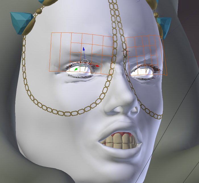
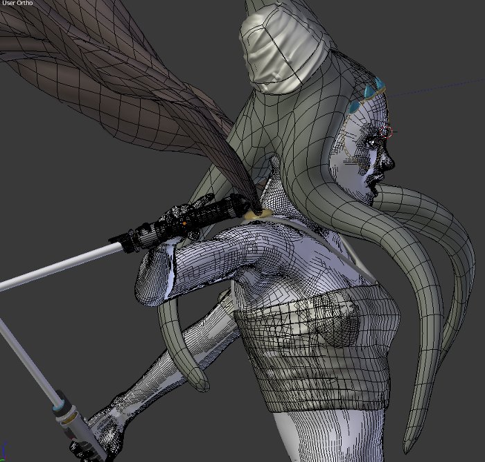
One thing that was giving me consistent trouble was trying to get her facial expression to read through the SSS. The node setup I used was overly complicated, and whatever I tried, it continued to muddy up her face crinkles, I’ll post a wireframe and blender internal shot so you can see the model too.
lol she really looks pissed lmao, I think you should draw in her cheek bones, Im sorry but I have NEVER seen someone grit their teeth like that unless they are trying not to smile while someone tickles them on the scariest rollercoaster EVER :D, so maybe tone the muscles for the face in a little and relax her jaw, put a tiny gap in between her teeth
that will show shes angry, but not at the fact someone stole her rollercoaster spot


 ) which meant there was no sub-surf coming after the amrature modifier to smooth things over. So to fix the jaggedness I added a “smooth” modifier to the rough parts and it worked like a charm.
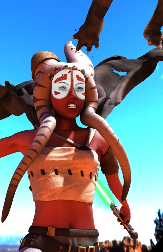


 Most of what I was getting at was colour/light/details related anyway as I stuck as close to your original image as possible while emulating the tweaks I would make. The two main things were adjusting the levels and using rgb curves a bit (in photoshop, but generally less destructive in Blender’s comp nodes) and giving her more dirt. Not to suggest she’s been rolling around on the floor, but she’s probably been hiking through that rock world for a week or two, fighting thugs and wild animals. That whole thing. I don’t imagine Jedi would do a whole lot of laundry on patrol. Other than that, using a gradient or two on soft light, different sky, a bit less saturated. Good work so far, hope that gives some food for thought.