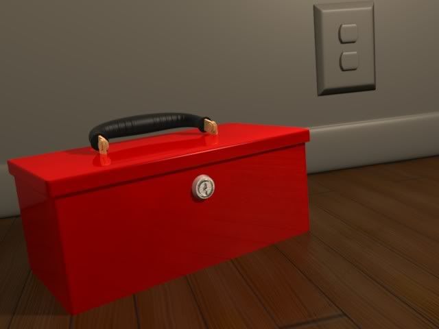
I am practicing textures creation technique’s aswell as lighting techniques, right now the image is very “clean”.
Right now what I am looking for is good photoshop techniques and brushes, aswell as advanced lighting tricks that you may have to share.
Also, take note that the “repeatable” texture on the ground is not so repeatable after all (I made a stupid mistake). So I am hiding it for now, and it is little stretched in one direction.
Any advice or techniques shared will be most appreciated.
Thx for the help, I have looked, and found lighing textures and tutorials, I am merely asking to see if anyone has some unique, or helpful tips that I didn’t catch.
The slanting was just me tilting the camera to give make the toolbox stick out a bit, and to give it a less than perfect angle, but for now, I guess I will tilt it back to normal.
That composition article is nice, thanks for the link.
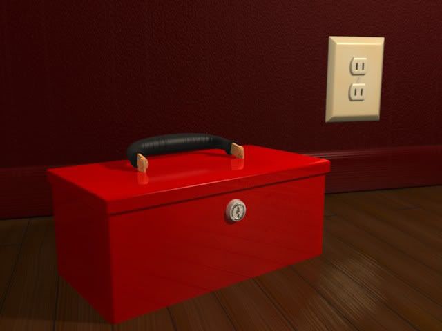
Update, I textures the wall socket, and added normal and color mapping.
My next step is to add the dirt now that all teh clean textures are on, The next step I have yet to practice, so I will see if I can get any good results.
I showed the image to my friend, and he was disgusted with the red baseboard, so I made a white version, yet I am unsure of which is better personally. The red one make the floor look good, but the white base board makes the end of the wood near it a little whiter.