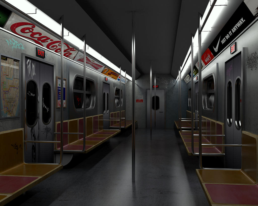
this work was based on gnomon concept
softwar:BLENDER,YAFARAY,PHOTOSHOP
nice one, I like it!
thanks for comment:RocknRoll:
the thing that really stuck me was that the bucket seats seem a bit too flat. here in NYC our subways have seats with more curvature.
but other than that good job.
This is really good. I think the best parts of this image are the highly detailed train map on the wall, and the extremely realistic logos/adds on the ceiling.
I also agree with max11d, but as it’s supposed to be a finished project, (and you’re probably sick of reworking it due to critiques already) I wouldn’t bother reworking it, as I don’t think it takes away from the image.
Ed: Btw, what is the red glowy thing outside the window on the left of the train meant to be?
I agree with noob, the details really make the picture awesome!
Thanks for the comments, the red one is left on the glass graffiti
Okay…  Thanks for explaining.
-Nathan
looks great I love it! The only thing I have to say is maybe you could make the exit signs glow a little more? That could easily be accomplished in the compositor. But it’s your choice. and I just have to say the graffiti looks awesome 
missmajor thanks for commenting, I will follow your cue to exit as a brighter light:yes: