Hello,
I’ve been trying to work on this project for some time now, on and off - only recently giving it another shot as Blender seemed to start playing with my Mac Mini + eGPU a bit better. I’m currently running Blender 3.0 Alpha, Cycled Rendering Engine.
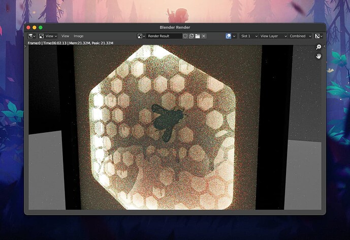
Basically I want to recreate this (Right picture) - It’s a papercut layered shadowbox with LED backlighting. I hope to recreate it in Blender so I can easier showcase designs, produce marketing material, and preview what it might look like before cutting.
I’ve modelled the frame (to scale) and imported the paper layers as SVG - they’re distanced the same as they would be in reality. I’ve opted to use an emission layer for the back, and a little sunlight to make the frame a bit visible etc. I have also experimented with imported PNG files as this would making swapping out the layers easier in the future - but have been sticking with SVG for now.
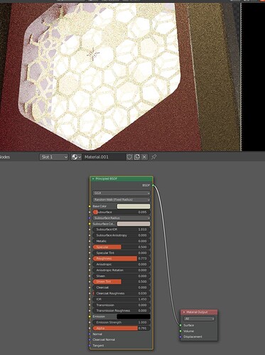
I asked on Reddit and was recommended to use the Principled BSDF shader with transmission turned up for the paper layers - and this gives me an effect very close to what I’m after (Left picture)
The most noticeable problem however is where the closer layers pass over holes - In the real photo the light doesn’t bleed through as it does in the render - the layer sort of retains it’s colour throughout, even when passing over holes in the layer behind it. In the render it’s feeling less like paper and more like plastic? Its hard to describe but I hope you can see what I mean.
I’ve been trying this on/off for ages, trying a whole bunch of paper shaders I found online, I think I started this project/idea over a year a go, and it just feels like I’m going in circles so I am seeking help from folks better experienced with this than me.
I’ve seen someone else ask for a similar project before (where they had actually achieved the look in 3DS Max and vray) - but it was either a deadend or the offered solution wasn’t working for me.
Any help would be greatly appreciated!  (also I hope I have posted this in the right section, it seems most related to the lighting/shaders?)
// C
The image on the right looks like it has some subsurface scattering going on,
What paper is it? tissue? baking type waxy paper?
Maybe, your roughness could be higher ie, less shiny, some paper isn’t that shiny.
Maybe using a highres image in the alpha and giving the paper some porous variation?
I was also thinking for the scale you may want to add a very slight texture in,maybe bump as there is variation in that last layer.
Hope that helps.
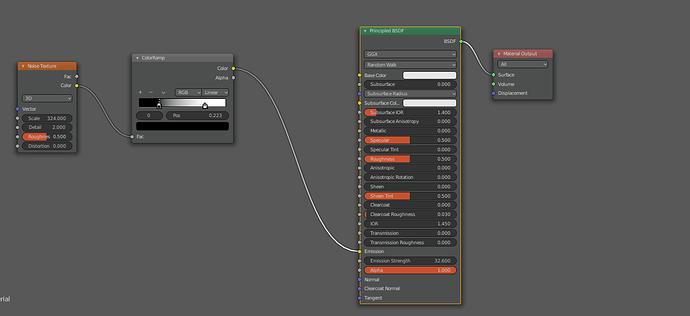
a few hundred samples…in Cycles Blender 3.0 alpha. Then some color balance.
paper material.
emission mat.
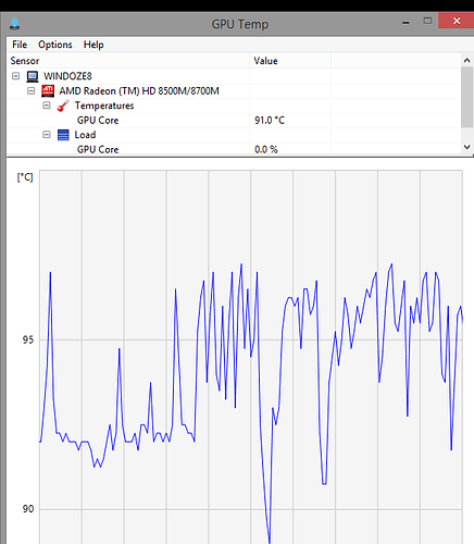
No Glass as I dont have a spare GPU to melt…
So sorry I should have specified the image on the right is the real shadowbox I have made and taken a photo of,
The paper is 120gsm Materica which I found to have the best properties for my shadowbox needs (and it cut great on the machine too), and the top/first/front layer is a slightly thicker smooth white card - which I used as it better stopped the light bleed - and helped brighten up the inside in a way.
This paper isn’t really shiny at all you’re right, and has a faint texture / roughness to it. I hadn’t even thought of trying to bring that element into blender - I will have to explore it
Oh my goodness, thank you so much for going to all this trouble! Amazing - Interesting outcome, it’s very close indeed - I will try to implement the nodes you’ve shared in my scene and report back ,thank you
1 Like
Yeah ,I realised that. Can you take a better one? lol.
I got as close as I could.
Didnt take long as blender has a honeycomb generator in extras addon.
Nice paper, and it does have texture, is it slightly wavy bumpy? bump node maybe, its all going to help scatter the light, this may take alot of samples, and I wasnt joking about my GPU either…
You could render all relevant passes too, opacity, and comp up a layer at a time, giving even more flexibility.
Also take it apart and take a picture of the leds’ head on…Then turn this into yr emission.
Hope that helps.
Oh, I nearly forgot, beacause I have one in my startup file,
I used an HDRI of indoor hotel room, free from HDRIHeaven.
This is one of the most important things to get some real world feel.
Sorry I don’t have access to the frame right now to swap the layers and take more photos (its currently got a buddha scene, aha, when I get back I can get more) I did find some others, and one of the LED backing, which i’ve uploaded to imgur if it helps - https://imgur.com/a/sU0fetb
I’m realising now that I should probably make “led strips” to mimic where the light is coming from in reality right? At the moment it’s just solid plane the width/height of the backplate giving off light.
Yes, the paper is ever so slightly bumpy, I will try play around with these nodes you’ve mentioned to try improve it - What I’m finding so far is the layers still appear rather see through, as in the edge of the layer behind it is visible
I must admit I am feeling pretty sheepish because a lot of this is new for me, and I feel I’ve made a lot of silly mistakes so far in this project XD - I will look into HDRI’s too, thank you to yourself and your GPU for this help 
EDIT: Wait, that’s my bad, I was still rocking the transmission variable from my old tests - I am turning that off and trying to run another render (My mac mini sounds like it’s about to explode) XD
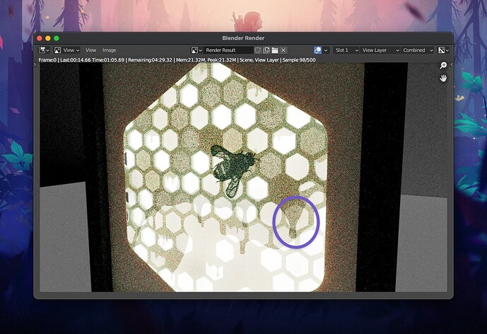
EDIT 2: ok, I’ve copied your paper nodes exactly (apart from Alpha, it seems having any lower alpha shows the edges similar to what I circled in the render attached) Though with it kept at 1, the bee detail is completely dark. I will try to change the emit layer size to be more realistic, and put the paper backing layer I have
EDIT 3: Right, getting on the right track I feel now. My layers were far too close, silly me didn’t account for the distance between them properly (There are 5mm foamcore spacers) whereas in the blend file was only separating them every 2mm… So I’ve positioned them more accurately - I’ve also cut out a big square from the emission plane I was using previously - to better mimic the LED strips which only go around the edge of the backing panel.
1 Like
Yup, looking really good.
Keep going!
1 Like
![]() (also I hope I have posted this in the right section, it seems most related to the lighting/shaders?)
(also I hope I have posted this in the right section, it seems most related to the lighting/shaders?)

