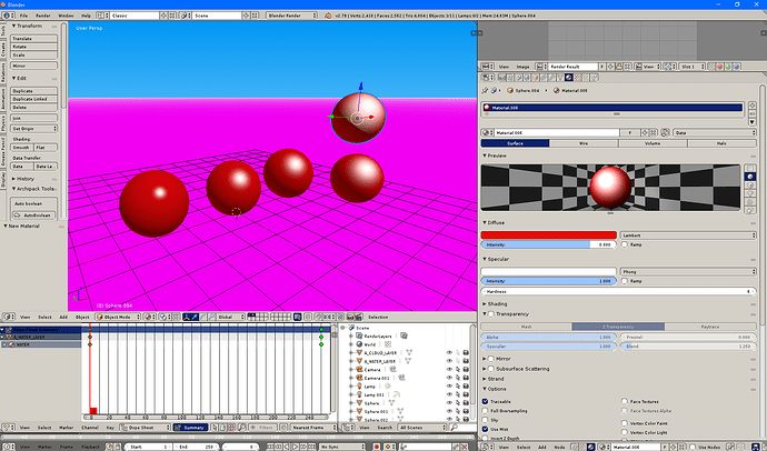
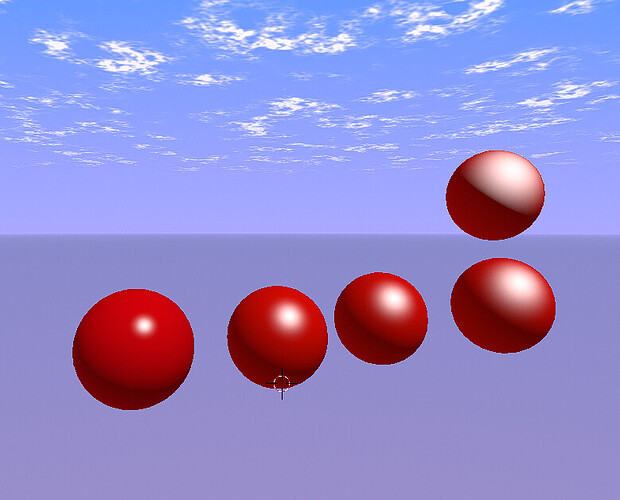
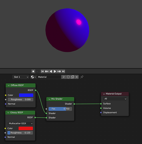
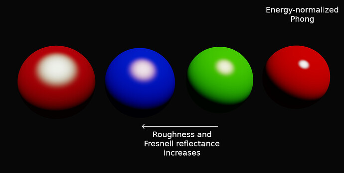
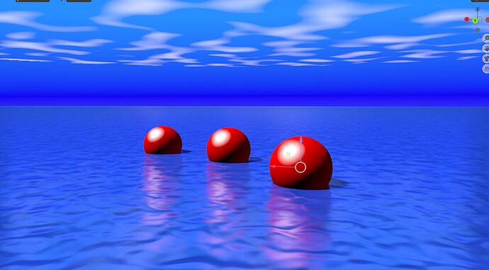
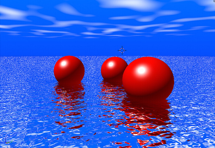
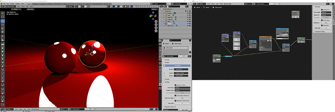
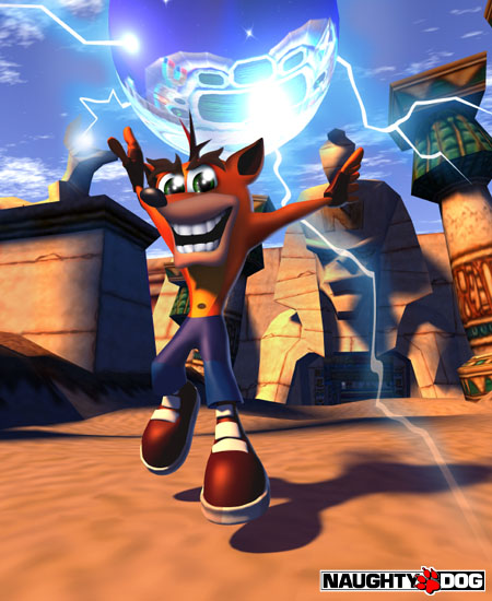
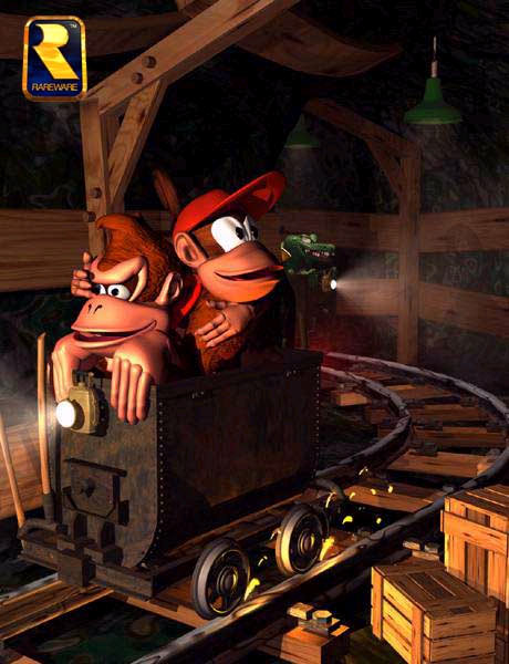
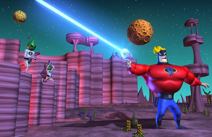
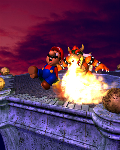
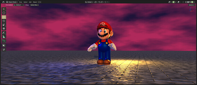
Yes but for it to look correct and actually more good looking and not strange looking, you pretty much need to be able to resize the specular, otherwise it just looks more like metal of some kind, and in your case, it looks nothing like 90s CGI at all for that matter, like maybe 10% or 20% but otherwise, what you showed still has a modern look to it / non-phong specular look (which from things i’ve done the phong is actually the real thing that does it, besides not having not having modern rendering features
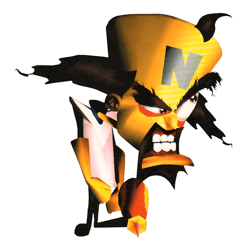
Infact the only thing on that image you showed that looks remotely like its 90s CGI is the hat and shoes
Everything else just looks like its PBR or metal of some kind
infact the whole scene you made actually looks more crappier then the actual 90s CGI does (which of course 90s CGI doesn’t unless you’re comparing it to reality otherwise it looks fine and just unique looking or cartoony depending on how its being used, but in this case, the scene you made pretty much as no actual good quality to it period no matter which way you actually look at it)
Also, Technicly, Cycles is usuable too since Raytracing did exist back then, you just couldnt use it at ALL in real time, and some stuff could take hours, to days or even worse cases, weeks to render, was mostly a matter of the complexity of the scene and what you had going on for it to take that long
Infact most of what i showed you is infact Raytraced, since pretty much all of those back then were unless it was on a game console or was PC game or anything that ran in real time, for reasons you likely already know
And for what am doing infact, This does not work, as i myself pretty much require a way to resize the specular
and i have tried but the things i’ve tried either don’t work, or do but have bugs duo to certain things not being exposed to the user as nodes or inputs/outputs on nodes
and as i mentioned, doesn’t exactly help that the Specular Light decreases in strength
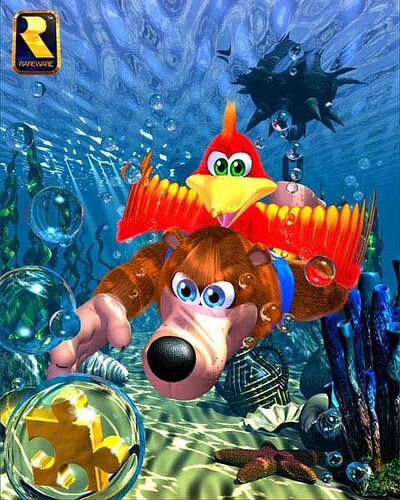
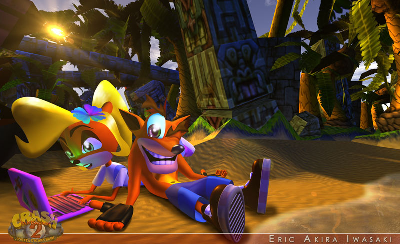
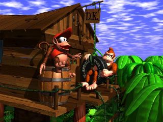
Also i find it funny how you call those Generic Crappy renders when they don’t really look crappy at all, sure if you compare it to reality then they do, but otherwise, no, They really don’t
Infact, what i would call crap is making a Model with flat shading, no shadows and crap textures, and Extremely horrific modeling
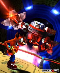
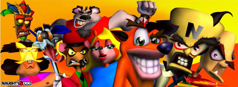
But yea i find it funny that you say those look like crap since they really don’t, and for sure with the crash bandicoot ones, since those ones are pretty nice lookin and cartoony, since it has a fine blend of an almost 2D and 3D with some of its elements on the characters and stuff with how the texturing is and some of the color choices and other stuff

Honestly only one there in that bottom image i’d say looks odd is the guy wearin the weird Gold/Yellow Thing that has the Red and stuff under his eyes and is wearing some kind of thing with pink and red colors
Otherwise most of that looks fine duo to the texture work and the way the specular and other things are being used, plus the colors
Also, Soft shadows did infact exist back then, and turning off Tone mapping usually isn’t a good idea either, usually you wanna stick that crap on standard and mostly that for the colors, since using Raw is just pretty much overkill at that point
