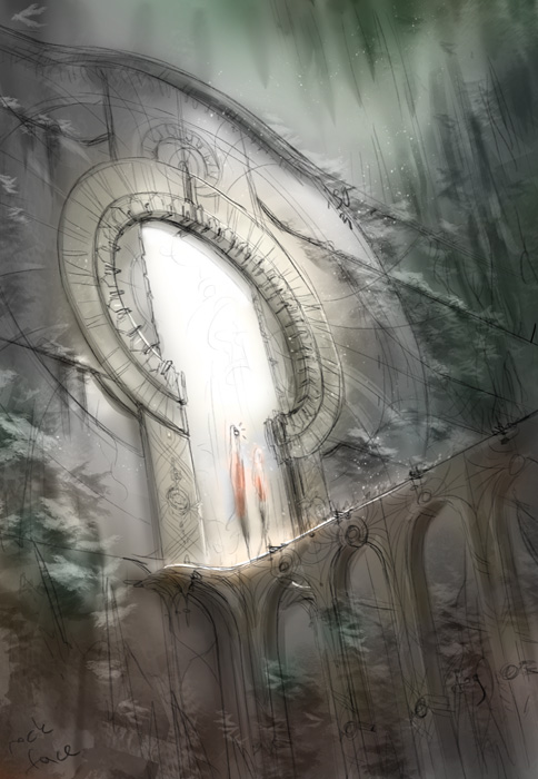
Working on this environment concept. A lot of base geo done in Blender, but then lots of lighting + other stuff photobashed and painted on top in Photoshop. Here’s what I have so far, crits and comments welcome to improve it:
Amazing and intriguing. Looks like a mix between Journey and Monument Valley.
It took me a while to notice the character though (by “a while” I mean about 10 seconds, taking into account the time during which I watched the thumbnail, but that can be enough for some people to skip to another artwork).
This may be due to the fact that her cloth is very bright and doesn’t contrast with the background. Maybe if it was a bit darker and less transparent it would be harder to miss.
Thanks guys. Interesting point about the character lightness, I didn’t even think of that. I did think that I lightened the top of its sheet too much and that area started looking like long white hair (it’s not supposed to be hair, it’s just a sheet; it’s also not necessarily a “she,” but because the sheet looks like hair, the ghost thing might be coming across as female). Hmm, I’ll try to darken it.
And I definitely didn’t intend for any Journey / Monument Valley homages, d’oh! Haha
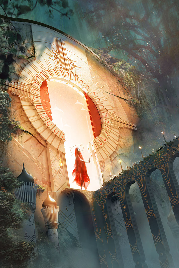
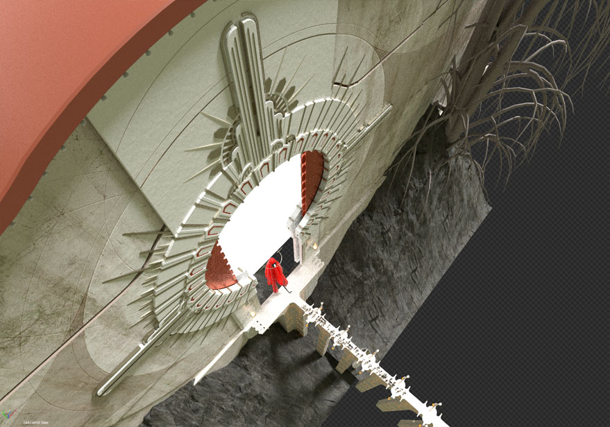
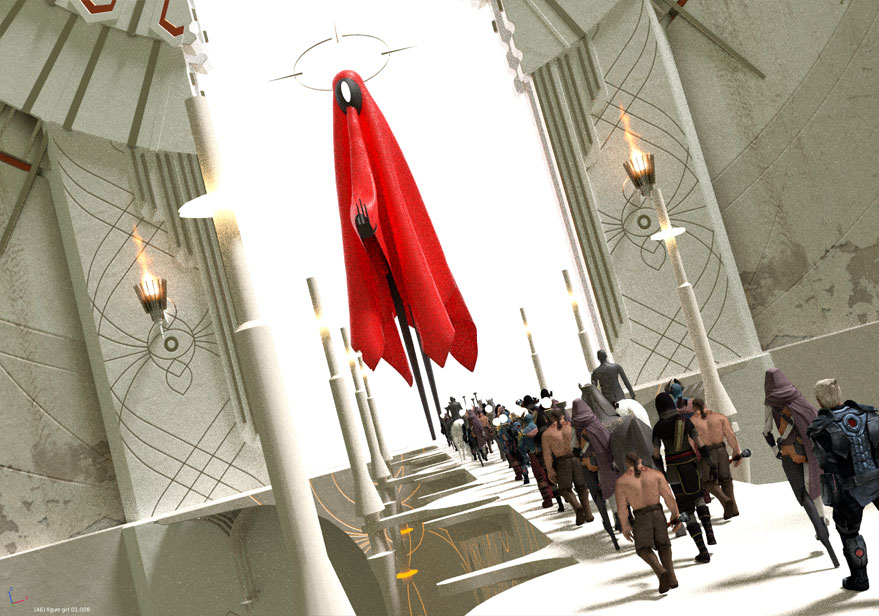
OK, made some updates. I embellished the architecture, made the ghost’s robe red, made it cast a magic barrier thing. Are the nomads on the bridge noticeable, or do they get lost?
For the gate’s decorations, the added parts look very consistent with the rest, although the simplicity of the first version was not problematic for me.
For the ghost, in the first version I had the feeling that part of it was refracted as if the gate acted as a boundary between 2 mediums (2 different atmospheres), which I found quite interesting. But now with the new ghost’s pose and robe color and opacity, it’s clear that there is no such thing. Speaking of the robe’s color, it’s sure that we can’t unsee the ghost now, but this red starts to resemble Journey a little too much for my taste and lack originality. That said, how would you feel about adding some volume scattering on the other side of the gate, with refraction on the surface? This could fade part of the red robe and make the image more original. Unfortunately the castle behind is already very dim but maybe you could remove some of the background fog to compensate and keep it visible?
for the magic barrier thing, I find it very video-game-ish and resembling Journey even more. I don’t find it necessary.
for the nomads, I didn’t notice them from the beginning. The reason is that I thought the ghost had a human size, and the trees and vegetation don’t seem to contradict that. Now they seem all giant. A good way to give a sense of big scale is flying birds. As for how to make the nomads more noticeable, I fear it’s going to be hard at this angle of view. If it was animated there would be no problem but on a still image I’m not sure what to do about it. Maybe making them brighter so they contrast with the bridge? Or instead, adding some fog between them and the vegetation so they don’t blend in it. I don’t know. Maybe it’s just me who has no eyes though.
Visualize what would be the actual shot sequence. The shot that you now have would be an “establishing shot,” and from it we would then immediately jump-cut to a framing similar to your shot #2 but even tighter and closer. We’d then go onto the walkway and do OTS (over-the-shoulder) shots that establish the human characters and their reactions. And this edit would be … “bang, bang, bang” … very quick and tight.
And it would be very difficult shooting, because the doorway is apparently several hundred feet high, as is the apparition.
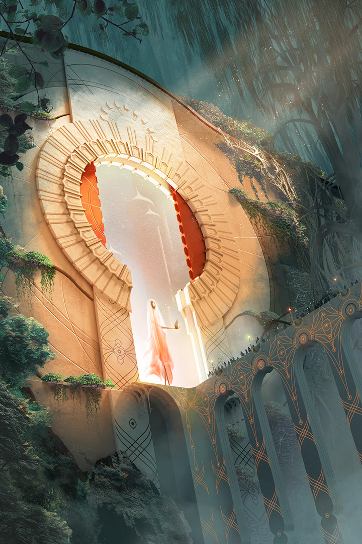
ChameleonScales: Wow, that’s great feedback, thanks for taking the time. Good points about the robe. I tried to make it semi-transparent in Photoshop, but I think the magic shield she’s casting is hiding it. I made it more transparent in the version below. I did mean for the area inside the wall to be a weird alternate-dimension thing, which is why I lit it so differently from the rest of the forest. I exaggerated that difference below, but now it looks even more like Journey haha, oh well. I’m doing most of the lighting in Photoshop, because it was hard to get the mood I wanted in Blender, and volumetrics take forever (I did this in 2.79). Re: the fog behind the caravan, that is a BRILLIANT idea. Re: foliage scale, I meant for lots of those bushy-looking things to be full-sized trees, but maybe they don’t read that way.
sundialsvc4: I originally just saw this as a piece of architectural concept art, and I shoehorned the characters / story in as an afterthought, so this single image by itself doesn’t communicate any narrative well. If this was 100% done in Blender, it’d be cool to do an animation, but it’s half Blender / half Photoshop. I should’ve done more of it in Blender
BTW, what foliage / tree generators do you guys like for Blender? Maybe I should do that kind of stuff in World Creator instead.
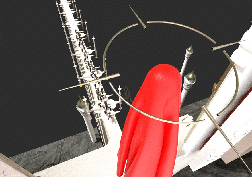
Yea for the floating crown, the transparency of the red robe (which I didn’t notice previously) and the visibility of the nomads
For the castle background getting more yellow, I’m not sure. I liked the blue and the better visibility of the castle. Now it blends more with the wall.
For the color of the robe, have you tried others? I wonder how it could look with a bright greenish blue or some other mix. Maybe it would look terrible but I can’t imagine.
For the robe (and the gates), I tried purple, blue, black. I wasn’t crazy about any of them. I think red works fine because it’s a complement to the greenery. I think I’ll leave it.
I forgot to mention earlier, I didn’t want to add flying birds, because they’d be tiny at this scale: they’d basically be the same size as the light specks in the upper right.
You might be right about the lighting inside the city. But I think I’ve been staring at this too long, can’t tell what I like and don’t like anymore. I’m gonna let it sit a while and come back to it later. Thanks for all the help so far though
I have one critique the inner ring bothers me a bit, just above the ghost, it looks more like some great being has put a cookie cutter through it to make a doorway instead of it being purposefully built, i say this with utmost respect to your work, but i just cant unsee this.
that’s literally what it is haha, a live boolean subtract. I’ll add fixing those areas to my to-do list.
This so far is a couple solid days of work. I haven’t been timing, but maybe … 30-40 hours? A lot of that is just sitting there tweaking stuff in Photoshop. I did a lot of the inlays as vectors, and those took a while–constant tweaking in Illustrator, reloading textures in Blender to check, rinse and repeat. I need to make this whole process faster, either leaning more on 3D or more on 2D. I need to learn more about how pro matte painters work nowadays, seems like an interesting field.
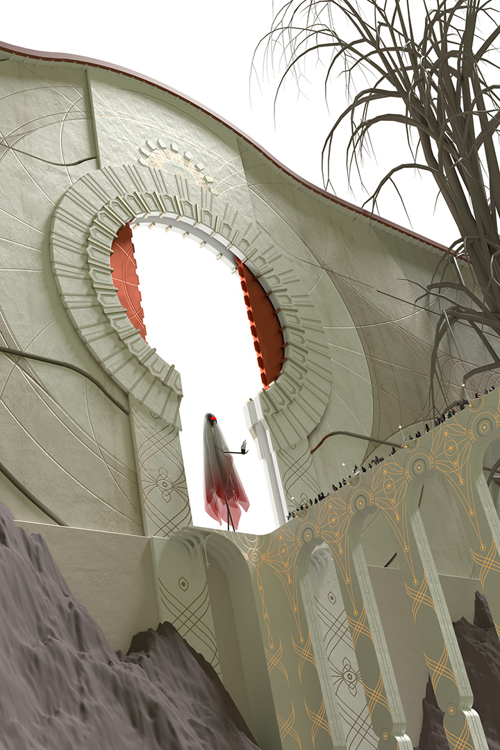
BTW, I didn’t post this earlier, but this was my initial sketch for this:
i allready like the first one the most.for improvements,its all a matter of taste,isnt it?
now the mood is very pastell with some fog and more low contrast.if you want to increase the sence of depth then a increasing of contrast can help.for example makeing the backround darker for more depth,and place maybe something in the lower part near to the camera to give it even more a sence of scale,if that makes sence.and the shadows under the bridge could be darker,to give a more dramatic light and helps to make it more seperate/stand out agains the backround.
if the ghost is a good one then the pastell works right now,if its not a good one then a more dramatic light could help to catch that mood more.
i think the ghost should be more translucent vs the redish version,i gives a more mystic look.
Yup, the fact that the caravan gets lost is by far the biggest crit I got. I’ll leave the composition as is for now, but I’ll keep story in mind for future things.
I added some towers to the scene, to populate the foreground and background a little more. I thought it felt kinda empty too.
I wouldn’t call the crimson red of the ghost’s robes “pastel,” I think the color’s pretty deep. I don’t want to make them more translucent because it would fade the color too much, and that was the problem with my first pass at the ghost: it got lost.