What I wished I had learned as a beginning artist: how powerful compositing can be, and how it can vastly improve renders.
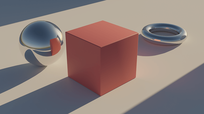
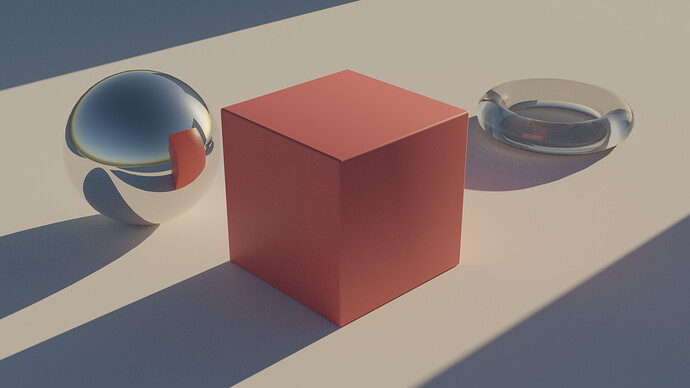
Below is a before-and-after, showing the raw render and the composited result:
I’d like to give an overview on my compositing process. Any other experts, feel free to impart your knowledge here as well; I don’t own a monopoly on this! This is just sharing what I’ve learned as a compositor and VFX artist.
What are Passes?
Passes are what the render engine captures. Naturally, you want to see the final, beautiful result. But you can also capture individual pieces, including the color of your diffuse materials, and all the indirect light. You can go to the View Layer Properties to find passes.

You will notice the same three types of passes for Diffuse, Glossy, and Transmission. Here’s what they mean:
- Direct: color values from direct lighting - from the camera to the object only, and taking lights into account. Notice that these passes have barely any noise. Since there’s less potential for variation in ray direction and what it hits, these are pretty consistently sharp.
- Indirect: color values from indirect lighting. In short, anything resulting from 1+ bounces of rays. Notice that these passes create more noise. The more bounces, the more rays, the more potential for noise. Reducing bounces reduces noise, but also removes any finer detail.
- Color: the “albedo” color for those rays. If the metal is given a green color, the metal will be a flat green seen here, maybe with some fresnel.
But what do they mean to each other? How do these passes come together for the final render?
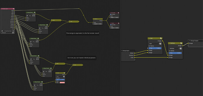
Given that d is the direct pass, i is the indirect pass, and c is the color pass, the formula is: (d + i) * c. This way, you can get the final diffuse, glossy, and transmission beauty passes. And if you add these together, it’ll make the final beauty pass including these:
There are also volume, emission, and environment passes. These can also be mixed and added on top of the result. I just didn’t include them in this example. But remember that light is additive, so the order they’re added is inconsequential. This also means your colors will go beyond the range of 0-1 in your raw render. That’s actually good; it gives us more room to manipulate our scene’s brightness and lighting using color spaces and compositing afterward.
But why would you want to split all these passes up? What’s the point? Let’s say you look at that glass torus and say, “I actually want it to be red.” Normally, you’d have to change the material and re-render, right? With passes, you don’t have to! Just tweak the transmission color before merging the transmission pass all together.
Keep in mind that adding passes to your render doesn’t significantly affect render times. Blender is already calculating these passes anyway, just not saving them. If you want to save all these passes into an actual file, you’ll need to select “EXR Multilayer” or some other multilayer format as your output.
How to Improve Your Composition
Alright, so you know how to tweak renders after the fact in the compositor. But how can you actually improve the look of your renders using the compositor?
I’ll share the file I’m using at the end, but here are the basics and the nodes I use. Prior to rendering, I add the following:
- Depth of field! While you can add depth of field in the compositor, but 9/10 times doing it in-render looks better. If someone has a good depth of field compositing tutorial, I’d love to hear it!
- Exposure adjustments, seen in the “Color Management” panel. This may mean readjusting light settings too. Keep your materials, lights, and object scale to real-world values; Blender works with real life scale! Dark scenes should be overexposed, and bright scenes underexposed. You can also adjust exposure in the compositor, but I like doing this in-render to better understand my lighting.
- in my case, the color management’s view transform is set to “Filmic”, but the “Look” isn’t set. We’ll adjust the look via color grading in the compositor.
Here are common additions I do in compositing to make the render pop:
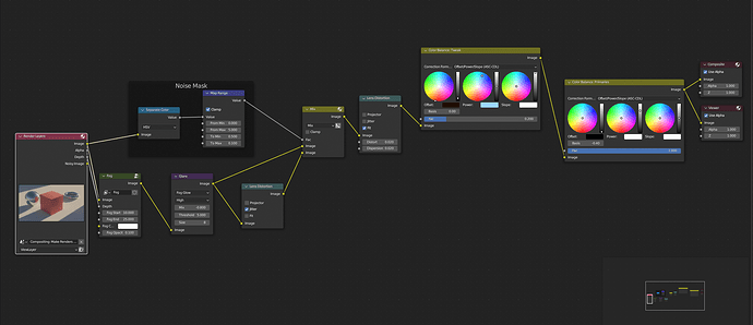
- Fog. Just take your depth or mist pass, plug it into the factor of a mix node, where you mix in the original render and the color of your fog. Use a Map Range node to adjust the fog distance and opacity. Even for small-scale scenes, a faint fog increases readability and separation of elements.
- A glare node adds glow to highlights. For bright, underexposed scenes, glare tends to be minimal. For dark, overexposed scenes, glare may seem too much at times. Again, real photo references are your friend.
- Grain gives in-camera realism to your scene. Render noise is NOT the same as camera noise! This topic could be its own article. But for simple digital noise, I mix some jitter from a Lens Distortion node. For digital noise, shadows are more effected by noise than highlights. Nuke’s built-in nodes or other custom grain node setups are often better at making realistic grain and realistic camera noise.
- Lens distortion node to distort edges and colors. Professional lenses tend to mitigate distortion, but sometimes it’s intentional or old-timey. Adding just a smidge of distortion can also mitigate the “clean” CGI look.
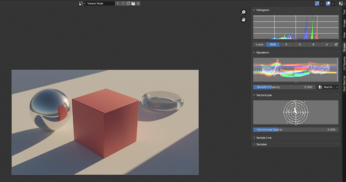
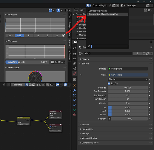
- Color grading. This is where the magic happens. In the image editor, open the right panel; you’ll see a histogram, waveform, and the vector scope, as shown below. Captain Disillusion’s video on color perfectly defines these, but in summary, they help you understand the color range of your image! Use these with the Viewer Node in the compositor to preview and make the most of your color range.
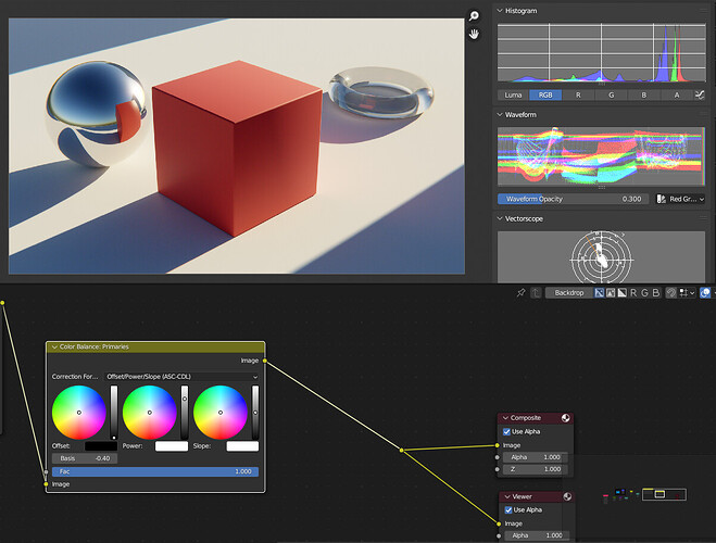
With the original flat image, I use the Color Balance node (but you can also use Color Correction, Gamma, and Exposure nodes). Using the Offset/Power/Slope model, I set the basis and offset so the darkest values are near black, and then adjust the power and slope so the bright values are near white, as seen below.
Once primaries are adjusted, I add a separate Color Balance node (before primaries) to tweak my palette to personal taste. Often I start with extreme color values, then turn the Factor down to tweak the effect’s strength. This is where your render’s personality shines!
And don’t be afraid to use other compositing or color grading softwares! Davinci Resolve is professionally used for color grading, and rightly so. For some of my simple projects, saving and using in multiple softwares can be overkill. In those cases, I like to keep it all within Blender.
This is my final compositing node tree:
And let’s bring back that final result, shall we?
Final Thoughts
Effect Order
In my node tree, notice the order of my nodes and their effects. I try to order effects as they would happen in a real camera:
- fog would be in the scene itself, so that’s first
- Glare and lens distortion happen in the camera’s lens, so they go next
- color grading is done in post-processing, therefore last
In some cases, the order of your actual nodes may not make much difference to the final result. Regardless, I find it helpful for organization.
Color Clamping
Some nodes or blend modes assume a 0-1 color space, and may even clamp light values to 0-1. Try to prevent this as much as possible, allowing maximum adjustment power!
This is why I set the Color Balance’s Correction formula to “ASC-CDL” - it preserves bright values.
It’s not well documented, so it may be trial and error with color visualizers (but again, if someone found a solid resource on what clamps and what doesn’t without opening up the code, let me know!).
Subtlety
A good rule of thumb for most effects is subtlety; add it just enough to notice. Obviously for your personal flair or style, you can adjust as you like. But know that most effects don’t need very much to fulfill their purpose, and can become a distraction to the art itself.
Final File
This contains the workspace and compositing setups shown. It is mainly for Cycles, but I added some reflection cubemaps to work in Eevee: Compositing Basics.blend (912.1 KB)
