second hair study from a photo ref, next up painting lips this is now bad drawing number 16

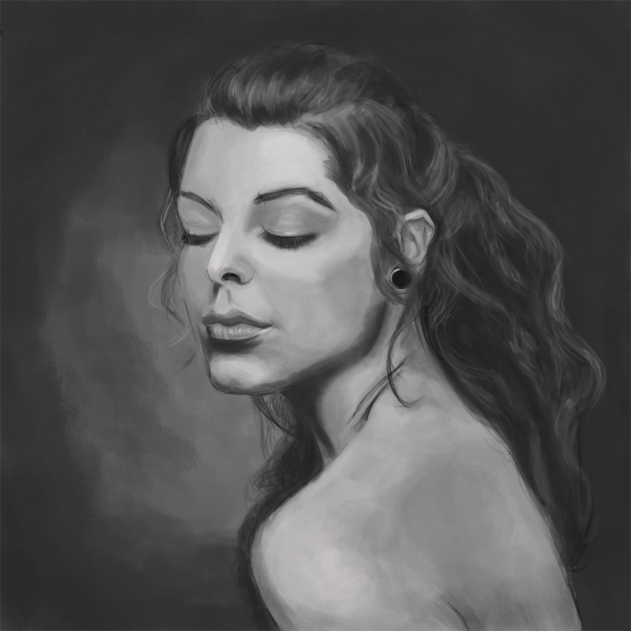
an almost full portrait from a ref that floats around on this forum the Adrianna ref. this would be bad drawing number 17, I am almost close to 5% of my target. One step at a time
Attachments

Really liking the Adrianna painting, Awesome job:)
Hair is looking better, don’t worry about strands so much as the masses/shadows/highlights of the hair. You’d be surprised how little detail you need to make hair look like hair.
thanks bunkie and jay, I will try and work on some of the things you pointed out. I just brought a shit load of books; Bridgeman’s guide to drawing the figure, Figure drawing and Invention, Atlas of Human Anatomy for the Artist, Force Dynamic figure drawing for animators, vanishing point perspective for comic book artists and several 3dtotal ebooks. Its a shitload of reading material but than again I am not attending art school and I am teaching myself this stuff.
I have started working through the force book and its truly inspiring stuff the books focus is not on proportions and anatomy more on gesture and drawing force. Here is my first value study putting the principles I am learning to work.
Its all about exaggeration, gesture and drawing force and making stuff less stiff.
This is now Bad drawing number 18 - 482 to go.
The Mother Theresa drawing is good. It would be a good one to rework.
Keep them up!
hey, these are some awful drawings. ;D I think you’re doing pretty good with these studies. Another one you can probably look up is Vilppu, if you haven’t already.
almost done with my 3d total e-book I just need to work on a full portrait and than I am done with that book.
This time its the ears, this is now bad drawing number 19 that means I have about 481 to go
I am now noticing a positive effect that I want to keep going the space between updates is now narrowing. my aim for next year is to get it to about one update a week by may/june and than aim for two updates a week after that.
Should I get to over two updates a week than those 500 bad drawings are going to be toast.

Good ear i like it 
A new year has started, hopefully this time around I will be more committed. It’s time to get back on the saddle and to take one step closer to that target of 500 bad drawings. I am trying to learn how my values before I try and go back to painting in color. I don’t think I ever got the hang of that. So here is a portrait done from a photo reference in grey scale. I plan on doing over 30 of these this year about 4 every month I have completed this one and have started on my next.
This is Bad Drawing number 20 so 480 to go
Nope Tyrant, that last one doesn’t count. You are only on 481.
thanks 3dementia, onwards we match another photo study, two more to go before I reach this months quote of portrait photo studies. This I believe is bad drawing number 21. I tried a different approach for the hair this time around no custom brush just a round brush and playing around with the size a lot.

1 Like
Really nice! Why should we wait? You should stay up all night and get to 500 done right away so we can all be blown away tomorrow! 
When you work from reference / photos, where do you put them? On paper next to your computer screen? As a separate window where you flip back and forth? Underneath as a layer where you directly paintover?
Better and better! So much life in this last one, she is one sexy bitch, and she knows it. Particularly impressed with the smoke, hair and lips. I love how dark you made them.
@ Lancer: I say any of those methods is fine, except the direct paintover. You won’t feel as proud, or learn as much if you do that. Whatever you do, make sure your viewing angle of your refernce is the same as your viewing angle of your picture. Learn little tricks to adjust the scale and position (I use light dots) of elements before you even start.
@Lancer thanks for the kind words as to how I do it, I place the desaturated picture in another window and pin it so its always on top. than i just draw and paint it in photoshop. If you compared this to the original,http://www.portrait-photos.org/photo/21790.html , you will see several places where I am off. I never trace as I feel I won’t learn as much, calling these paintings bad drawings helps takes off the mental pressure of trying to make things perfect.
@3dmentia thanks man
I started going through and doing some of the projects from the conceptart.org peer project thread. this is the first suggested exercise that helps in value recognition
you paint a sphere using values only, you than paint another sphere using a hue and eyeballing it in trying to match values
you than desaturate (I used gimp with luminosity as my option, luminosity apparently desaturates in a way that mimicks how the eye sees values) and compare
this is my first attempt I want a little too light:o that bad drawing number 22 now am off to study some figure drawing


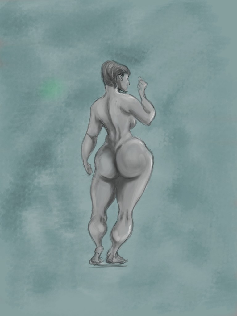
A couple of studies from figure drawing and invention. that would be bad drawing number 23 and 24, I am almost 5% towards my target.


I like the figure drawings - they convey emotion and mood quite well. The curves really accentuate your skill.
#73 Looks perfect!