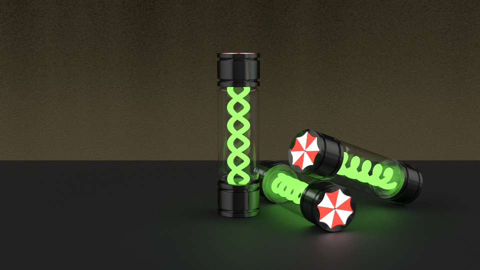
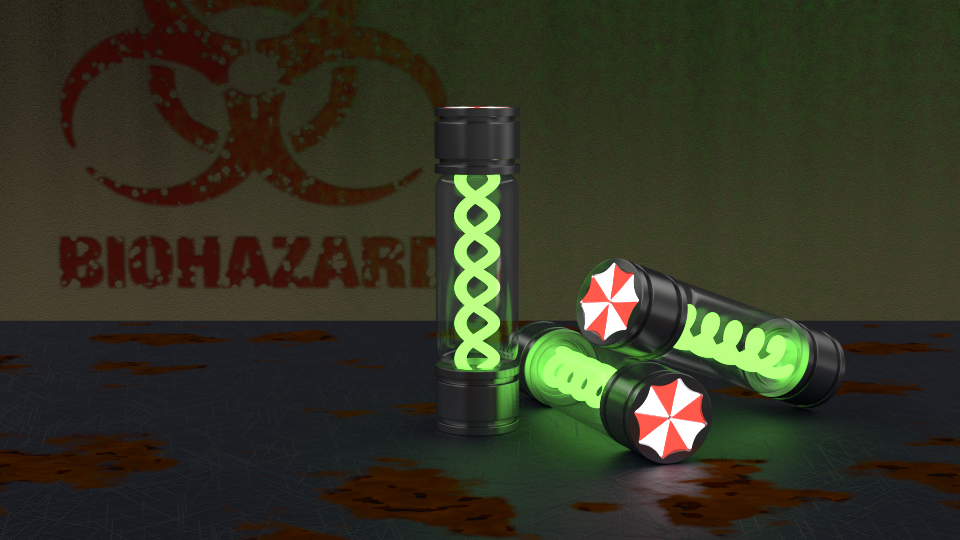
Hi all. I am making a scene inspired in Tyrant virus, from Resident Evil. I want to do a dark scene, showing the lights from the virus cotainers and their umbrella logo.
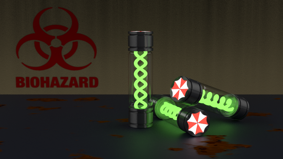
I’m thinking in setting a biohazard logo on the wall on the left hand side. Also I want to change the table material, adding some bumping and a dirty material.
i love Resident evil, amazing games. Adding a hazard sign in the back is a cool idea, what about having one of the vile’s cracked open with the T-Virus running out of it? For the table, maybe a rusted metal, kinda like what you see in old Labs.
I have a few questions since i’m making a similar project!
How did you get the glow effect for the cylinders inside the tube.
How did you get the glass to look so realistic.
What effect did you use for the table and how did you get the Umbrella logo on the tube.
I think you could make a few different colors in a darker environment that would look nice :)!
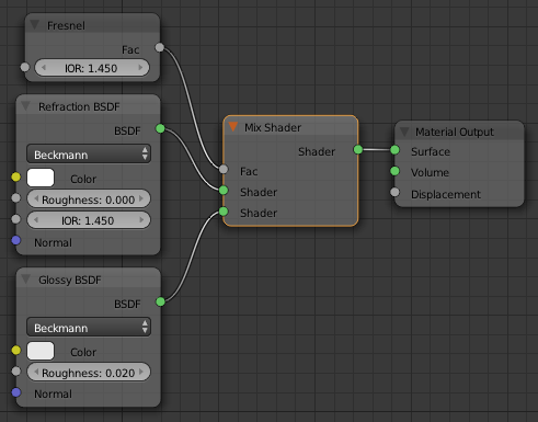
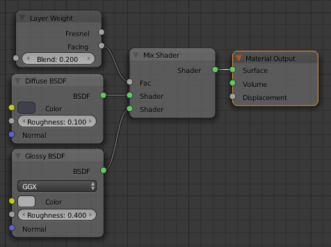
Hi Skyast. The glow effect is only produced by the lighting (I’m using Cycles render engine). The table and glass have basic materials. The only trick is I have used a HDR image for the world which is not too bright. You can download in Bluesummers. The problem with the reflections of all materials is that they depend on the mix of lights in your scene. So you have to set the suitable strength parameter in your lights because it affects to the general lighting. So to get a realistic glass the reflections of your world should be low. In my scene this is not complicated because it is a dark scene and I want to play with the lighting.
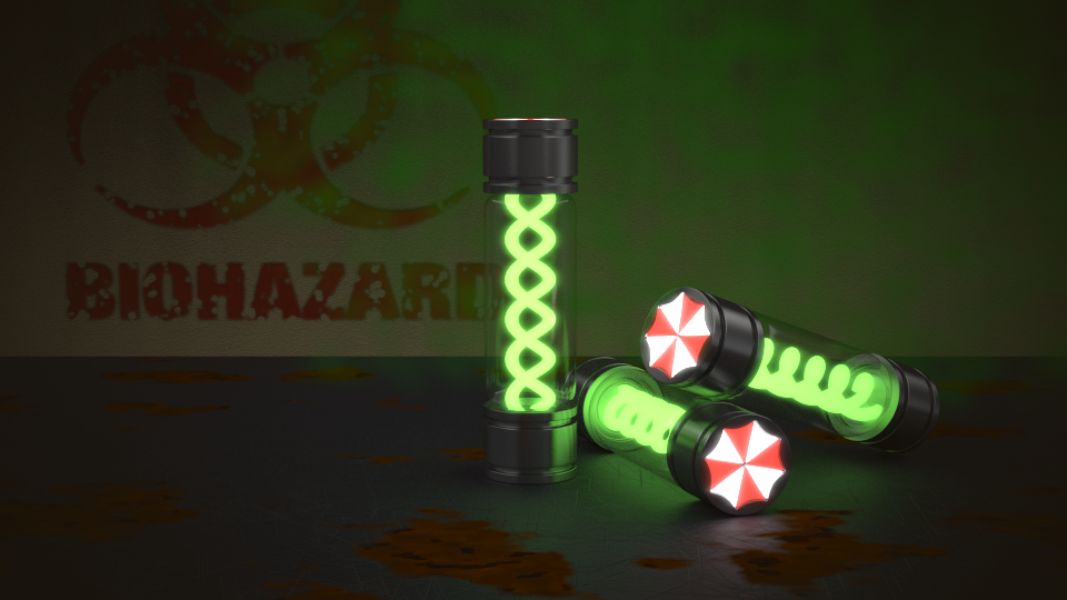
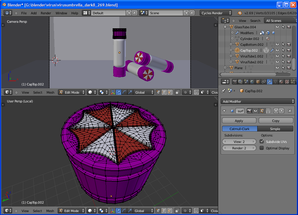
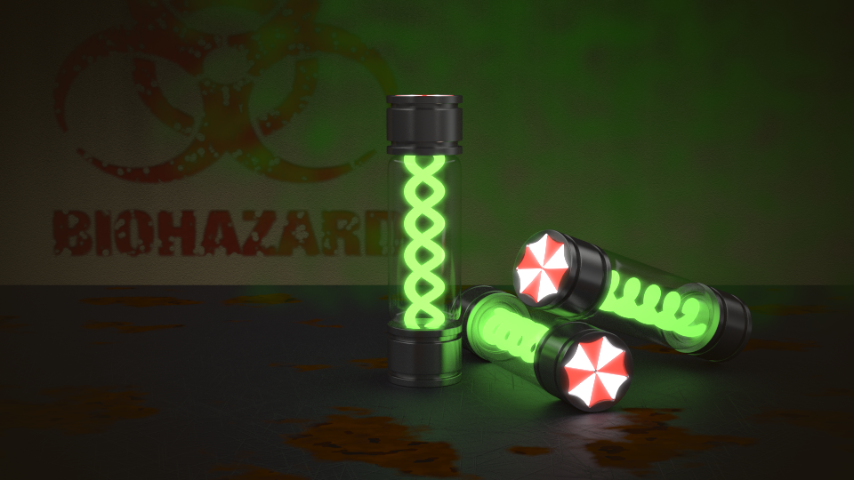
I have changed the volumetric cloud and added the glow effect with compositing. I’m not totally happy with the logo, but I think it is very near to its end.
I think the problem with the logo is that it doesn’t look like it’s part of the mesh,maybe try and darken the colors a bit and giving it a displacement map.Currently it looks like a simple sticker stamped on to the tube.
The problem is that the sticker is so bright yet the metal parts are so dark.
Hey, I’m still fairly new to blender, but would like to say a few things. The cloud doesn’t feel right as of yet, first of all. It is supposed to be coming from the containers, if I’m correct; perhaps add a crack in one of the containers to make it a bit more plausible. Also (and I realize you are likely still working on it) the cloud doesn’t seem too realistic as of yet. As I have said though, I’m pretty new to blender and really can’t say how to fix that. Also, perhaps the glow off of the virus is slightly too bright. I tried to find an image from the movie or game to compare it to, but couldn’t. Going off of memory, it is glowing slightly too much here. Also (and I believe that this has already been stated) but the umbrella logo on the containers seems too bright, as well. The final critique would probably be the table. I like the materials alot, they work well. The rust contrasts with the regular table well. But with the rust, I assume the table has been sitting there for quite a while. Shouldn’t there be some dust/dirt/grime? It just feels too clean. And from the middle container, you can see the reflection on the table. Perhaps the rust is too smooth?
I realize that is alot (from a kid with little experience), but its just suggestions. Speaking as a fan of the games and movies, I really like this piece. Don’t take anything above as malicious, because that is not the way it is intended. Some of what I said is more subjective and may/may not matter. Great job so far