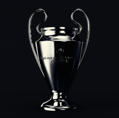
This is not finished and i haven’t done extra renderings but overall i want to know what you guys think…
Looks great. Perhaps you could try putting an image of a football stadium behind the camera to reflect onto the front of the Trophy. You would be able to see the pitch and sky out of focus to help increase the detailing on the front. Hope that makes sense.
The model and overall composition look quite good, especially the texturing! I agree with the previous post about lighting to help show the front details, though I do like the dark and simple aesthetic. I think some basic additional lighting (e.g. lamp from the upper or lower right) can help bring out the lettering and symbol. The lettering is nicely curved around the trophy cup, though if you are going for realism I think adding some bevel and a blend into the cup could be beneficial. If you make additional renders I’b be excited to see the trophy from other angles!
