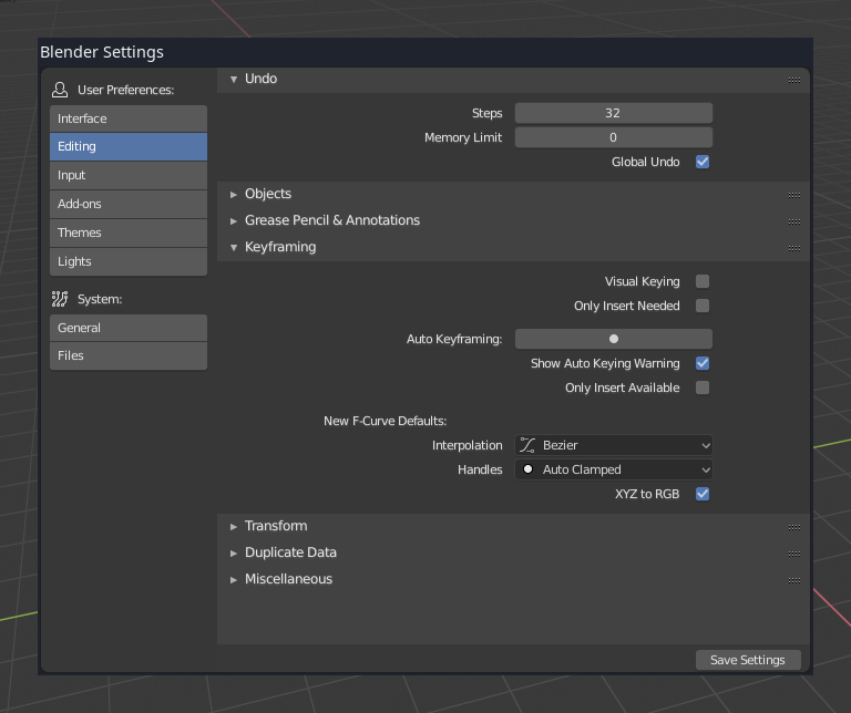
Rename “User Preferences” window to “Settings” in the UI.
We’ll likely put workspace settings in there, separate from the global
user settings. System settings should become separate from user
settings in future to allow settings for specific hardware.
Add sidebar region for navigation (scrolls independently).
Addresses space problems, so we can add more categories as needed now.
Increase size of Settings window to compensate new navigation bar.
Group sections into User Preferences and System. > Icons for section groups by Andrzej Ambroz. Thanks!
Bumps subversion for file compatibility.
As it has been committed to master, this will be something that will be encountered during the Beta.
i tested it, and it’s really looking elegant some areas could use grouping or divided in more columns to reduce scrolling, but i think this is just the first draft
Unless the floating window itself becomes a bit smaller in area, I’m not sure how much tangible benefit this will have. As long as the alignment is proper, there would be plenty of empty space that results.
I’m interested in seeing how they plan to tackle the hotkey editor more than anything else in the Settings. If hotkey entries are also going to get generically panelized, there will be scrolling for days - mark my words