UPBGE 0.3.0 Logo Designs

og post

It’s been a long time since UPBGE’s last logo change, but since the advent of UPBGE 0.3.0, which is completely integrated into Blender 2.8/2.9 and takes advantage of Eevee, it’s probably time for a small upgrade.

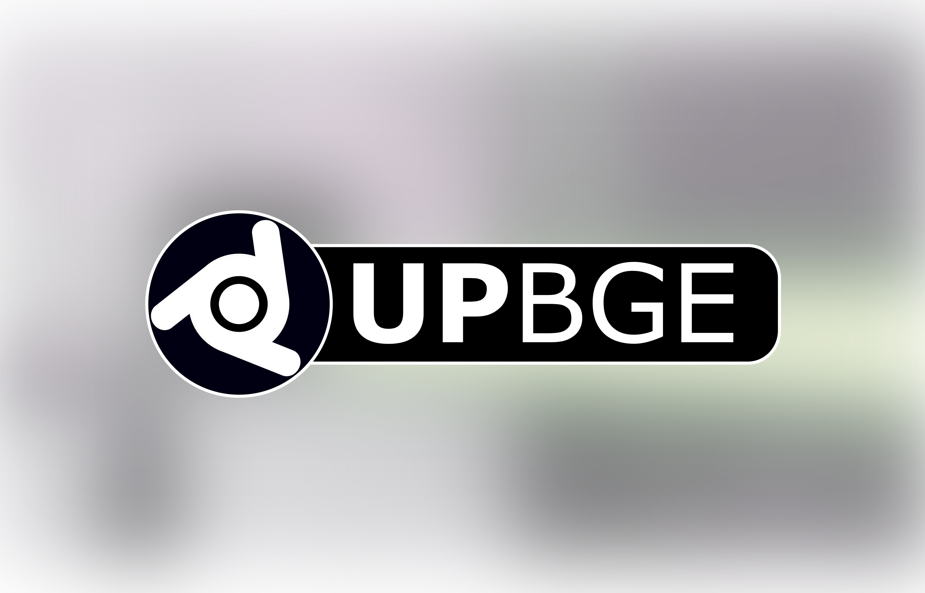
Us on the Discord were thinking maybe just tinting it blue or something, here’s my personal mockup sheet (these are all vector, except for the old logo):

What are your thoughts and ideas?

official logo will not be changing at this time, see solution

4 Likes

Oh, btw the circle ones on the left I was thinking could be for small icons or something?
Idk, these were fun to make

I like bottom right :cat:

The logo in the lower left corner looks good :slightly_smiling_face:

I’m not an logo designer and these were just quick mockups made with gimp, logo is off-centered in that circle etc. But the idea comes across fine, I hope

upbge_mockup_black upbge_mockup_orangeblack upbge_mockup_orangewhite upbge_mockup_white

I really like that modified blender logo, to me it looks like this weird one-eyed ball guy jumping in air with his fist up, like he is yelling “Yay!” :smiley:

11 Likes

Here, I adjusted the vector version to better match the original logo, any better?

1 Like

Those look cool, i like these more than the versions with the big U in the background

1 Like

Sorry guys but although I like it some of the your proposals I think it’s not yet time to change the UPBGE logo (only is 4 years old).

6 Likes

I was thinking that with BF’s decision to drop BGE a while ago and the great improvements UPBGE has done for the game engine it might benefit UPBGE to update a little bit just for differentiation and also so that people know it’s still in active development and stuff

haha these are starting to look like the chrome logo a little lol

Here, I added some color variants of the old-style UPBGE logo

I think the idea was to have a new icon for upbge 0.3.0 vs 0.2.5 so you can tell them apart in your shortcut bar etc

2 Likes

Just piping in that I think a new logo is a good idea. I don’t have a shortcut to UPBGE on my desktop and keep it in a folder instead simply because I’m not a fan of the current logo.

this. :+1:

1 Like

You can take any of the logos on here, make a shortcut to UPBGE, and change the shortcut’s icon BTW

2 Likes

Thats great. The “U” is not necessary. This is much more a Logo. The orange/white is my Favorite.

Yeah that is not what show up as a pin down on the windows bar though.

If you drag and drop the shortcut (with the changed icon) to your taskbar then it does appear with the custom one (at least for me)

Here’s a few just for fun! :smile:

Oh, by the way if anyone wants high-res exports of any one of the icons I made, just ask


small-bge

4 Likes

Yes, I quite like the logo without the big U, just the spinning icon, it reminds us of blender but is its own thing. The image in the middle there works well, with the upbge separated from the logo, the white colors against the background. Suspikuutti’s concept is indeed pretty cool, I like the orange and white version, just solid colors.

Great work guys. I think when lordloki feels its time, these will be a great resource for the redesign.

1 Like