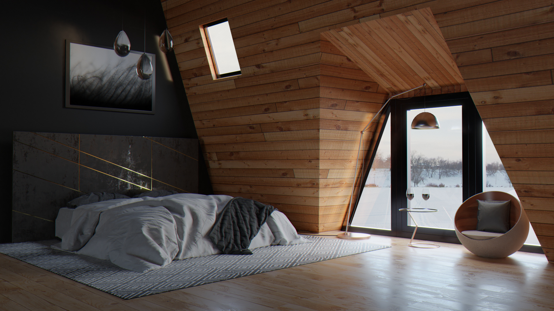
Some days ago I saw in Blendernation a “Behind the scene” post and I inmediatly felt in love with the look and feel of the render. I saw the post here as well.
So I have tried to recreate it more or less. In some points I have got stuck.
Variations introduced are related to the impossibility of getting the original result, most of the time.
I contacted the author asking for some help.
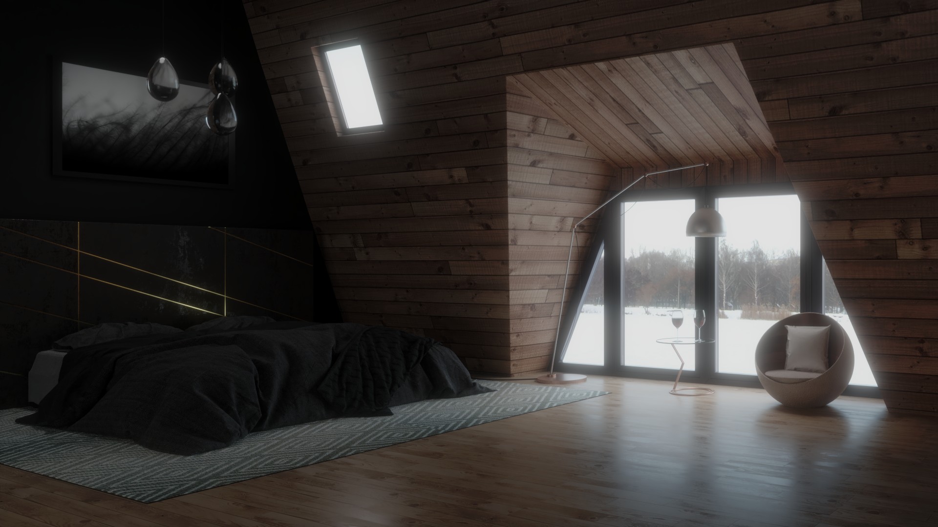
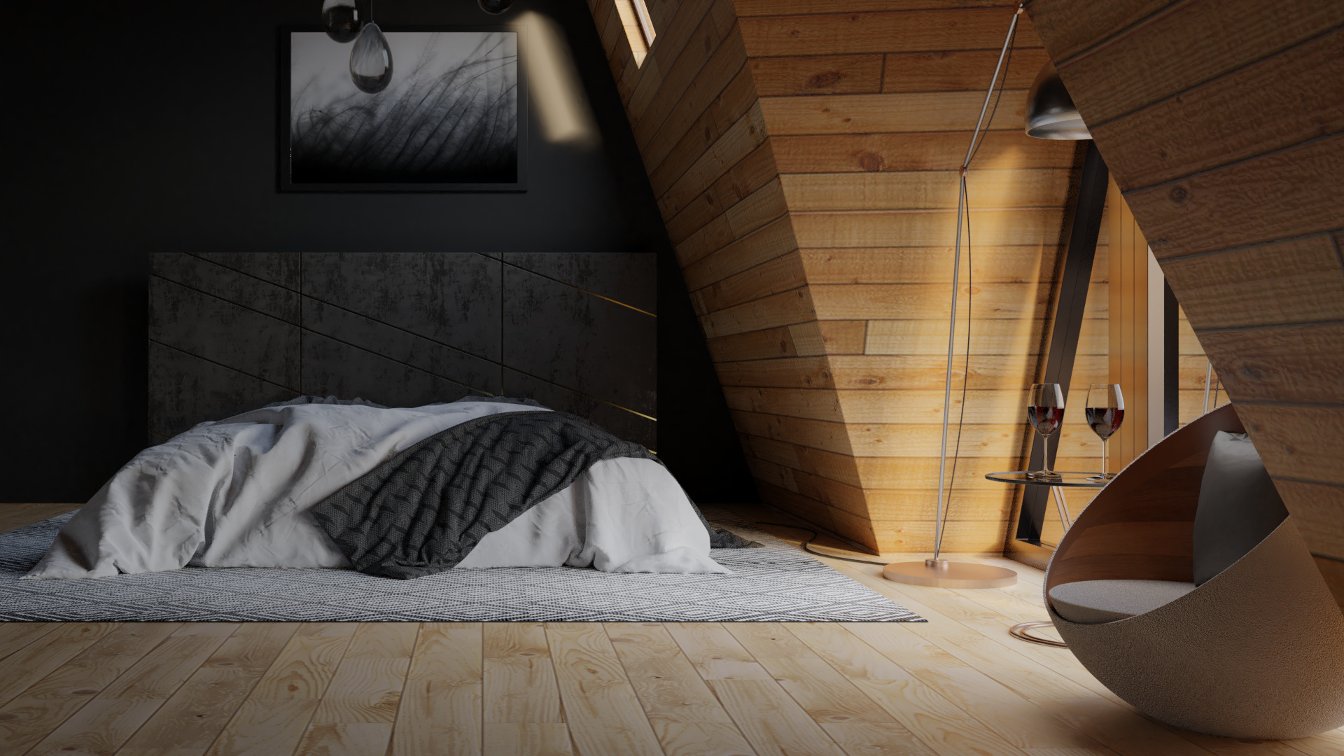
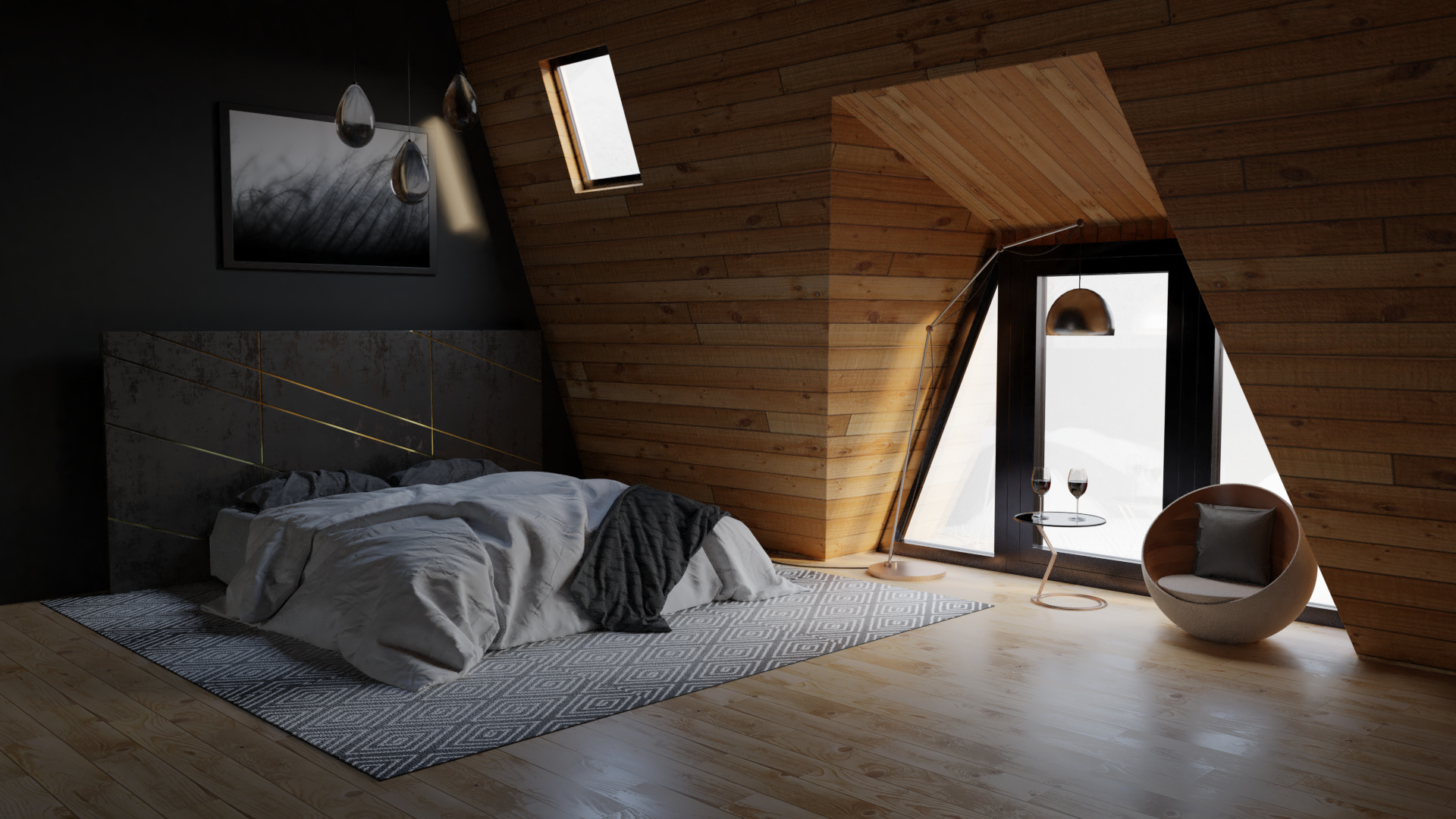
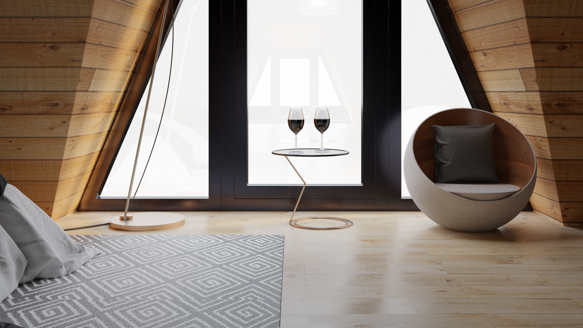
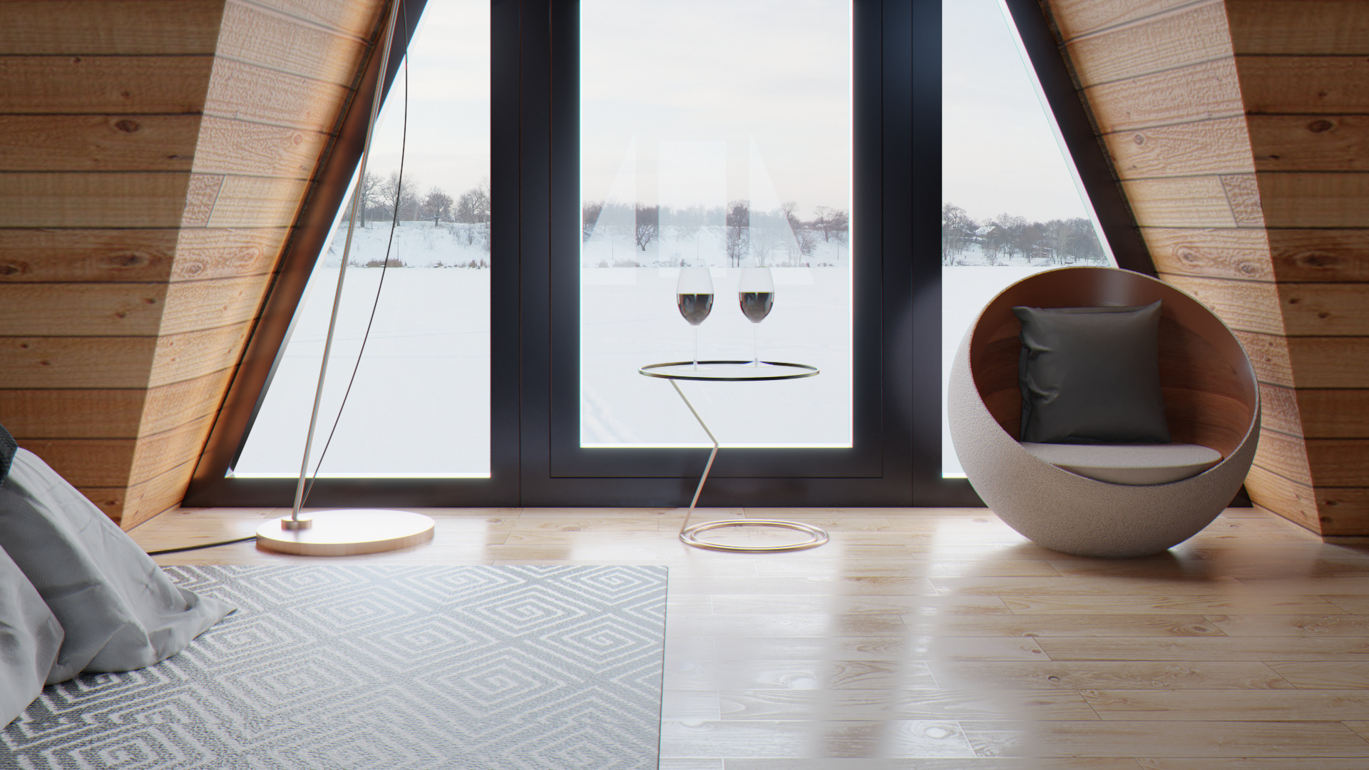
And for now this is the result. Bed and cups are from a library.
I repeat: this is a recreation of an scene I liked so much. Not my idea.
The problems that got my head crazy:
Camera angle that makes a confusing room geometry.
Background integration.
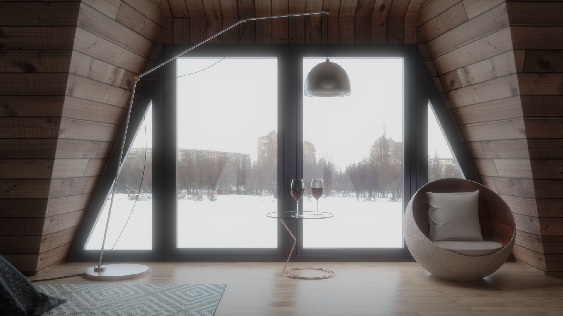
Glass shader reflections.
Some of them are unsolved or with a non happy solution for me yet. So you can throw your axes on me.
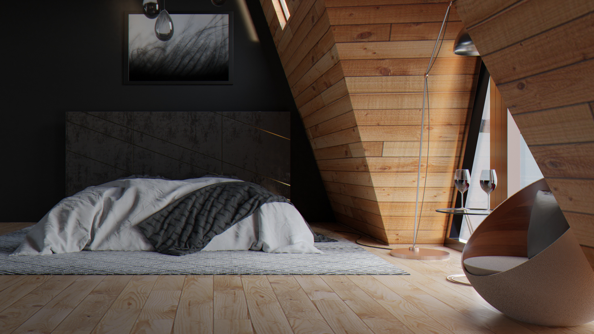
First of all, too much bloom, at least for my taste. Try to reduce it. 1/2 of this, or less imo.
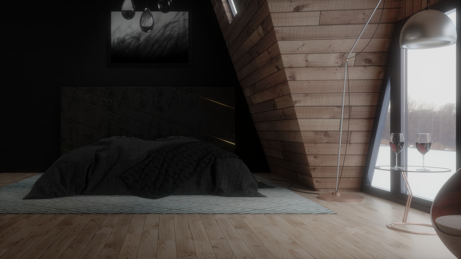
The 2nd and 3rd images are more interesting. In the first one the bed is near the edge. Try to correct the camera angle (move the camera to the left and slightly rotate it right) and bring the bed closer to the viewer a bit. Make it more dramatic. The bed should be the point of interest here, as the large window could be placed at the upper third of the image on the right and make it more contrasty.
I think the internal of the room is too dark compared to the super bright external light. I would increase the intensity of indirect lighting and make the details of the bed and the wall behind more visible. Especially in the 3rd shot the bed and the wall are tending to be indistinguishable. The golden bars on the headboard are almost invisible.
Make the egg chair’s cushion slightly more organic. It’s too flat and perfect.
The ceiling lights are too almost lost inside the darkness of the room. Maybe try a more prominent style? Or pair them with the floor light’s style, i.e. stainless steel? I don’t know.
Very nice try overall. I think you can hugely improve the scene and make it really special.
M2C.
Thank you so much for your thughts, @birdnamnam. I really appreciate them and will consider them to try to get better results.
If you have taken a look to the original scene, it is very dark too. At least in my computer. Bed top and wall almost mix. Lamps are almost invisible, but I think they are glass in the original screne
And camera angle makes one side of the window seem 90º angled with floor. I have tried to imitate that.
Anyway I will try to apply your tips. Im planning to change the bed to more bright colors. I have modified carpet color too.
Well, I hadn’t seen it. Thanks.
Most of my comments have a point.
In the original there’s almost no bloom at all. And the external light isn’t so intense.
Also, in the 1st render the camera is a bit further and the bed is positioned better inside the frame (lower left 3rd of the picture). Yours is closer to the left edge.
Furthermore, the bed has light colored blanket and pillows, which add the right contrast and attract the eye. The painting in the original picture is also white-ish.
As for the secondary lights, I would give the same advice to the original creator. I’d like slightly more intense GI lights in his scene too. But that’s just my taste.
Hope this helps a bit.
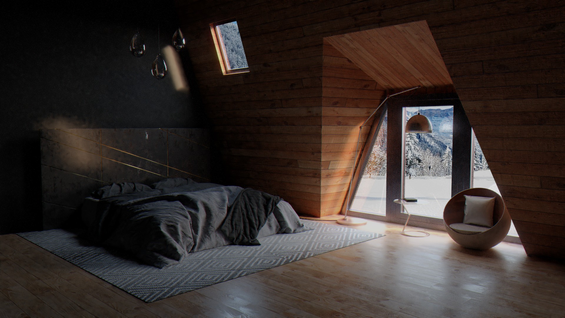
Im working with the tips suggested. Light is being a pain. If I add light to the scene it looses the contrast from top to bottom of the room and becomes a too flat lightning in general.
Changing the colors of the bed clothes helps, but Im still working on it.
I have modified the big window geometry too to match the original one.
Background integration is being a pain. This time instead of using an image as plane in the scene I have tried to integrate it via compositor. But I think it looks fake.