Hi once again,
One more visual bug that I’ve just found.
Go to the website from your smartphone and you might see something like this:
(emulated in Google Chrome)

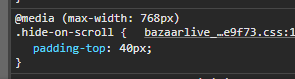
As you see, there’s a padding at the top of the logo. I already found the class that’s responsible for this, it’s right here:
If removed, it looks way better:

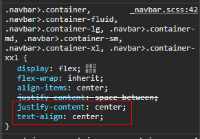
Also, you can fit your logo to the center by adding a few rules to the classes below:
And end up with something like this:

P.S. Maybe just add some margin to the bottom of the logo, 'cause it’s way too close to the search field now.
P.S.S I showed just examples of how to fix this, suggest you would need to wrap all these rules into a media query, in order to avoid any conflicts on desktop resolutions.
Be happy 