A highly detailed model will hold up in any light. But if there is lacking detail you may find that a more atmospheric lighting will help you find a path to a great picture. So how about experimenting with sun positions and some mist.
Thanks - yes, definitely something to think about. I think I’m currently caught between wanting to make some nice ‘art’ and wanting to come up with a faithful model of the station and its environs (or as faithful as I can make it with the info I have). Focussing on the latter is making the former harder to achieve!
Update Number 18: More tweaks and some backward steps

Reference:
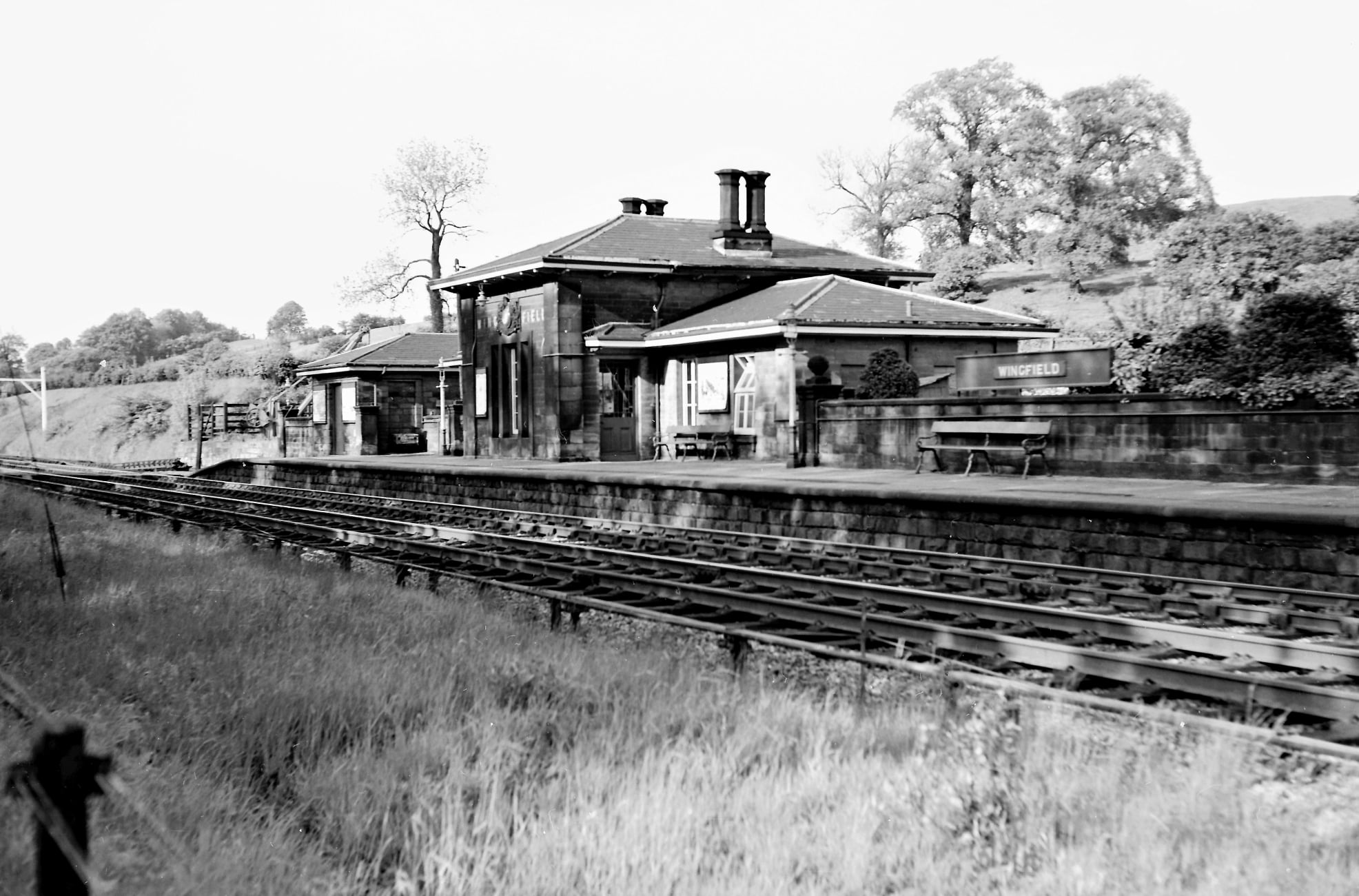
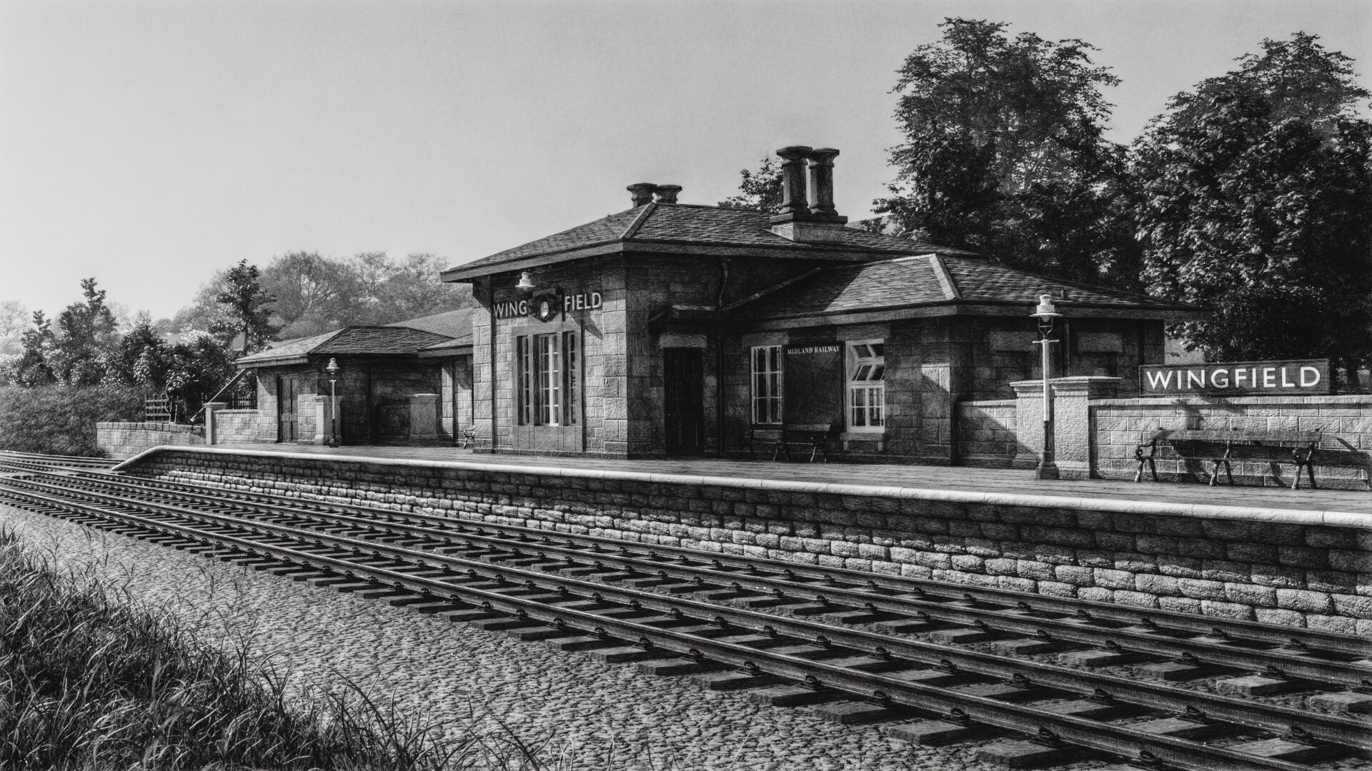
If anybody is looking at these I’m sure this set will look no different to some of the others, but I have got the goods platform more or less sorted with crane and cattle pen (seen better in some of the platform 2 shots above, but decided to see what they look like from the now ‘classic’ camera position. Looking reasonably accurate from a distance (see reference photo for comparison)). Decided to do some major surgery to the tracks and track bed to make life easier in the long run. Can’t see much difference, apart from it looks a bit worse - but will be easier to modify and use from different angles (especially as I want to do points, signals and crossing tracks and stuff later on). Tried to use adaptive displacement on the track bed and my PC wouldn’t take it. May need some advice on what a decent Blender PC might be for about 1200-1500 quid! (Obviously not a beast of a machine for that but something usable for the type of stuff I do.)
Other changes = subtle grunge on walls. Baby steps to less subtle grunge and the platform is now a more accurate length.
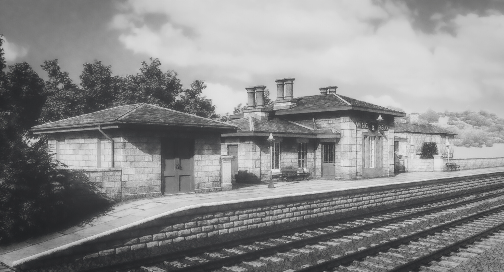
Have done a black and white sketchy one 'cos why not? Fits in with the era and the reference photos!
5 Likes
I came up with an approach for microdisplacement for the ballast in my pictures. Can certainly be a problem with large areas. One trick you could try is to just have the strip of ballast on the near side of the track set up with the adaptive geometry and leave the rest to the bump.
I managed to get a pretty good procedural ballast material that stands up to reasonably close inspection. Mostly using voronoi IIRC. LMK if you want some pointers. You should also check out standard dimensions for the sleepers, spacing between sleepers and the size of the chairs. Something looks a little off here. I think it is to do with the ratio of size between the chairs and the sleepers.
1 Like
Monochrome, really adds that sense of archival nostalgia - personally like it ![]()
and as to a possible PC upgrade option in terms of your budget, then here’s a thread that might be useful:
1 Like
The black and white picture is so good.
The track is, as has been said, a little hypnotic, but I notice you haven’t put in any track joins which will break up the rails, and once you get some tree reflections across them, I assume you’d go for something like tree shape Gobo’s, the repetitiveness will be gone.
Apart from that, I won’t mention the gravel, I could step into the picture and be back in time. Yep, very nice.
1 Like
Thanks - really appreciate it. But yes, there is a lot still to do to make things look ‘just so’.
It’ll keep me busy for a bit ![]()
Update number 19: Embryonic signal box


There was a signal box near the station (but not that close to it really). Whether it will appear in any final images is not known, but I fancied trying to model it anyway (or something similar to it). Only image of the actual signal box is above but there are loads of references. This is probably an amalgam of quite a few different ones. Obviously, texturing needs work as do some of the details, but a decent start (I hope). I’m sure there are inaccuracies galore (trouble with trying anything to do with railways - there is a lot of knowledge out there and mistakes/anachronisms stand out). There’s had to be some guesswork as the photo isn’t great and I don’t know what the back looked like.
Hopefully it will look better when placed in the landscape and not on this temporary ground.
I shall definitely not be seeking to model the inner workings of the box! There will probably be a lot less detail on stuff around it too.
(EDIT)


An attempt to place it into my environment (with a mono one as the previous one seemed to go down quite well). I’m sure they just didn’t plonk these things down on the gravel, so if this is going to become one of the suite of images it will need a lot of work to make everything look right (just making the whole thing even harder than it was!). I quite like the model though.
The more I add, the more I might need to model stuff happening outside the station too - which is probably more than I want or am prepared to do… so this might have been an interesting, but ultimately fruitless, little diversion (at least for now!). Having said that, I think I’m going to have to do the station master’s house at some point for completeness.
4 Likes
Update number 20: Running out of steam

I’ve become quite enamoured with the black and white treatment, partially because it is in-keeping with the period, partially because it hides some sins and partially because I just enjoy messing around with my renders in photoshop.
Haven’t spent much time on this in the last couple of weeks. When I have, I’ve been trying to sort out a few things that probably won’t be seen too much - such as getting the platforms the right length, sorting out the track bed (not the track - that needs completely tearing up and starting again) and the like. I’ve also made a start on the station master’s house - but as this will only ever be seen, at most, in glimpsed views, I don’t intend to try and make it too accurate/good/detailed. Just seeing here how it fits into the wider angle ‘shot’. Ok really. Now the boring stuff of windows, guttering, texturing etc.
Maybe house looking a bit small here… also not sure where that bush on the platform has come from but will put it down to poor maintenance.

Colour version for luck.
9 Likes
Probably lack of maintenance ![]()
I quite like it… (the bush)
These black and white ones do look lovely, my fav is the signal box one.
2 Likes
Update 21: Iterations

My favourite ‘painterly’ style.

Straight render but post processed in photoshop for more ‘vintage’ look…
Again, a fairly quiet weekend where most progress has been on tinkering and nothing significant. The house looks better (now might be a but too big but hey ho). Added some garden trees. More detail on the platform. Windows on station now correct colour for period (I think) - but the red is still wrong - too bright - but I keep forgetting to change it. The roof tiles on station and parcel shed are now much better though.
Excitingly, I found a load more photos on the web of the station when it was in use and so need to start correcting things I’d got wrong and adding things I didn’t know where there. Still lacking photos of the far end of the platforms though so still not quite sure where they end or where the toilets are. More research needed. The photos have already shown me that the platform ended differently, so corrected that. Lots more to do. Rails still need work. They’re frightening me (I need to do points and curves and things).
Slow going and tiny steps but I’m enjoying myself (helps massively with relieving stress!).
4 Likes
Mini update 22: Still going (yes, really)


There are still many ‘big ticket’ items to deal with, but I can’t be bothered so I’m tinkering (including in post processing - obviously). Not much to update on - have sorted the painted wood colour so its now more properly aligned to ‘Midland Railway Maroon’, track side cable trunking gone in (from very poor photos, so not sure how accurate), have started adding the posters to all the notice boards - will add a bit of life, have put track joins in - they are too close together in terms of reality but done for ‘artistic’ / visual interest reasons, more tweaking the materials and stuff. Just trying to avoid making doing the harder or more finickity stuff ![]() The colour ones are now using AgX rather than filmic. Definitely darker, but overall I think there is an improvement.
The colour ones are now using AgX rather than filmic. Definitely darker, but overall I think there is an improvement.
5 Likes
Update 23: After a break…

I’ve been taking a break and building a model train (very very very slowly - partly because of work and partly because I got a free copy of Football Manager 23 and that has been taking up a lot of my free time ![]()
![]() I’m far too old to be playing these games!).
I’m far too old to be playing these games!).
The train is nowhere near finished but I’ve been hankering to see what it would look like in my scene and - based on this override texture version, with no smoke/steam, no carriages (to come), possibly incorrect scale and a very undetailed train itself (none of the windows or rivets are showing - doh!) - it has some potential, I think (no need to point out the train is a bit basic at the moment).
As it happens, the station refurbishment is nearly complete and they had the grand opening last weekend. They’ve done a very good job! https://www.derbyshirehistoricbuildingstrust.org.uk/wingfield-station-project
3 Likes
Looking really good.
1 Like
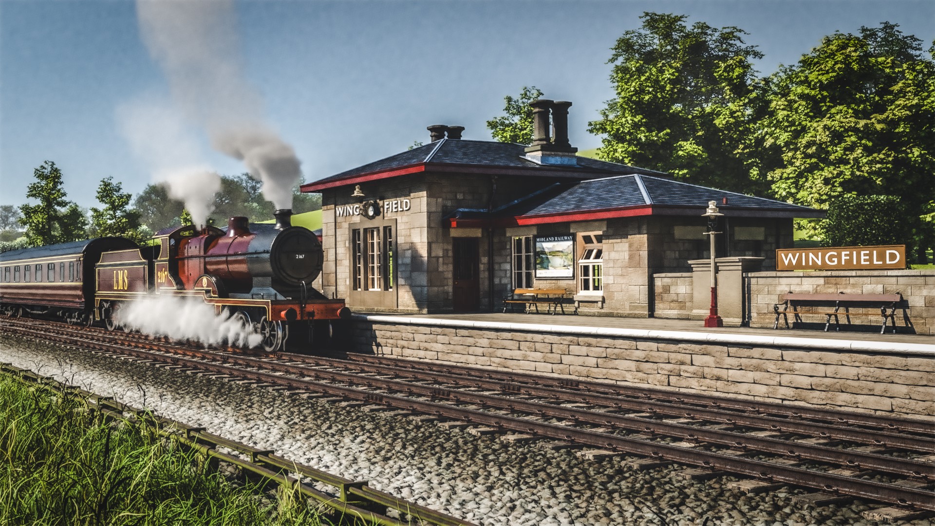
Update 24: A train in glorious technicolour!

Nearly finished my train (see below) so thought I’d add it to my main scene to see what it looks like. The steam and smoke obviously look very meh at the moment, but decent proof of concept for making look better. Maybe some scale issues too. But overall, quite happy. Opportunities for a few different angles and so on with this. Have also recently got some more info on track layout etc, so going to be working on that to try and get the station and environs ‘proper’ (amazing that what was going to be a quick building project has turned into something of a labour of love!).
Main problem I have now is that - because not great at optimising projects - my creaking 3GB 1060 is getting a bit full up and struggling. Its going to limit me significantly, but having just bought a new car… well a new PC is out of the question for now ![]()

The train - which still some work on materials and a few details (but as I really quite like it, I wanted to share!) is a Midland Railway 2p 4-4-0. Taken me ages to do, having had a little break - but really enjoyed this one. There is quite a lot ‘wrong’ with it technically (both from a 3d modelling perspective - some of my topology would make a grown man cry - and in terms of ‘reality’ - where I have taken some artistic and lazy liberties with the train). But I think it looks OK.
7 Likes
Really starting to shape up. The main area I see for attention is the ballast. Looks like you are on the right path with displacements but I would try to get it a bit more angular. Also consider the dirt! For the steam, my current approach is to hand sculpt the envelope then use mesh to volume with some volume displacement. Can get some good results that way.
Great work, I enjoy seeing your updates. ![]()
1 Like
@ontogenic Thanks. Yes, my ballast has gone backwards a bit. I’d really like to use ‘real’ gravel but would blow my machine up. I had dirt on earlier versions but it seems to have stopped working. Not sure why - some debugging in my material setup needed. My technique for the smoke is similar to yours (quite likely I remember you saying this in one of your posts and I tried a similar approach) but I just need a bit more practice… and a lot more smoke!
@thorn Thanks - very much appreciated. I’ve still got some way to go so there’ll be a few more updates yet I imagine! ![]()
(Mini) Update 25: So many steps forward and so many steps back
Smoke/steam - better, but still not great.
Train - better, but still not perfect.
Ballast - still horrible.
Moving to 4.1 - losing loads of botaniq objects and having to mess around - annoying!
Render times - slowing down beyond belief. Don’t know what’s happened but now painful ![]()
Fun - up to hitting F12 - lots!
6 Likes
Overall, your shading on this looks great to me. The ballast…hm, i guess could be improved… but the train and building (especially) are very nice!
On the smoke - I think the plume nearest the back of the engine is your best one, for shaping. The main stack - i like the coloring on the smoke, but it doesn’t feel billowy enough - like it’s “easing out”, instead of puffing.
The smoke around the wheels - yeah, it’s quite spiky on the leading edge.
I know you’ll manage all of that, looking forward to your next update.
1 Like