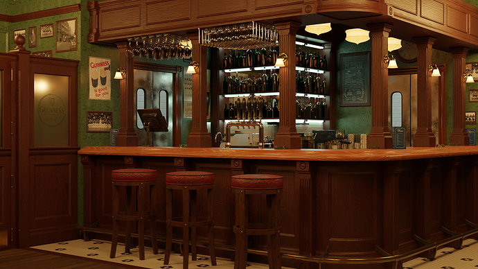
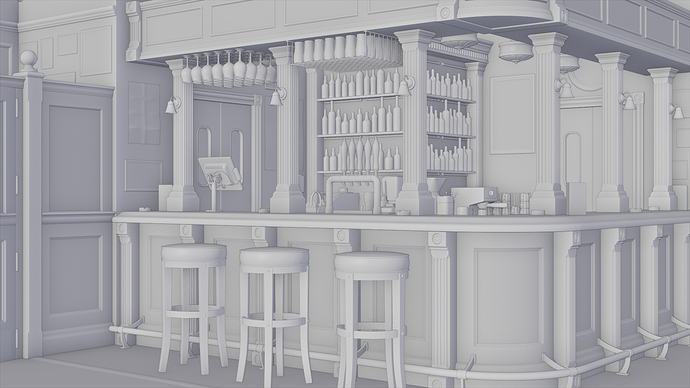
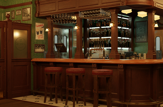
Here is my latest scene from my series of views within my pub project. I was going for warm lighting and materials. I feel like I’m getting closer to photo realism. You be the judge!
Detailed and interesting but I think U should use MORE perspective imo - looks “flat”. Still like…
JayM
Would you have recommendations on how to accomplish that? DOF or a more narrow shot perhaps?
No, I suppose the change of camera focal length Bro letting the 3d space to shine. And yep, DoF is a VERY good idea!
JayM
it looks photorealistic and also warm.i think the bar top looks empty needs some objects.the right third of image is empty compared to rest,maybe it can be shown less with different camera view
Now that you point it out, I can’t unsee that! It is quite unbalanced. This is a bit better I suppose.
Cool scene, the wood looks really fake though. You need some roughness breakup and perhaps some darker and less saturated colours.
The wood also looks like it’s made of plastic so you might need to tweak the overall roughness values!
I agree the wood is the weakest point with any of the materials. Since I played with the roughness and scaling quite a bit, I think an entirely different set of textures may be needed.
Yeah that’s a good idea, you could use a clearcoat ontop of the wood to simulate a lacquer
Why do I never think of clear coat! Thanks for that. I’m taking all of this down for future ref since I am already working on another project.
also don’t forget about subtle imperfections. Don’t make the objects look too perfect. Make some of the seats have some wear and tare on them and make them look a little different and so on…
Beautiful work. So close to photo realism! I think the bump on the wood, Guinness poster, and leather seats is a little high… and I’ve never seen such a well lit bar. Lots of great details though, and a warm atmosphere. Love the palette.
Absolutely! Excellent point.
Hurray! Thank you so much. For some reason I stared at your response for a while not knowing what you meant by “high”. Oh, actual physical height.  The lighting was tough. I was trying to walk a line between realism and visual interest if that makes sense. I’m glad I achieved a warm atmosphere. That was my primary goal!
I think it’s great that all the criticism has been pointing out exactly what I thought were the weakest points! It lets me know that I am bothered by the right things. 
That makes total sense. Bar owners keep the lights low to hide details like wear, tear, and grime. What artist wants to hide details? 
I featured you on BlenderNation, have a great weekend!
Wow! Thanks Bart!
Is the featured tag something I need to add, or am I not understanding how it is used?
The #featured tag is for the featured bar here on Blender Artists, not for featured on BlenderNation. It’s a ‘staff-only’ tag that can’t be added by users.


