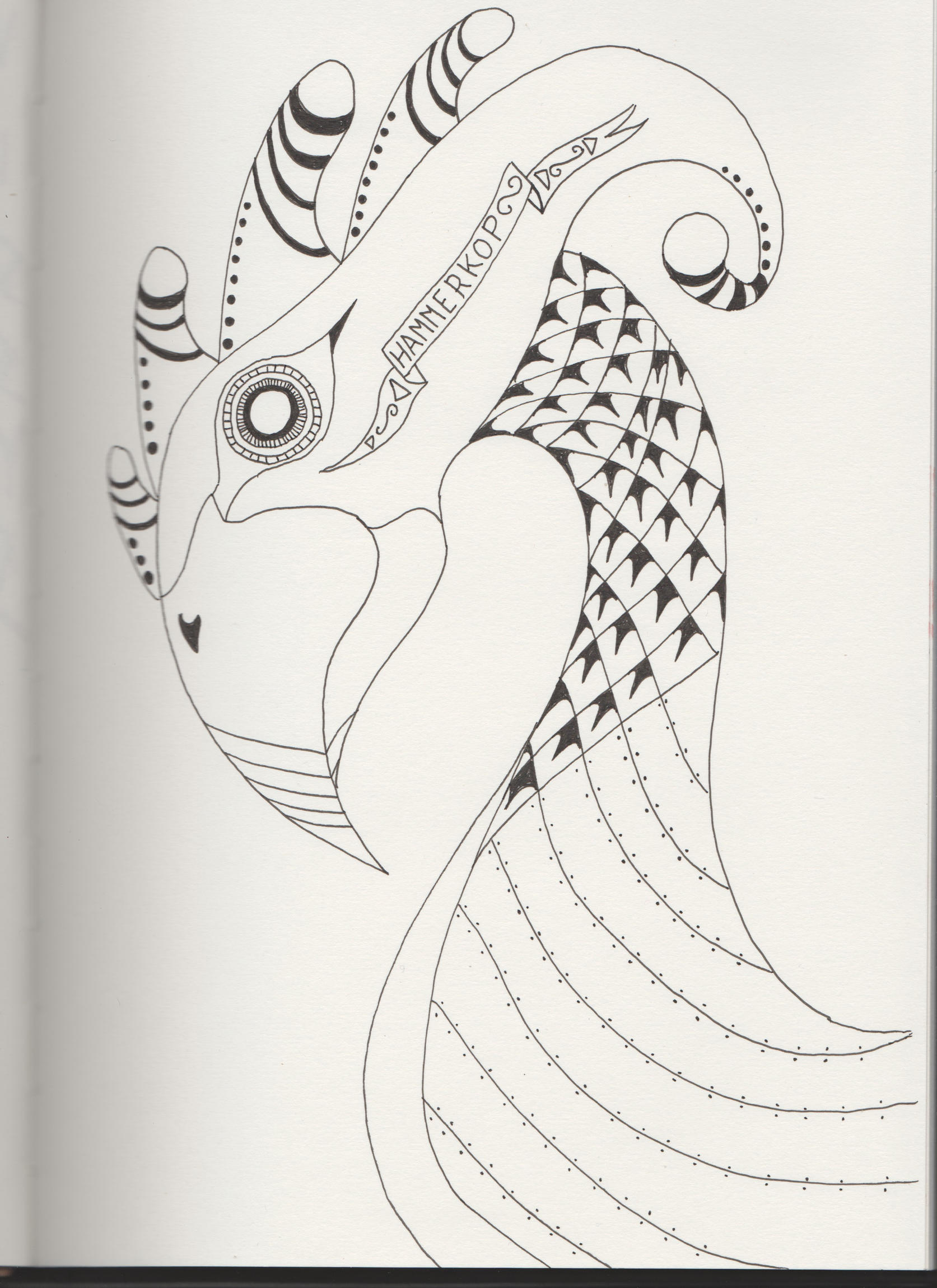
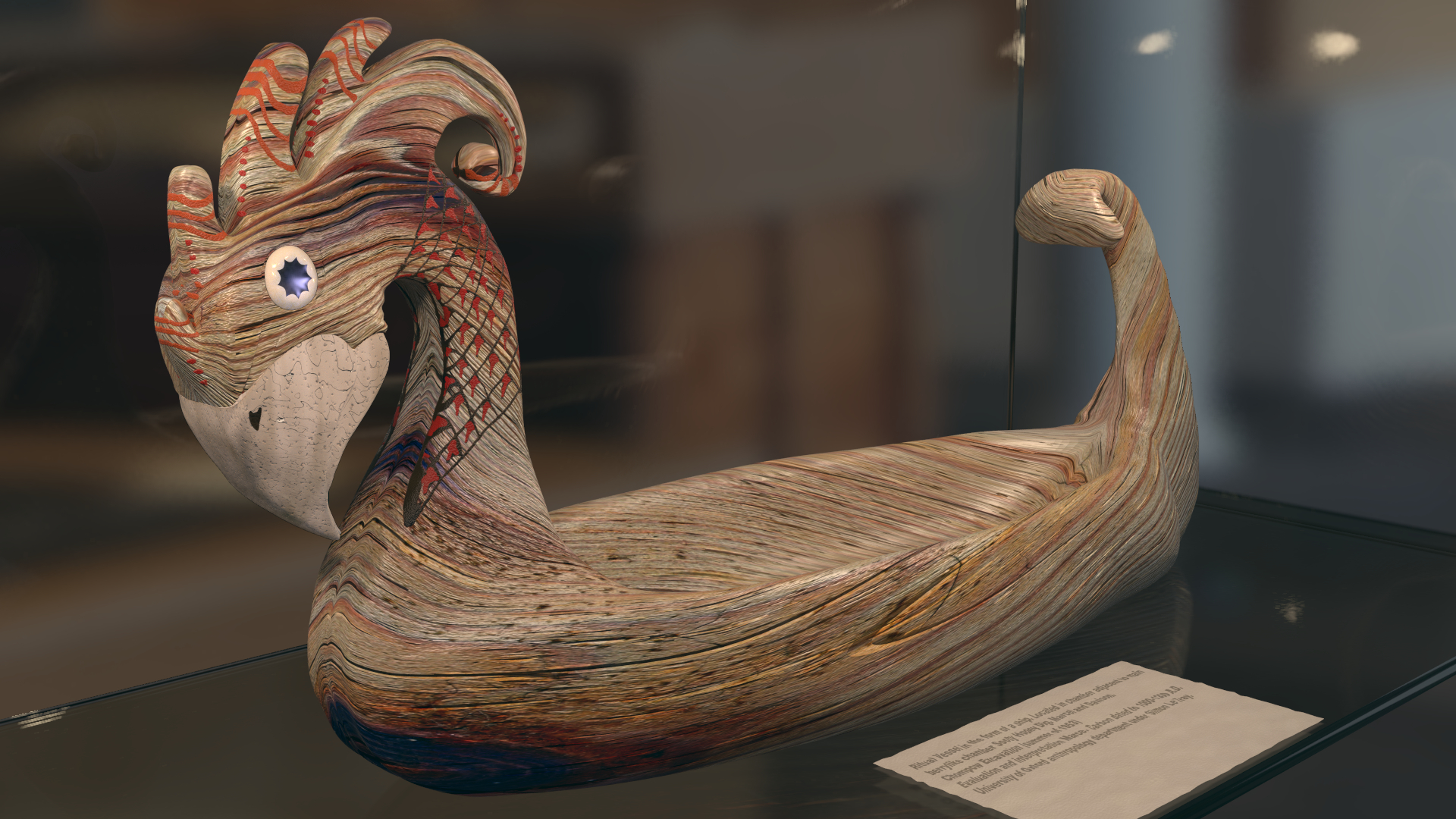
This is a model I have created based on a sketch my wife made. It is supposed to be a Viking style bowl displayed in a museum case and The intention is to push it in the direction of photo-realistic or at least believable. I have pushed it as far as my current skills allow. So what I am after is what is wrong with it. Anything Good or Bad is helpful. It’s really what am I failing to see here. I don’t want to change the form of the model itself but anything else goes.
This is a cool model. Some things I would suggest:
Presentation is everything. Give it a brighter environment. Have a less distracting background. As for the texture, it looks like it wasn’t properly unwrapped. You can see the texture stretching in places, and the wood looks too smooth. If you work on those things, it will definitely improve. Let me know if you don’t know how to do any of these things I suggested.
I already have some bump mapping of the model. So I will try turning this up to see how that looks.
As for the uv mapping looking stretched. I was rather lazily using the generated coordinate to wrap the object. So am now working on creating a uvmap for this purpose. I can’t use the uvmap generated for the texture painting because this is discontinuous and the wood ends up looking rather like patchwork quilt if I use it for the wood. So I have created a second uvmap just for the wood. One question I have is what is the best way to get a wrap. I would rather like something like the Mercator projection used on maps. So far The best result seem to come from project from view.
Alternatively should I apply the mirror modifier and then set seams on the object before attempting an unwrap ?
Will look at lighting and background one I have got the wood stable.
Thank you for your advises. I have changed quite of number of things.
I have kept the background as I want to have the bowl look like it is in a museum but have made it less focused so as to be less distracting and increased the brightness so it is less gloomy
Have increased the colour temperature of the case lamps from 3000K to 4500K. I was having problems with peak red hitting saturation. This improves the apparent brightness of the lighting.
There were problems with the original wood texture so Have used another and added a UVMap rather than the generated vector for the wrapping added some maths nodes to twist the vector to give a more interesting flow to the wood. Various surface dents and scratches have been added using procedural methods and bump and normal maps have been turned up to make it less smooth.
The new wood pattern is rather bold so I have changed the beak to use a different material (which needs some more work) so that it stands out a bit more. See what you think.
I was curious about the red markings, if they are supposed to be paint or stain? If stain they would need to be more transparent and pick up the wood grain in them, if it’s paint you might want to wear it away a bit around the edges or have some faded or scratched to really give a photorealistic look of an ancient object. I like the wood change, the rougher wood looks like it’s been aged more than the previous pattern you had on.
The problem of the eye not looking old. To be honest different materials degraded at different rates depending on the environment, Gold been the great survivor. A glass eye would age differently from wood or textiles. There are many exceptions, For example we do have examples of Roman bread from Pompeii ! (No seriously, but I suspect it is past the sandwich making stage).
As to the Tail. There was something seriously wrong there. The question is what. I have re-worked the model as it may have been a optical illusion, a bad collision between the mesh and the wood pattern. Also I am attempting to add subtle depth defocus and have re-worked the compositor nodes for this as it may of not been quite right. So does this look better or worse ?
The paint was the type of heavy ochre in resin I have seen on old museum pieces. The surface is degraded and quite rough if you look closely and should stand proud of the wood. Such paints are good survivors However since I have changed the wood to a more gnarly pattern it may well now look too new and clean. Particularly the orange on top of the head. Something to look into I think.
the model itself is really good, but there are some other things to improve. The annual rings would not look like that - on the left side (from tail to head) and tail it goes up whereas on the right side it goes down. I think it should be symmetrical. also the material is shiny and everything, but the texture seems to me as something made by an axe. I thing that you should try something bit smoother for texture or maybe to weaken the bump map could help too. And the last thing - hand made wooden things mostly have the surface bit uneven - you can see, where the knife went (I would add a picture, but I didn’t find any) - I once made a wooden spoon and it is really hard to polish something so that it is completely even.