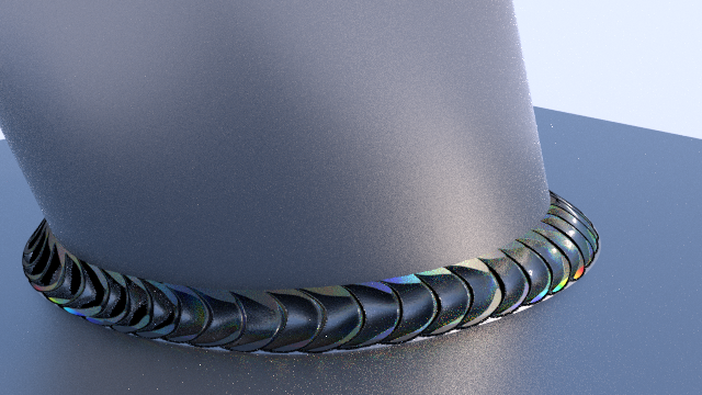
Trying to find a good technique to make weld marks. Using dynamic paint as an input for the heat discoloration and the new intersect operator in trunk for merging geometry.
Any welders out there who wanna point out some glaring errors?
Trying to find a good technique to make weld marks. Using dynamic paint as an input for the heat discoloration and the new intersect operator in trunk for merging geometry.
Any welders out there who wanna point out some glaring errors?
I like your bare steel material and the heat effected zone colors. But the weld bead looks a little jagged. A weld bead should look like ‘stacked coins’.
yes the Welder phrase for it is “Stacking Dimes” …
But for reality’s sake, you should do some bad welds too 
I would like to know how you got the color gradient in the heat affected zone. It looks real good.
Here are the nodes for the welded steel, it’s a little chaotic, but the parts that color the heat effected zone are colored blue. Basically, I run a dynamic paint sim with the weld object as a proximity brush affecting vertex colors (thus the extra subdivisions on the flat faces). Then I use a color gradient with colors sampled from a tempering color chart that I found and mix that in on top of the rest of my steel material.
thanks for the post on this… here’s my try with it… (just a start… still needs work)
Thanks for the Really great post on getting the weld iridescence colors in there…!

here’s several guys doing some work on iridescense shaders that might be good for some of this…
start at post #295
Very nice work Sterling.
@ norv: I don’t think the heat discoloration is actually an irridescent effect though, I know it is a thin film caused by uneven surface heating, but I don’t think the effect is view dependent.
@ Anthony: Thanks!
@ norv: I don’t think the heat discoloration is actually an irridescent effect though, I know it is a thin film caused by uneven surface heating, but I don’t think the effect is view dependent.
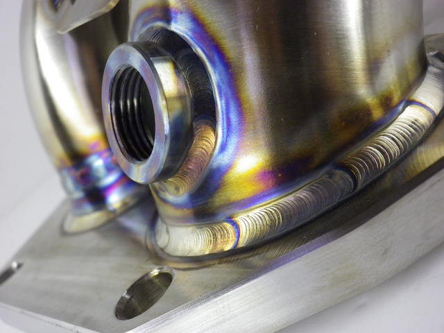
well now that you mention it… yah… you maybe correct… people have been calling it the 'irridescence" shader… and is reminds me alot of the effect of welding on some metals… like this pic…

but if you google irridescence… yah… think that is a word that fits the above pic…
That’s the effect I’m addressing… of coarse this doesn’t happen on all metals to the same extent as the above…
Norv, the wiki page on structural color has a semi-good explanation of the difference: http://en.wikipedia.org/wiki/Structural_color#Principles
Iridescence, as explained by Thomas Young in 1803, is created when extremely thin films reflect part of the light falling on them from their top surfaces. The rest of the light goes through the films, and a further part of it is reflected from their bottom surfaces. The two sets of reflected waves travel back upwards in the same direction. But since the bottom-reflected waves traveled a little further – controlled by the thickness and refractive index of the film, and the angle at which the light fell – the two sets of waves are out of phase.
But, the difference with welding oxide layers is they aren’t super transparent. You don’t get the phase shift of the lower reflections because there aren’t lower reflections, they are all absorbed already.
I’ve looked at those iridescent nodegroups, and I certainly wouldn’t want to bog down my shaders by adding in those nodes unless absolutely necessary. In this case, a simple color gradient is sufficient to cover the optical effects.
I’ve looked at those iridescent nodegroups, and I certainly wouldn’t want to bog down my shaders by adding in those nodes unless absolutely necessary. In this case, a simple color gradient is sufficient to cover the optical effects.
You sound like I’m trying to twist your arm here… I’m not… My suggestions are for further study… and use… when it comes to creating images the first rule is… If it looks Right … it is Right… it doesn’t matter how you got there…
Having said that… I’m personally loath to limit my arsenal of ‘tricks’ to only one way… I know that’s why I am here on the forums… is to throw out some ideas and listen to what others have to say about it… I’ve learned immensely from it all…
But don’t think I’m trying to force you to do something a certain way… Not so… I’ll be damned if someone else is going to tell me how to create my ‘ART’ … and I hope you feel the same way… just take what you can use from me and others and set the rest of it aside for some other time when you have more time to look at it…
as far as Iridescences goes…
“Iridescence (also known as goniochromism) is the property of certain surfaces that appear to change colour as the angle of view or the angle of illumination changes. Examples of iridescence include soap bubbles, butterfly wings and sea shells, as well as certain minerals. It is often created by structural coloration (microstructures which interfere with light).” …
note… structural coloration … "Colours are produced when a material is scored with fine parallel lines, formed of one or more parallel thin layers, or otherwise composed of microstructures on the scale of the colour’s wavelength.
note… no transparency required… only scratched surfaces… or Structure not pigment… (or thin transparent layers)
also known as…
Fixed Structures…
“A number of fixed structures can create structural colours, by mechanisms including diffraction gratings, selective mirrors, photonic crystals, crystal fibres and deformed matrices. Structures can be far more elaborate than a single thin film: films can be stacked up to give strong iridescence, to combine two colours, or to balance out the inevitable change of colour with angle to give a more diffuse, less iridescent effect.[SUP][2][/SUP] Each mechanism offers a specific solution to the problem of creating a bright colour or combination of colours visible from different directions.”
Again FYI…
Y’know, if there was an “incredible plot-point” revolving around this particular weld fracturing, in an extreme close-up (ECU) shot accompanied by much pyrotechnics and a huge orchestral music-swell, then I would lavish an incredible amount of geometric detail on it – as you more-or-less have done here.
But if not, I would just paint something. You’ve already got a seam that can easily be ring-selected to make a vertex group, and you can easily create a few “swatches” of bumpy-texture to projection-paint by hand into those areas, then maybe smudge it a little. “Spritz! Spritz!” Command-S, and you’re done. Use one for color and maybe a second one as a bump-map if the weld was ever going to be seen up close. You can do the same thing with the burn-marks (sure sign of an amateur welder …), or discolorations or what-have-you. Just paint them on.
If something’s small, unimportant to the plot, and familiar to the eye, it simply doesn’t call for geometry. There just aren’t that many pixels on the screen that are going to show that: “it’s a welded joint.” There’s no return-on-investment here: save your time for something else.
And sometimes, if you presuppose that the joint was touched-up with a grinding wheel after the weld was made, and then painted, heck, you don’t need any visual detail at all in order to “sell the shot.”
I feel you, I’m not trying to change your mind either, If it looks good to you then that is the way to do it! I know that I can get a little deep and technical in my art, and it can often be a stumbling block for me, but I strive to technical accuracy. Really, I’m slow at work this week and am taking some time to develop some techniques. Here’s one last link with some more information on tempering colors: http://en.wikipedia.org/wiki/Tempering_(metallurgy)#Tempering_colors
@sundial:
Not everybody is in the business of making movies  I work for a commercial display production company in previsualization. The Client needs to know what they are buying before we build it. They need to know what it is going to look like when they choose a lower cost option and go with welded, raw, hot rolled steel. If they don’t like the look of the end product, then we have to find a way to change it, then we have rush charges and our deadlines get tighter. I know it can seem a little anal, but clearly communicating every visual detail really helps the process.
Here’s one last link with some more information on tempering colors: http://en.wikipedia.org/wiki/Temperi…mpering_colors
There yah go … great reference!
I did the welds manually throughout all the edges, makes it look more realistic but a lot more work. This trick is nice and faster, simply uv unwrap on a good texture
care to elaborate on the manual method ? that sounds interesting and might come in handy for close in shots…
your welds look FreakingFantastic by the way…