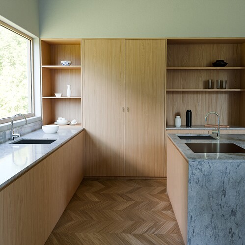
These are my final renders, and now i consider to mimic the camera like adding some grain lens distortion etc. What are other things that i need to work in post processing to make this image look more realistic do i need to work more with highlights or to add more constrast, do i need to work with shadows, tone mapping etc.
Can you please give me any advice?
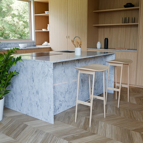
For the second image, I think the camera position is too bright.
And the shadows are gone and they look like planes. ![]()
Well for “realism”… this kitchen looks a bit empty… have look in yours ![]()
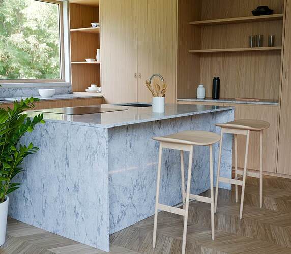
Also for the second: the pattern in this camera angle makes this look like there are somekind of stairs… arkward… but with a simple cut :
this seems to look far better ![]()
Normally, in shot like this you need to keep camera X rotation to zero so vertical lines don’t get perspective effect, unless you choose it for a specific purpose/style
Suggestion: “Close one eye.” Look around the room so your mind gets used to “no depth-perception.” Then, look at your image again.
In the second image, in particular, I have trouble with those two stools. Very specifically, at the exact point where the left-front leg of the rightmost stool precisely intersects with the right-rear leg of the left one. Complicating the visual image is the complicated diagonal(!) pattern of the floor. The all-important “3D illusion” is now being tested. Also where the top of the counter intersects with the cabinet: right now, it appears to merge into it.
One way to address this sort of thing – in addition to slight adjustments of placement – is to carefully consider how a real kitchen would be lit, and with what sort of (“color temperature …”) lighting fixtures. They wouldn’t be area lights, and they wouldn’t be “pure white.” Therefore, I suggest that you focus your primary attention now on the lighting design.
For me the scale on the stools vs the counter is a problem: The seats look too high for the knees of people sitting on them to fit under the counter. Agreeing with the above.
Another thing to seriously consider is the lighting. Right now, you’ve got basically one light source: “over-the-shoulder on the cameraman’s left,” and it’s probably white. I can’t be certain that light is also coming in from the window angle … and it is significant that I can’t.
There is actually no plausible reason why “this light” would be here at all, nor why it would be coming from this angle. So, “it looks like you now have a lighting design(!) to do!” And, when you do so, the entire “now-artificial” feeling of the entire scene will magically begin to change (and mature).
Surf online for photos of real-world similar scenes and take a look at how they lighted them.


