I created this scene for a Sponsorship on youtube, I didn’t want it to look 100% Photorealistic, just because I wouldn’t have enough time to render it in the tutorial.
Is there anything specific I should change in this scene? I know a few things I should add.
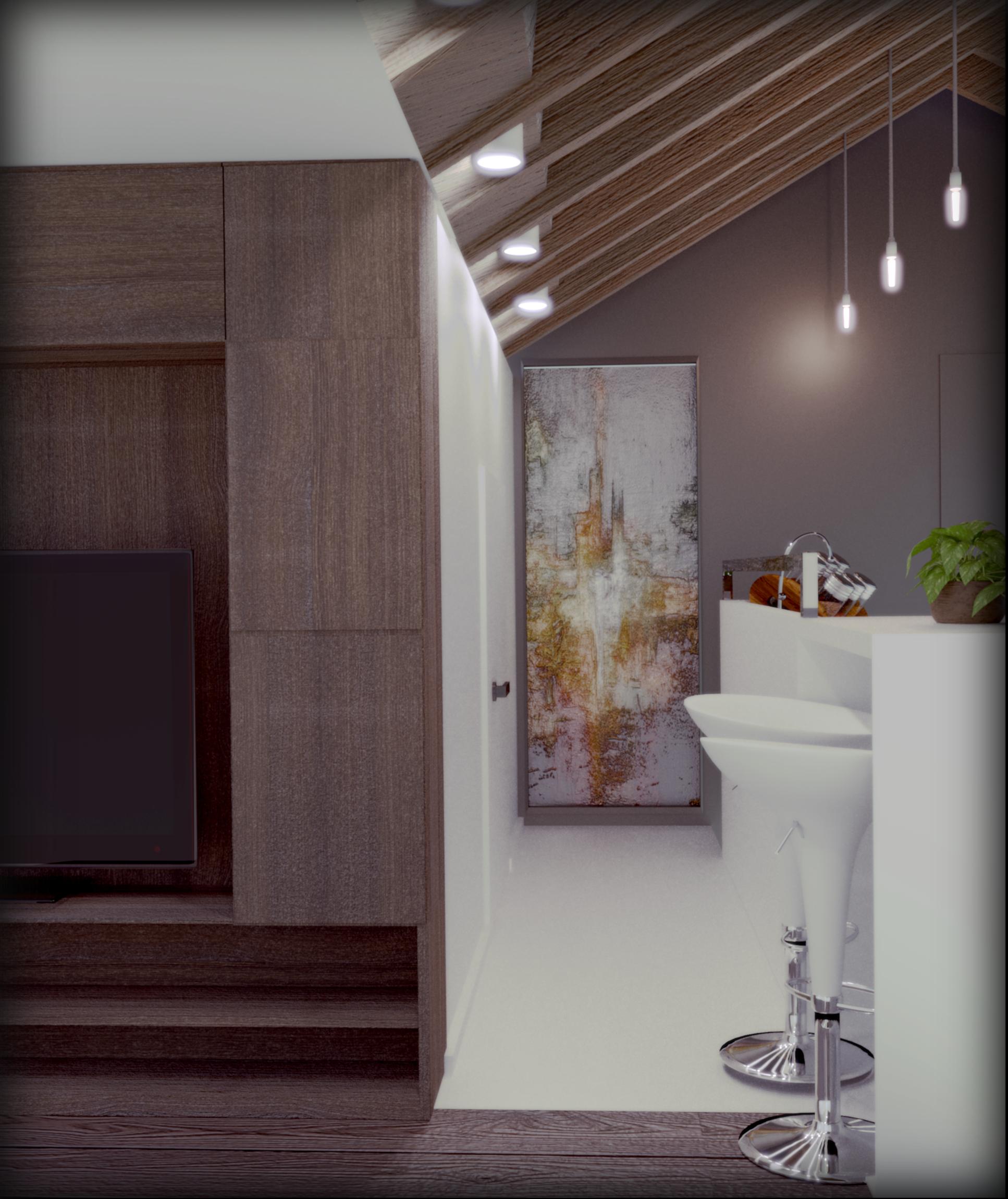
The lighting is very flat. I don’t know if you’re using simple environment lighting, but I think you need a more interesting lighting setup and reflections. An HDRI might work well if you have one that looks similar enough to your scene that the reflections would look appropriate. I think the composition (camera/object placement) of the image needs work, as well.
I agree that the lighting needs improvement, but also those elements can tweaked.
The darker frame around the image doesn’t look good. It looks kind of fake so it would be better to just forget about this kind of thing for now.
The framing is kind of random, find some tutorials on Youtube about basics of composition, and before finding the right shot, just render some in lower quality an than choose from them. Also try to answer the question, what you want to show in this image?
I think you added something like bloom effect to lights but it is not well executed. Ath this point just don’t use it and try to make the render look as good as you can without such effects.
The contrast of the image is very low. Both bright and dark parts of the image are cut at some level, try to play around with levels/curves in the post work to find a better look.
In general, it is hard what you want to show in this image, so try to make it clearer by choosing different framing.
When I look I this, I’m wondering what’s supposed to be the focus? What is the purpose? What is it trying to show?
My eye feels pulled to the left, but it’s largely “blank” and plain there – Seems unimportant for something taking up about 1/3 of the left side (which is why my eye is drifting there). With nothing over there, that should just barely even be a part of the image (like less than 1/8 if at all). That object (painting? Wood? Not sure what it is?) in the back seems like it should be important, but my eye doesn’t feel drawn to it. With that plant on the edge, I’m almost curious as to what is over there (especially with the “boring” left half). So if that object in the back is the point and focal element, make it more important in the image by bringing it closer to the camera. You could also use the Thirds or Golden composition guide to help with the composition.
What I’m trying to say is that the composition is struggling. Figure out what is important and find ways to bring attention to it by making it closer, have lines and lighting lead toward it, and reducing the unneeded clutter or distractions.
As for if anything else should be in the scene… Who uses this space? Male? Female? Single? Married? Kids? Hobbies or interest? The more of these kinds of questions and details you can figure out (even if you don’t show it in the scene) the more you can get a feel for what should (and should not) be there. Just make sure that anything you add doesn’t distract from what you decide is the focal point of the image.