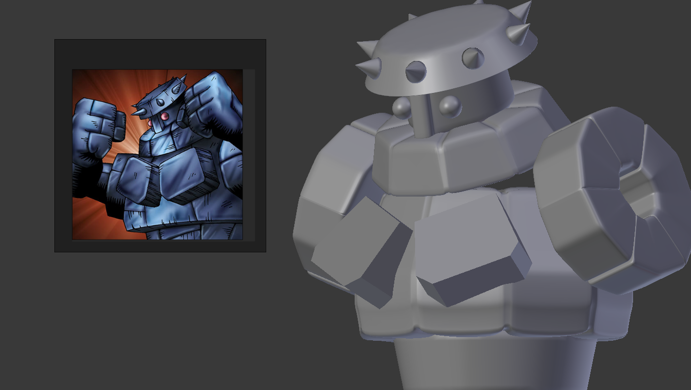
These are the reference images I could find - all those images are available in the gallery of the card - at the end of the page - link to the card gallery:
I’m having issues with the shape of his upper chest (not the square pecs, but the part that is behind those square pecs) - I can’t figure out the shape neither how can I make a similar shape on Blender.
i think you already have the right shape, just too small. flattened oval from top view, and close to the same from front view, cut off at bottom. but i think the body/head ratio is off in yours… with either head too big, or body too small.
The fists looks awful but, I’ll leave it as-is until I found some tutorials or resources that helps me to understand better how to modify a cube for give him a better look.
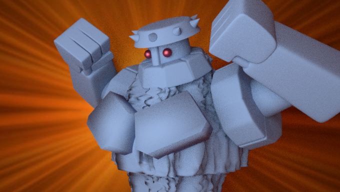
I think it needs a better lightning and I’m looking about how to emulate the (background shining explotion), but, without luck so far. Can’t get the right search terms for find a lightning settings as the sample and also I’m thinking in adding a texture to the material - make him more (iron-ish?).
With these changes:
Better lightning - for highlight his front view
A (iron-ish) texture for the body
A lightning set-up that emulates the (background shining explotion) = light beam (I’m looking about it).
one simple trick for the background would be use an image (jpg, png, whathaveyou), which is pretty much what would have been done for the original, even if the original were done in 3d. find a good image of that style of ‘light explosion’ and map that to a plane that’s set behind your 'bot.
Add texture to object = which leads me to UV wrapping, but, I have no idea how to apply UV wrapping to the odd shape of the chest/upper body…
Use a brush (with the image texture of rock tiles) and sculpt manually the surface; however, I haven’t found a tutorial about how to do this - just barely found mentions about this.
After googling using some keywords, I found and watched this tutorial: Blender Dungeon Tile Tutorial | How to Add 3D Texture
(Video link rendered below):
And there, she uses a “Displace” modifier (and using this rock tile) - I try it (without apply the modifier) and this is the result:
The result doesn’t look quite eye-catching/appealing
Looking more for inspiration, I got this video of the monster card - there are two of them, but, the main difference is the color, imho.
Here is the screenshot - if you don’t want to check the video (mark at 1:59):


 All Cards")
