Yeah, that’s what I meant. I like it. ![]() It helps break up that solid block of color effect that the small res pics had.
It helps break up that solid block of color effect that the small res pics had.
Thanks for the suggestion! I’ll try to use area light as main light. My only concern that it’ll give strange specular reflection if it is too big.
Got it, I’ll study these videos. I really need more planning and to stop treting background as afterthought
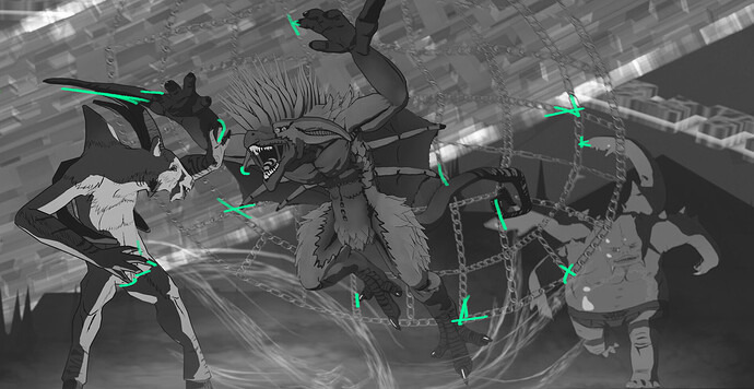
Thanks! I agree on most points, though backgrounds in first 2 pics were somewhat deliberate. These characters are OCs for existing sci fi setting. And their world has specific details, like them living in a planetary scale megacity (1st picture is from one of a blue rings orbiting a central core), and strands of “living light” growing everywhere. Doesn’t excuse bad grass and cobblestone though. I was experimenting with some shader based hacks.
Hello !
I’m a bit late to the party but here are a few thoughts :
I think the models and designs are generally fine, but it’s in the way they are presented that there can be some improvements.
Some people mentioned lighting, but you can also improve the composition a lot and make the image much more readable.
I’ll take the first one which IMO got many good elements, models are great, colors are fine too, the NPR render is great too ! But the image is a bit hard to process for our brain, and kinda feels lacking of something that might be hard to point out…
First you can try to switch the image to BW and or blur it :
This reveals that the main subject (supposedly the dude in the center) is the hardest to read. The net which seems part of the story is also blending too much in the background.
Giving orange colors to the subject helps to create a separation but you shouldn’t rely solely on that.
On top of that , there are a lot of tangents in the composition :
All that bring visual noise in the image which makes is harder to watch than necessary.
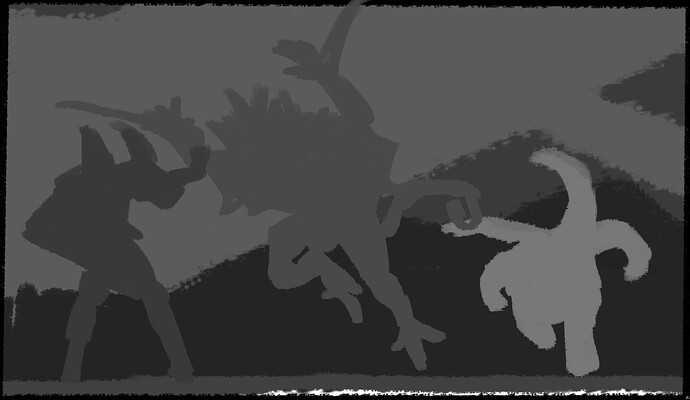
This is a simplified view of your composition :
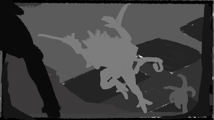
This is my take on re balancing stuff out :
What generally works well is to emphasis the scale and spacing of the scene by putting more stuff in the distance or close to camera .
It might not be super clear but I duplicated the blueish techno thing in the distance, to create a better sense of scale and depth…
It’s important to make the image as simple as possible so it’s easier to process.
Anyway, you should borrow compositional tricks from painters, cinematographers , concept artists.
To me it’s not really the subject that matters but more your vision to make it interesting.
What I mean is that it’s probably possible to take any story even the simplest and make it worth listening. And the opposite is very true, the most crazy story can be completely spoiled and told in a uninteresting way…
keep up the good work !
Thanks for your response! Indeed, I did not think about values in the composition, I’ll remember about them next time. Treating background lazily is a problem again. Perhaps, in fully cartoon renders, I’ll be able to brute force this value separation by adding some gradient along camera Z to my shaders. And I heard about the tangents, but it is eye opening to see how many of them are still there haha
Sometimes I post total crap, and everyone loves it…Yet other times I post stuff I thought was great and nobody even remarks on it. But that’s ok, because it’s not a popularity contest. You as the artist are the judge of whether or not you successfully conveyed your personal vision. People might like it, or not.
Hi Deckard
I Agree with etn249 Comments I couldn’t have said it better.
Hey !
Hum yeah it’s not always simple to manage especially when you have a lot of stuff going on on screen.
There are different strategies, like you can make sure your characters and the background doesn’t use the same values in general, in my B&P project I spend a bunch of time making sure that the character where brighter than the set.
From there, if you start to use lighting this might change, this is where you can tweak stuff in comp or add a transparent plane that will darken or lighten what is behind your subject.
Anyway, these where more about the details, but keep in mind the big picture, I think the overall composition in general , how you setup the camera and what you do with it could help a lot to bring your image to the next level.
You’ve got good skills in many areas but camera and light work seems neglected a lot. This gives the feeling of watching a good movie without sound…
Once the camera is setup correctly, you can see the lighting stage like a way to further work the composition and readability of the image, so are fixing tangents and looking for value separation across the image.
This isn’t only you, I’ve seen a lot of artists doing amazing models, but badly presented, badly lit and so on… In these cases , even if the 3D model is amazing, it’s really hard to look at the result as an image on it’s own rather than a glorified screen capture of a 3D model.
You reach a point where your models are good , now it’s time to learn more about how to present them as best as possible, visual storytelling, lighting, image composition and all that jazz. And you’ll see much more interest in your work !
Have fun !
One of the earliest and most-useful lessons that I learned from conventional(!) photography is twofold:
-
Your eye is immediately attracted to the brightest and most-contrasty element of the scene.
-
Then, your eye wants to "trace a visual path" through the scene, and wind up back where it started.
If you can achieve this, your audience will “take-in the entire scene ‘instantly.’” Whether we are talking about CG or a piece of film.


