I’m noticing that my pictures usually get lukewarm response, even those I put lot of work into. Are there any glaring technical issues, in your opinion? Like, bad anatomy/bad modeling in general, boring light, backgrounds look too half-assed?
Comc book style NPR examples:
Semi realistic work:
I am mosly interested in render tips for Eevee, since I plan to make animations in the future. And yes, I’m aware that the themes do not have mainstream appeal (and not pornographic enough for furries). I want to sort out technical side first
3 Likes
I think in a way you’ve answered your own question:
Is your goal to get widespread acclaim? If so, you’ll need to cater to the mainstream. Is your goal to make art you enjoy and find fulfilling? The mainstream doesn’t usually care about such things (see: Van Gogh)
For the record, I think your work is technically great- your first image here I could see as a full page spread in a comic I would read. I’m not personally interested in your themes, but that to me is besides the point - you’re putting in the effort to make cool things, and that’s what art is all about to me ![]()
3 Likes
To put it even more simply - consider that the highest grossing movies of the year are Barbie and Super Mario Bros, two movies that are mainstream to the point of nausea (IMO). They take no risks, they are tailor-made to appeal to as many people as possible. They are saccharine and ultimately forgettable (IMO), because they’re made to be. They’re made to be safe, comfortable, and ultimately meaningless, because that’s what mainstream means. Are they the best movies of the year? Not even a little bit. The best movie I’ve seen this year was Blue Beetle, which is technically a box-office flop, but the small group of people it was made for universally loved it.
You really can’t do both. Mainstream means safe, inoffensive, unobtrusive, familiar, and boring.
4 Likes
I totally agree, though I always feel like I am not giving my best from technical side. I’ll give more particular examples of what I feel wrong after I’m back at home PC
1 Like
Joseph makes a good point about doing what you want to do.
But if you wanna make these pics stand out more, you could give the characters super-duper exaggerated facial expressions.
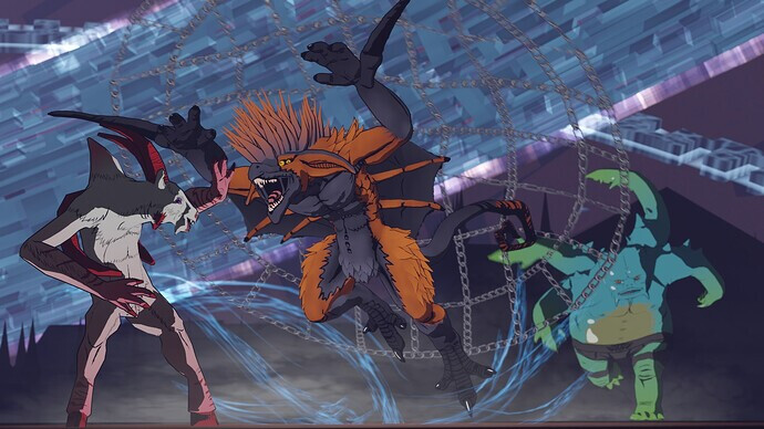
e.g. make the beasts in the 1st picture SNARLING with HUGE SHARP MENACING TEETH, FOAM FROTHING FROM THEIR MOUTHS or something ![]()
![]()
![]()
And also their EYES BIGGER, and perhaps their PUPILS SMALLER to emphasize the intensity of a vicious beast attacking another.
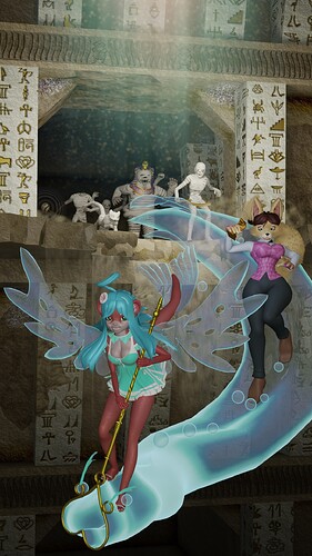
3rd pic, the characters could have BIG EYES AND BIG MOUTHS WIDE OPEN cuz after all, they’re RIDING SOME KIND OF MAGICAL SPIRIT SNAKE THING!!! ![]() .
.
One of them could be scared (i.e. pupils tiny, shoulders shrugged in a tense pose) since most people are afraid of heights.
If you don’t want a character to be so scared, you could still make them slightly scared, because someone who’s brave enough to stand on a flying spirit serpent can still be a bit nervous of falling off.
Even the other pics:
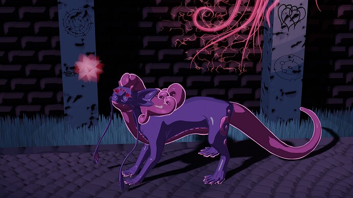
The 2nd pic, that dog creature could have its eyes closed, almost as if peacefully smiling.
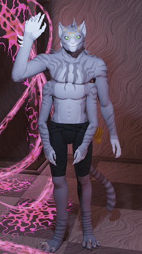
4th pic, the character could have their cheeks sort-of closing over the bottom of his eyes, as if he’s really happy to see a dear old friend.
Good luck!
2 Likes
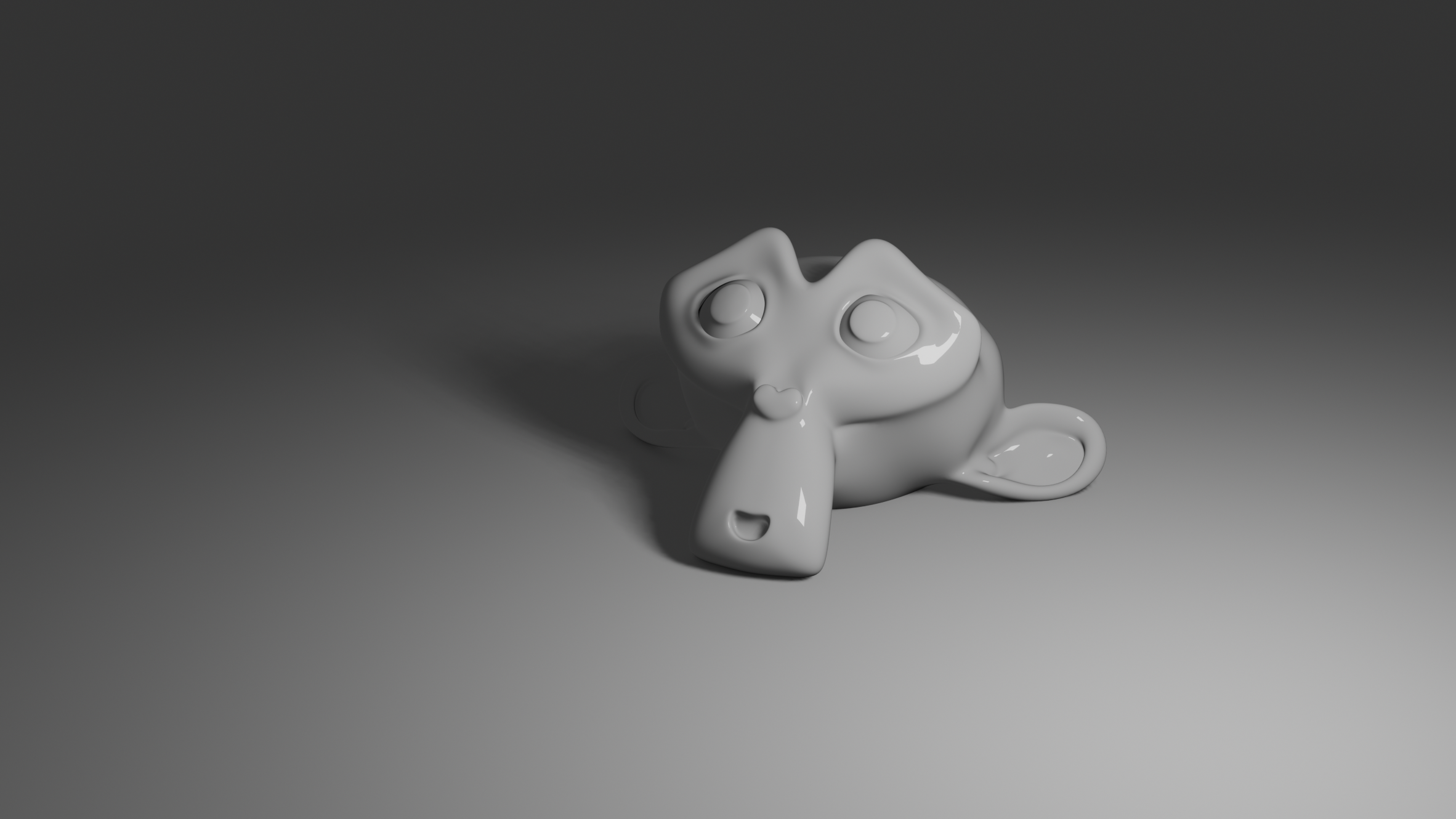
Good point, actually. I’ll need to make better face rigs in the future, to allow more expressions as you described. Right now some of the characters (like orange monster in the first picture) only have single animated bone for jaw. Ones with the more detailed rigs have about 10-12 lip control bones at best
1 Like
I totally understand. Weight-painting is tedious, and sometimes I unparent and re-parent a mesh, or make a new one. So I have to weight-paint again ugh.
1 Like
Your creature work is interesting for sure, but what has happened on this forum is that it is now far more common for people to not get replies at all, and one reason why is because the presence of the ‘like’ button actually reduces the amount of interaction by way of replying. The other reason is that you can no longer see how many replies a given thread has in the gallery view (so interaction is reduced further).
What that means, is that you should not panic when no one replies. It does not mean the work is bad, what it means is that the design of the software itself actively works to suppress the want to make a reply (which we unfortunately cannot do anything about because a lot of decisions tend to be set in stone and is not up for negotiation outside of critical bugs).
2 Likes
That’s not true- the vast majority of topics in the Artwork categories have replies. Of 2000 topics created this month, 531 currently have no replies- that’s 25%. For the quarter, there were 6000 topics created, with 949 having no replies- 15%, 85% with replies. For topics for the year, it’s near 100%, which admittedly is a law-of-large-numbers scenario, but still, the point stands that the vast majority of topics do have replies
1 Like
It can take a while though, and feel like no one responds to anything, when you’re one of those 10-25%. I posted a piece in September that got its first comment about 2 weeks ago. Honestly, I mostly forgot I put the piece up in the first place, so it was a pleasant surprise.
As for the original questions, I like the NPR ones. I’ve read comics with similiar styles, and enjoyed the art very much. The semi realistic ones look, for lack of better description, action figurey, if that makes sense. The figures all look smooth, and the colors are pretty uniform. Maybe some bump maps on the clothes, or to give the illusion of fur on the fox girl and the cat? Have you tried out SSS?
3 Likes
Hi DeckardX08,
Here are my two cents.
I think there are a couple of technical issues with your renderings (related to texturing and lighting) which make your images look 3D-ish and unpolished. But I think that you already realize that.
As for the “mainstream = boring” equation, I partially disagree with what has been told. It is literaly the artist’s job to turn boring into interesting. That’s the challenge! Maybe a good way to kill two birds with one stone would be to bring some “mainstream” themes in your artwork (or apply your style to mainstream subjects), if you think that’s the problem. Who knows what will come out of it!
And don’t worry too much if you don’t get many likes or replies. Consider that:
- The only person that you must please with your art is yourself. The rest of the world comes after!
- every 5 mins there is a new post in the art section. It is literally impossible for anyone to read and scroll through all that content!
Good luck!
4 Likes
My impressions:
-
These images don’t really work as still images. They look like random frames from an animation which are missing their context. If that’s what they are, that’s fine, but if you are actually trying to make still images, you should be careful to clarify what’s happening in them.
-
The combination of color, lighting, camera angles and artstyle makes the images rather chaotic and busy. Looking at them, I am not sure what is important, what I am supposed to understand or look at. The backgrounds have lots of sharp details and vivid colors, which are all in full light (be careful not to draw the viewer’s attention too much to something you don’t intend).
-
When there are multiple characters, their position and the camera angles make them appear the same size in the image, meaning the viewer doesn’t know where to look.
-
The characters have complex designs, which means their silhouettes can be hard to read if you aren’t careful with poses and lighting. This is especially important as soon as the characters overlap.
-
In the more realistic images, I notice there is a lot of light coming from the camera’s direction. This flattens shapes and makes shadows disappear, making an image’s details and depth harder to read. Putting the light sources more to the sides will give you gradients and shadows, revealing the volumes better. Having some light sources on the sides can give you some rim lighting, cutting the characters from the backgrounds.
3 Likes
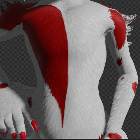
Yes, the fur is the thing I’m also worried about. I want my models to be performant and Eevee compatible, so I am staying away from particle fur. There is fur shader in those pictures, made using parallax mapping, which is visible on full resolution:
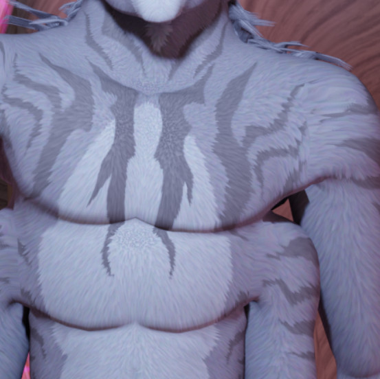
The only type of fake fur that looks somewhat decent and convenient to make. Later, I discovered some normal mapping tricks for making it shade like individual strands:
Though it still may not be enough.
Similar situation with SSS: I do not want to use Cycles for performance reasons, and Eevee version doesn’t support back scattering. Plus I do not know any ways to fake it.
Thank you, very insightful tips, especially about missing context and lighting. I really need to start making animations in order to provide context. And there is indeed light parallel to camera in some images. I noticed that characters that are supposed to look cute get ruined with angled lighting. Perhaps my models are just bad, but I couldn’t come up with better solution than direct light from the camera.
1 Like
This might be a matter of light source size. Have you tried to use wider light sources (with soft shadows)? If your shadows are too harsh, it could break the look and even have a slightly spooky effect by revealing sharp details, but softer lighting will instead give you gentle gradients that wrap around the volumes.
1 Like
On the modeling side, I think these are incredible! Love the textures + the imaginative creatures you’ve created!
However, the composition and lighting of these stills feels vague and awkward.
As the viewer, I don’t quite know where to look in the frame. I think you need lower, dynamic camera angles that really highlight the action.
This resource may help: https://www.rivkah.com/lets-make-magic/camera-conventions-in-graphic-novels/
Lighting-wise, I feel the shadows are a bit too strong, and, specifically in the semi-realistic work section, the flat, whitish lighting looks a bit outdated.
This resource may help: https://www.studiobinder.com/blog/film-lighting/
Finally, I would add some Depth of Field to really focus the viewer on what’s important in the scene.
4 Likes

3 Likes
Talking about lighting, here’s a video that helped me improve my lighting skills.

It’s not specifically for 3D rendering but it has a lot of concepts and ideas that can easily be translated to 3D rendering. Lighting is a very vast subject that includes many different mediums with their own specific techniques, some can be translated to other mediums and some can’t, but it’s still a good habit to learn how other people do it in other mediums.
For your renders it seems like you are trying to show off everything all in 1 image, every character, every background piece, etc. I get it, sometimes you work really hard on something and want to show everything all at once.
What you could do is maybe emphasize on 1 subject/object in 1 render and emphasize on another in a different render.
Separation, contrast, and balance is very important in art no matter what medium it is. Depth of field, lighting, composition, and color can help achieve that.
1 Like
In general, it feels like you’re stronger on character design, but need to refine your background work. The characters generally have strong coloring, shapes/profiles, and design - while the elements that aren’t characters often look like you’re searching for “what to do there”.
I think the first one demonstrates this the best. Strong traditional celshade, but the background looks like a completely different image made by another artist. And, I don’t really even know what I’m looking at - it’s very abstract, and I can’t determine if there is a ground/floor or not?
Back matches Fore in the second image far better stylistically, but the grass and large blocks look very CG. Perfectly straight grass, and it’s too easy to see the repeats in the texturing. The pink swirly thing lacks context, in the image - I would remove the flower that the critter is looking at, and have it looking at the swirly thing. (We still wouldn’t know what it is, but it shifts the ‘visual story’ if the animal is also examining it).
On 3 and 4 - i think they might look better with the celshade style of 1 & 2.
Thematically - I wouldn’t stress on this, unless more widespread appeal is part of your goal. I personally don’t like “animal heads on human bodies”, but I also don’t really get that interested in “photo real image of household object.” So, do what you like until you decide if you want to expand on your themes! ![]()
Hope some of that helps. ![]()
3 Likes