I am making some changes to the paint material. Will post soon. I want to finish this project now.

From this angle it look way better :), I like it.
1 Like
I think it’s quite good!
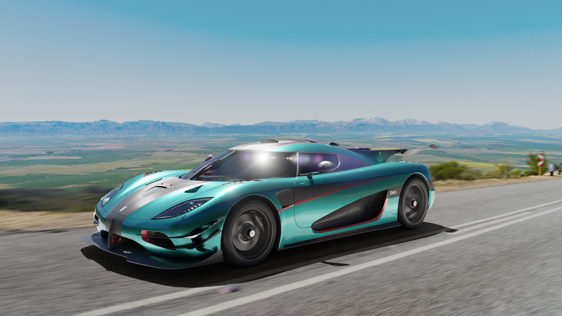
To be sincere though, what really disturbs me is the backplate with its over-saturated sky (look at other backplates on the same download page, some of them are natural, eye at the differences!)
And, as I told before, the vignette effect looks wrong and bad to me (it should be rounded anyway regardless of the cropping, and more faded).
Waiting for other responses, this is just my tast.
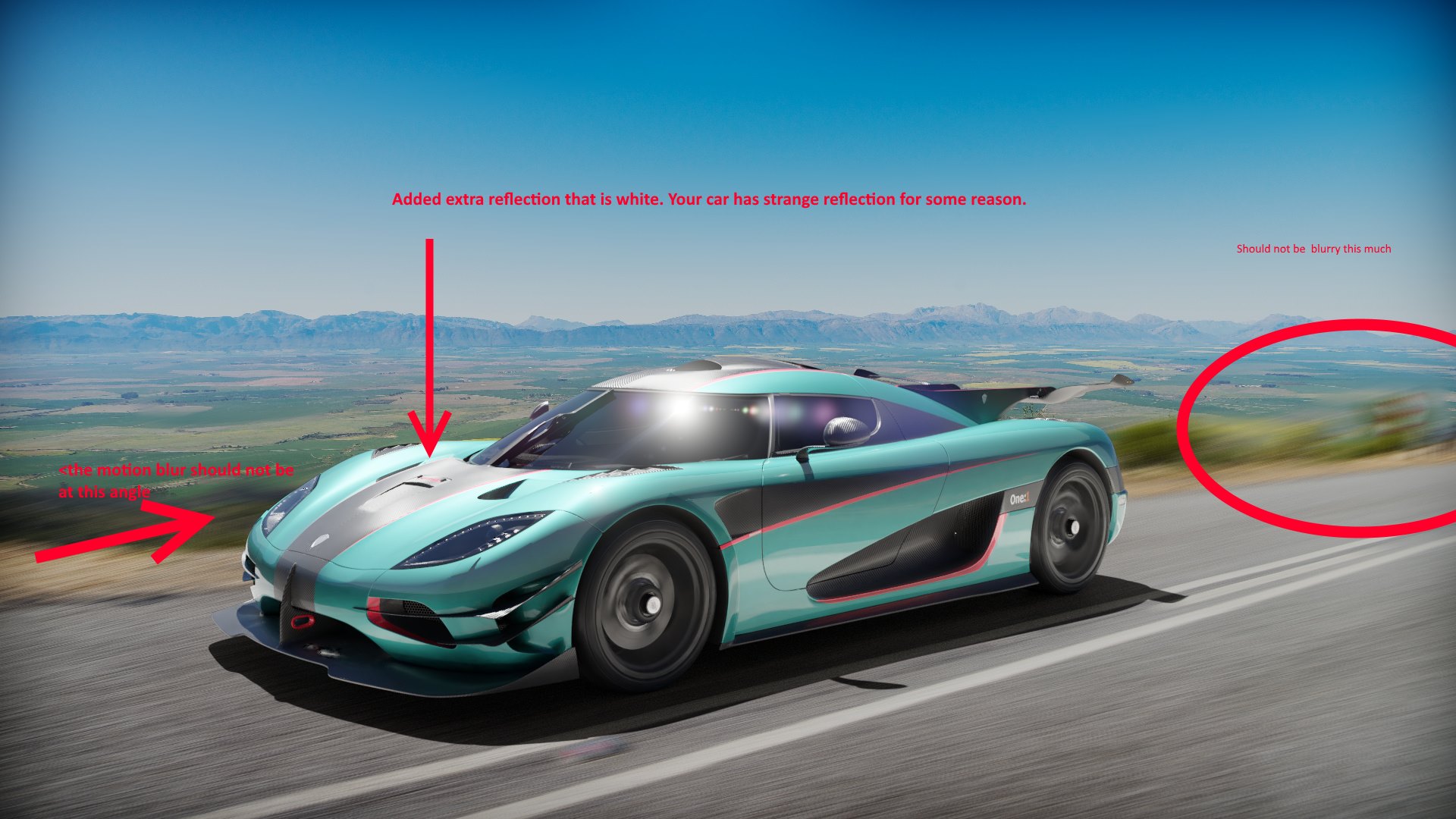
I took note of the wrong blur direction. So you are saying that the car should not reflect that much on the hood?
I think it should reflect more. Car paint has like two layers. One layer that you made on your car and another one that is like a mirror.
Clearcoat you mean? It’s turned all the way up.
You need to mix it even more in the nodes. I just found this on youtube.
I have seen that video. I will get back to outdoor render soon. Finishing studio renders right now. Thanks!
Can you give me an example of vignette effect? I have desaturated the sky.
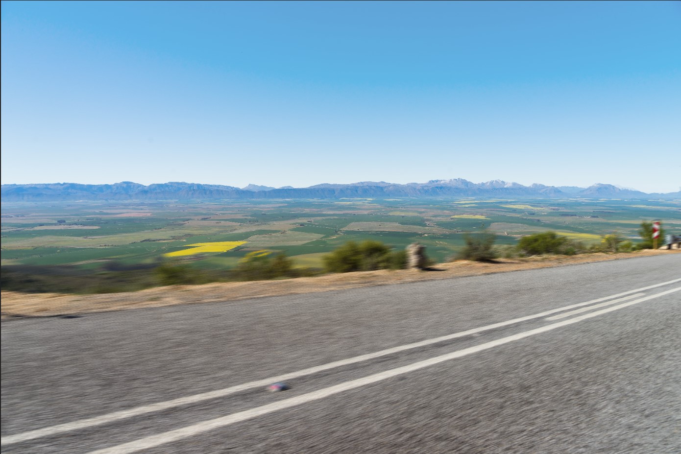
Here is the new background going to replace the previous one.
@BigBlend fixed the blur
it looks much more natural now (if it is what you want).
Vignetting is the effect of (not good) objectives limiting light at the border, particularly with wide angles, in photography is usually something to correct rather than to add.
Of course you can do whatever you want with your image, as make colored frames or such, and you have not to follow rules, though, for a natural look, such a strong dimming of the borders has no sense.
I tried this. basically no difference except more render time.

I want to be totally sincere, I like the result, and it looks more correct to me than before, but I still find something unnatural about it, and also that your original image had more strength.
I honestly don’t know how correct my suggestions were after all, and I might have pushed you in the wrong direction.
For example, a slight vignetting may also be fine, as long as it is correct (read ‘circular’) and fading very softly, I don’t know.
I expect suggestions by others in identifying further possible improvements.
1 Like
I featured you on BlenderNation, have a great weekend!
1 Like
Didn’t see that coming. Thanks Bart!
and also that your original image had more strength.
You mean the original one was better?
I think it looks fine without vignette.
1 Like
Not better, but somehow more powerful.
I prefer the last anyway.
1 Like
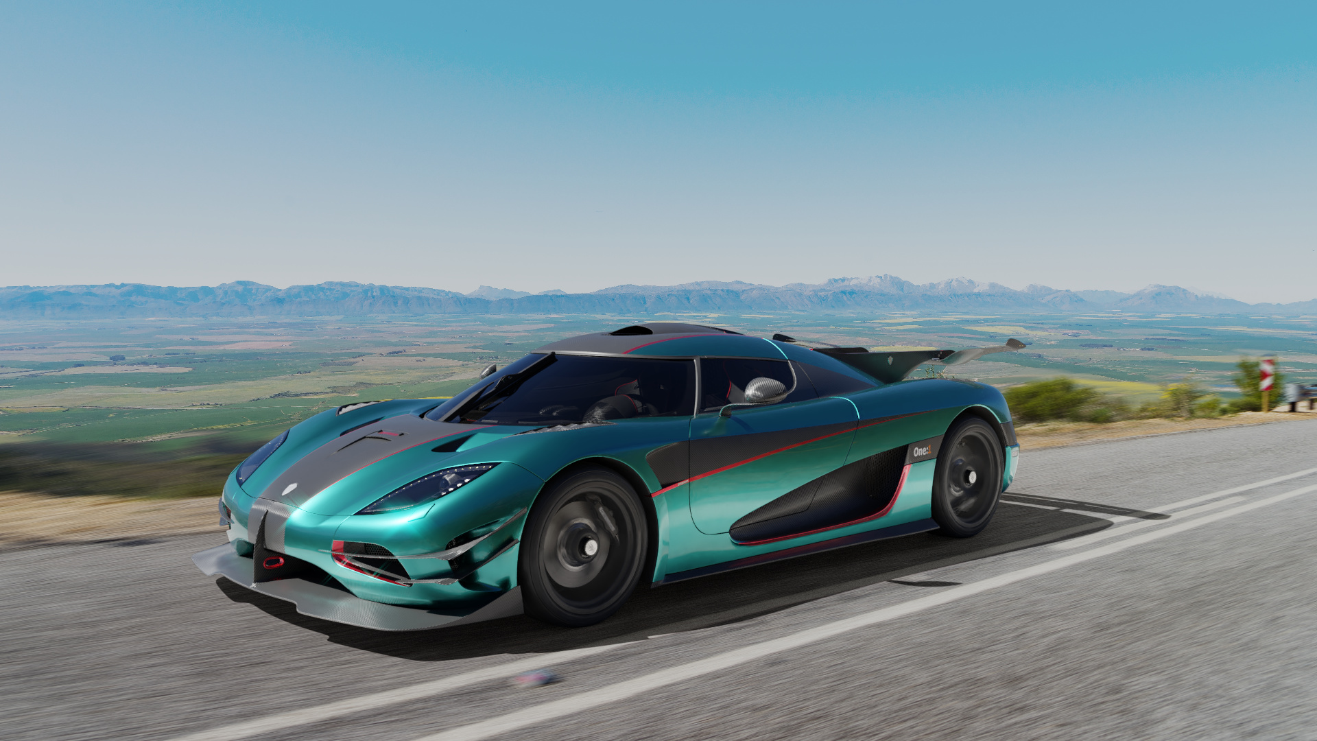
I’ve used same HDRI. Please check the result