Could you help me decide where to put the UI in my game? In the past most RTS games put the UI along the side of the screen, but these days it’s more common to put it along the bottom.
Part of this seems to be just a common convention of newer RTS games, devs do it because everyone does. But I think a lot of more modern RTS games are increasing the size of their UI bar and at the same time wide screen monitors are becoming more common. This is creating a game space which is more and more squashed horizontally.
What you mention about widescreen displays for RTS games makes sense, but I would much rather stick with it being on the bottom of the screen, even if it makes the game look squashed.
Another thought I had is that you could select a unit, press space bar, and type a command, similar to how you can just type commands in blender. There are some obvious downsides to this strategy, but I find in really useful in blender to just type a command rather than navigate to the button I want on the toolbar. Using a strategy like this in a game could be really cool.
Alternatively, you could just make your RTS toolbars look like the blender UI.
Thanks Grenzer. The game is going to have hotkey shortcuts, so it’s similar to how you say.
For example the different stances of the units include Aggressive, Sentry, Defend and Flank.
These have the hotkeys A, S, D, F. they will have onscreen buttons too for those who don’t like hot keys, or if you just can’t remember them. The hotkeys will be map-able too, if you want to change them.
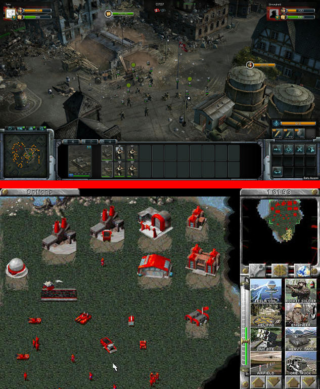
But I do need somewhere to put my mini map and a panel for giving details about the mouse-over units, so you can check how tough your own or enemy units are.
It’s funny, I’d prefer it on the right or left too, but I shared the poll on a reddit forum dedicated to RTS players and most of them have said “bottom” of the screen so far. I wonder if that is through habit, or if there’s some special reason for it. I can’t see any technical advantage to having more view space left and right, but maybe it’s due to aesthetic reasons?
the two most played RTS still today are Age of Empires: The Conqueros (AoC:TC in Voobly and AoE HD in Steam) and Starcraft II. Both game have bottom UI, the diference between them is the Minimap location. in Age of Empires Saga is in the right bottom corner and in Starcraft is in the left bottom corner.
I actually play a lot of RTS game (both above “competitive”, still today) and the bottom UI is really the way to go.
Depends, if you are doing fast-paced RTS like SC or AoE - bottom is the right place, otherwise if you are doing something like Cesar III or Civilization left or right is the right position.
OR
If you know something about basic people psychology and automated behavior you will know that most latin/cyrllic reading/writing people statistically look first at the top left corner then bottom left corner then move there eyes to the right.
With the arab reading/writing people is kinda opposite because of reading/writing direction.
Other things to mark is most screens have more pixels horizontally than vertically, so it is better to use more space.
Also it depends from your design and what information you want to display.
BUT
My personal opinion is bottom - it is neutral and it takes physically less efforts to look down instead of up,left or right and there is more space horizontally on the screen.
PS. If you are doing RTS like SC or AoE minimap position is the most important place, because people are looking at the minimap most frequently in these games.(telling this as master ranked in SCII :D)
Widescreen = bottom bar
Square-screen = right/left
but otherwise I personally prefer bottom/top bar mainly because human vision is used to seeing things set out horizontally. When was the last time you saw a movie in 1080x1920 instead of 1920x1080?
Having a menu on the side removes immersion as it sharply cuts over the horizontal view, whereas a bottom bar compliments the horizontal view.
Think about a film with a 2.35:1 aspect ratio (with cinematic black bars across the top and bottom).
Nobody really notices these, compared to if you were to have black bars on the sides, it would seem ridiculous.
@ Smoliterno and haidme
Do you think the bottom left corner is the best place for the Mini map?
I don’t know how much this sort of thing is just convention though. Did you know that many cultures put their subtitles along the side of the movie read vertically? It’s only Latin/Cyrillic languages which the horizontal subtitles, along the bottom of the screen are totally predominant.
We put the black bars along the bottom and top of the screen to create wide screen movies, but that’s because they did it in cinemas, the audience is laid out in front of the movie screen. It’s just convention. When those “widescreen” DVDs first came out I never bought them, because preferred to see a cropped picture on my crappy old TV than a letterboxed one which is too small to see.
A movie showing lots of panoramas or landscapes does well to be wide screen, but if you’ve got lots of character shots or portraits a tall picture would be better. Lots of directors use framing device (setting the scene in a doorway or corridor etc…) to bring the focus on the the character.
A game’s UI is a kind of framing device too, so it’s good to decide where to put it based not on convention but on utility and ease of use. As you say; mouse movement distance
One think I’ve been considering for a long time is having the mini map and other tools as floating boxes which can be dragged around the screen by the user to put them in the desired place. Maybe some people would find one configuration better than another.
There is no “convention”. All they do is “copying” from others. There might be arguments to do it one way or to avoid it. I do not know them.
The point is, it is your game, you are free to try out. Play around with different options. If it feels incorrect it probably is incorrect. Show it to others to avoid “topic blindness” (you are that much staring at the sheet of paper that you do not see the big fat note telling you not to use it). Jut some thoughts.
i actually more used to bottom right minimap, cause i´va played AoE since the first one. But the truth is, when i see the screen i pan from left to right, so actually im more aware of the minimap if it is in the left, in The Conquerors i sometimes loose my scout early game cause the right bottom minimap is the last thing i see, and that sucks jajaja, so i think if you´re going with bottom ui, minimap should go left bottom, it makes it easier to play focused on both views (current view and minimap), making scouting and macrocontrolling much more fluid.