Hi there!
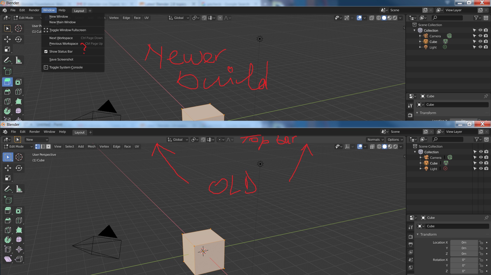
Did the devs removed the topbar?
Status bar is a different thing. You’re looking for “header”. They just hid it by default.
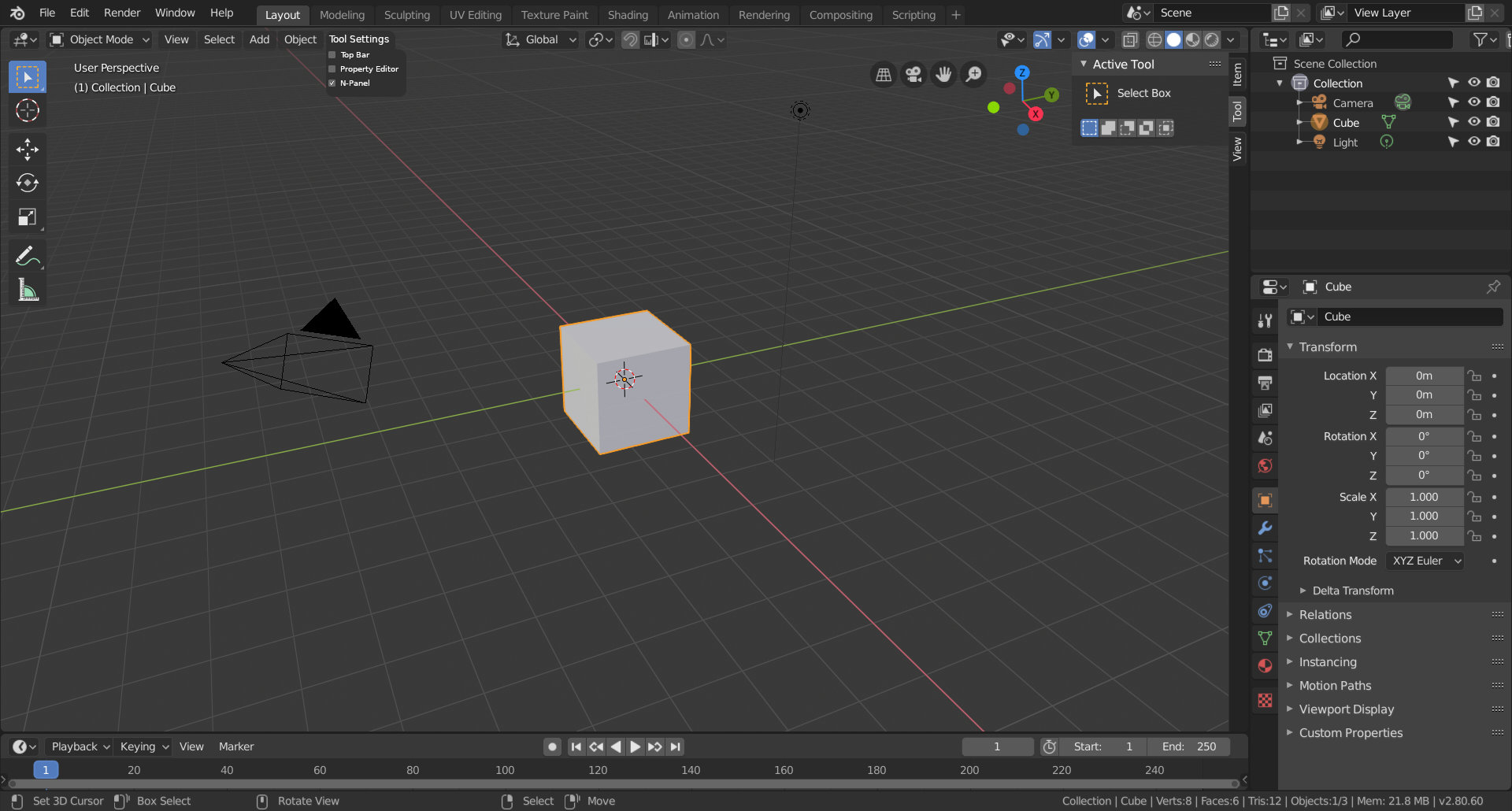
Right click anywhere in this area.


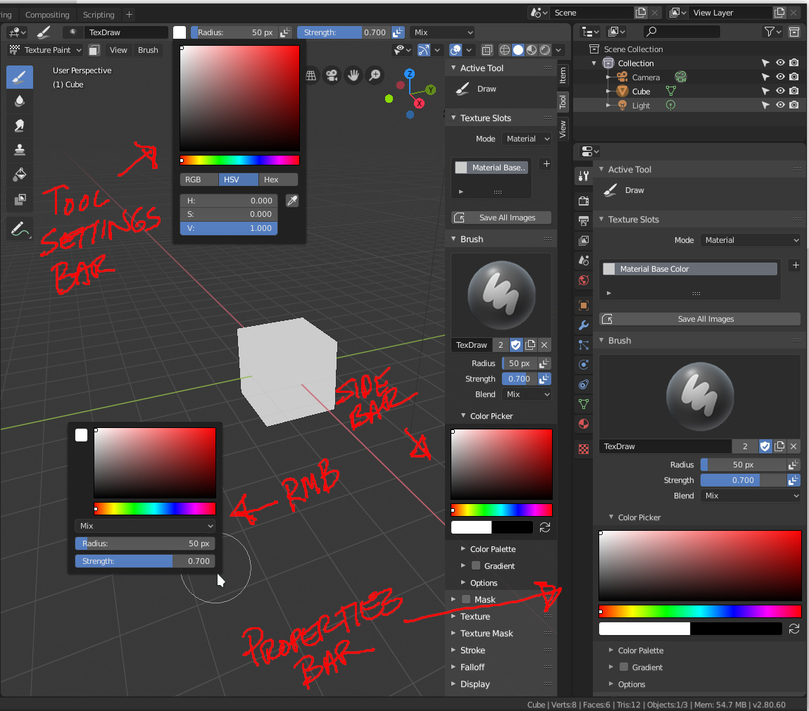
Thanks for your answer it solved the problem. Wanted to point out that in my image i was comparing old version with the new one and the question mark is the place where topbar was found like in the image below. It seems like the topbar even changed the name.
Thanks for you answer.
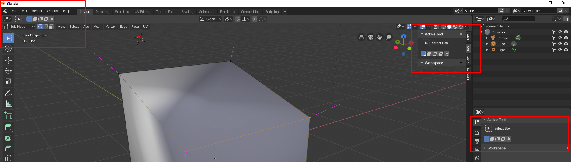
Yeah, and i think they broke this panel. I can’t find these options anywhere.
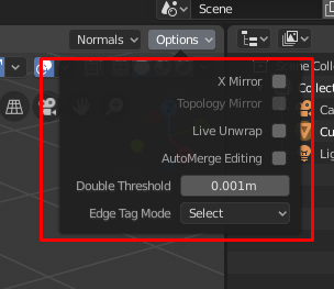
No, they didn’t break it:
I really don’t know who is making those decisions, this is so unrealistic decision to make; change the UI when we are close to the release date. I didn’t have problem with N-panel in Blender 2.79 but now i m happy working without N-panel and T-panel, i will have the need to open that N’-panel from time to time sigh 
Yeah, i already found it. But now we have so many duplicate menus… Seems like N panel become more and more like the old T panel was before 2.8.
Personally, I prefer having the tool settings in a tab under the n-panel. Anyway, I have an idea that I think will make everyone happy. We should have settings under a drop down menu that would allow us to choose where to display tool settings. Something like this:
This would work per workspace, and when you don’t have any editors set to use the property editor for tool settings, the tab for tool settings in all instances of the property editor inside that workspace should disappear.
Also if you specify that you want the tool settings from multiple editors displayed in the property editor then you can click somewhere inside one of those editors in order to get the property editor instances in that workspace to display it’s settings.
The last Monday meeting mentioned that UI decisions should be finalized this week, with the following weeks being focused on bugfixing and documentation, then there’s the (arguably) final step of fixing the high priority issues that are considered blockers.
The UI shuffling and the like should now largely be done for good.
I’d like to see the UI still get attention over the course of the 2.8 series. No major overhauls, but just not get completely neglected like after 2.5. There still seems to be a lot of ambiguity on where settings for things should go. Look at color selectors in texture paint for a rather extreme example. I’d like to see things like that cleaned up at some point after 2.8 is out.
Edit: just realized I wrote properties bar in the image: obviously, it should be properties editor.
We are not so close to release date. Currently, there are more than twice the amount of bugs known for previous release that have been reported.
Developers have a dozen of high priority design tasks.
And after that there may be a release candidate week.
So, there is still at least a month before release.
I agree.
What is really frustrating is that there are 3 places to display active tool panel where we want and truncated redo last operation panel is stuck to left corner.
I don’t know if it is already possible. But it would be great if we could define different designs for a same panel. If under tool setttings bar : show this ; if under sidebar : show that ; if under properties editor : show all…
But you can already do that. The top bar can be toggled on if you want it, the N panel you can switch to a different tab to ignore, and the same for the Properties.
And did you know that you can Pin any combination of panels from all of the N tabs and see them all at once? Just shift click on the panel header or right-click it.
That isn’t exactly the same though. I’m not saying the way it is now won’t work, but I think it would be better if for example the tab for tool settings under the n-panel would vanish entirely if you uncheck it in that concept image i made.
I personally feel it would be easier to configure these display options if we only had one spot where we could customize this. The way it is now, a new user would have no idea there is a top bar for settings unless they right click the header.
Personally I have no problems with repeated things. This allows a wide variety of configurations in workflow according to the taste of each user.
Yeah that is actually great, but the priorities are kinda messed up.
3 times active tools, but last operation only in one place that can’t be changed.
I’ve never ever use the “active tools” operations and i ALWAYS need access to the last operation panel.
Wasn’t the initial plan to make the last operation panel a free floating panel in the 3dViewport?
Wasn’t the tool panel in the properties editor the place where the last operator box should also be displayed?
And you are not the only one.
Not so sure about that, if it needs it…
It’s F9 now. (For some time no hotkey was assigned to this operator)