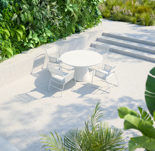
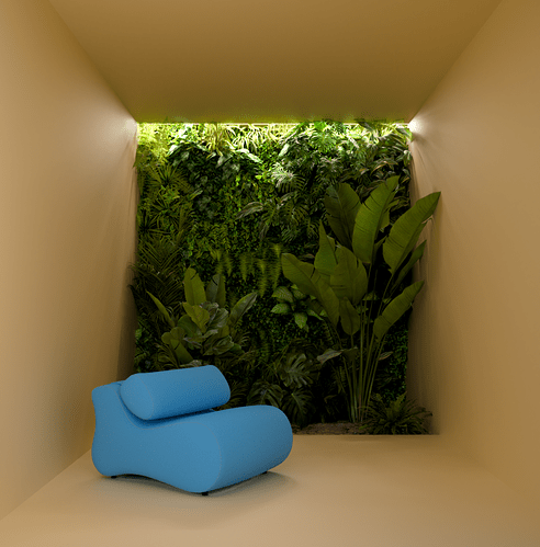
The last pic, but there is just a little to much blurry stuff in front of the camera (left side).
Keep the DOF and the plant in front on the right sight and go with it.
The other pics have just wrong saturation and looking to clean overall at this point
I agree the last one. For me it is more about clashing colours. The last one is more relaxing.
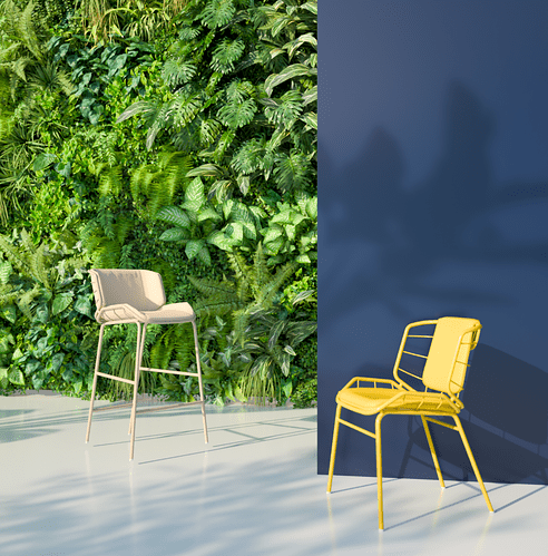
Second one. Love how blue wall “shatter” composition. Last is nice but DOF make it to look somehow as miniature. First is … well, too generic, technically perfect, but nothing “exciting”.
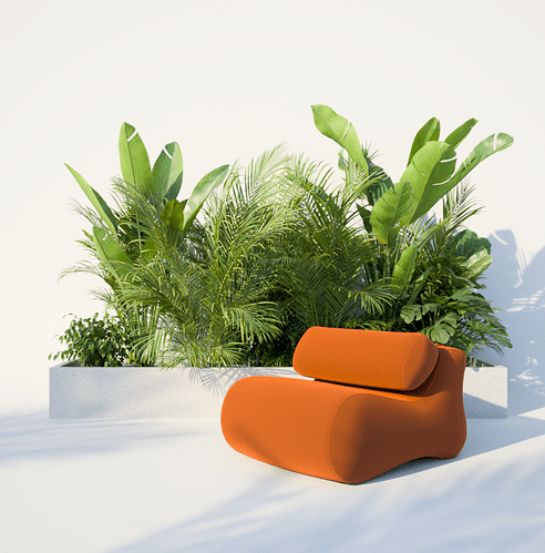
@3Dshaker I love the first one. The orange and green is such a lovely contrast.
Composition wise the 2nd one - but I would keep the upholstry of the chair infront of the vertical wall in the same orange as in the first image. and the sand colored framework does not look great to me.
Same with the same color for framework and upholstry for the yellow chair on the right
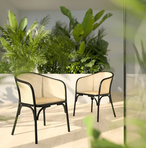
In the third one I agree with the other posters - a bit too much DOF. Also the color of the cain work of the chair is imho too close to the flooring and it does not help the readability of the image.
btw. from which collection are these amazing plants? Are these one of your collections?
Thank you, Jonathan,
I appreciate your opinion. The first one is my favorite too.
When it comes to plants - only a few are from our interior plants’ collection and tropical plants, but definitely not all of them. During the process of creating renders, we do not focus only on our models - there are plenty of great models on the market so we are supporting also other creators. I can check it and send you where we got it.
You are right, I would say that I like the first one because of the color of the chair mostly. On the third one there is too much going on I think - now I see it ![]() Thank you for your comment
Thank you for your comment
