.
.
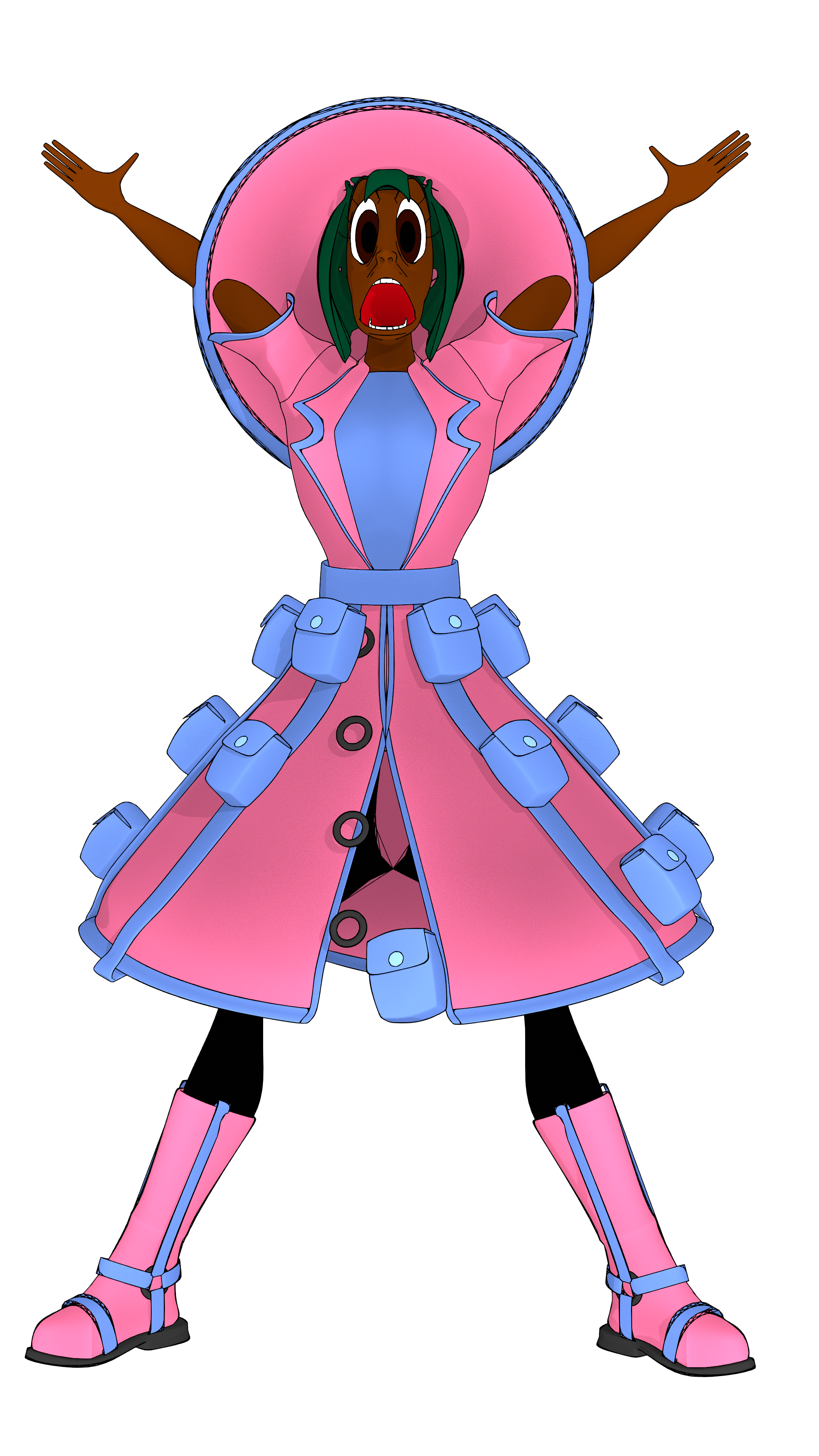
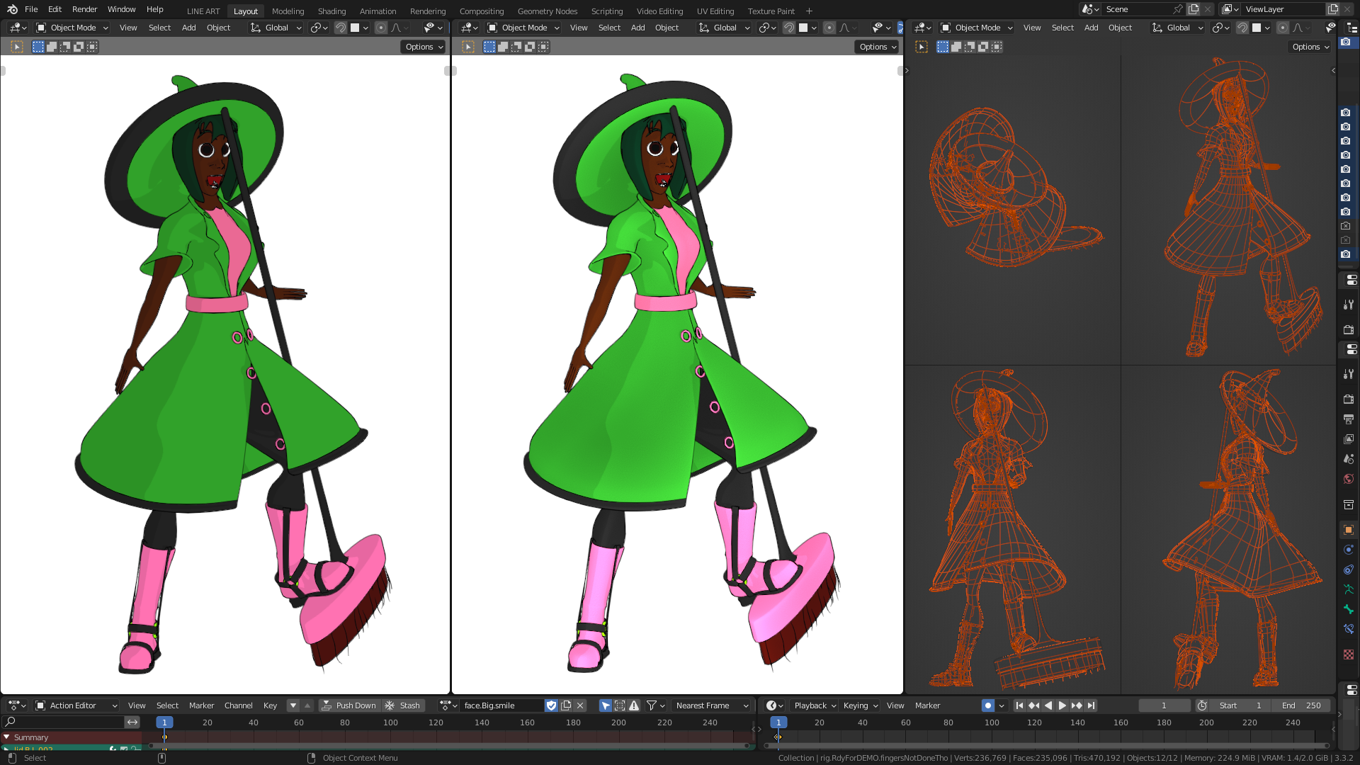
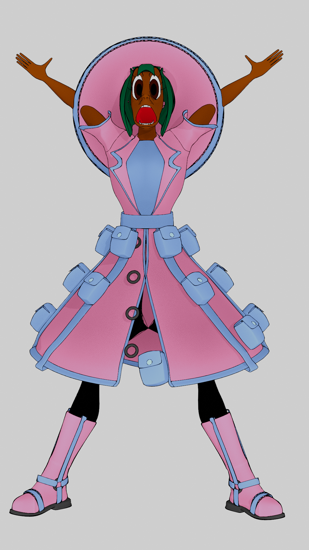
It’s 3d made to look cartoon-like!
I focused on the important stuff first,
That’s why I didn’t bother rigging the fingers yet lol.
The buttons also aren’t really rigged properly.
I’ve learned that adding details (e.g. borders around clothes, buttons, sash, etc.), even if they’re simple, can take a character design to the next level by making it look less plain.
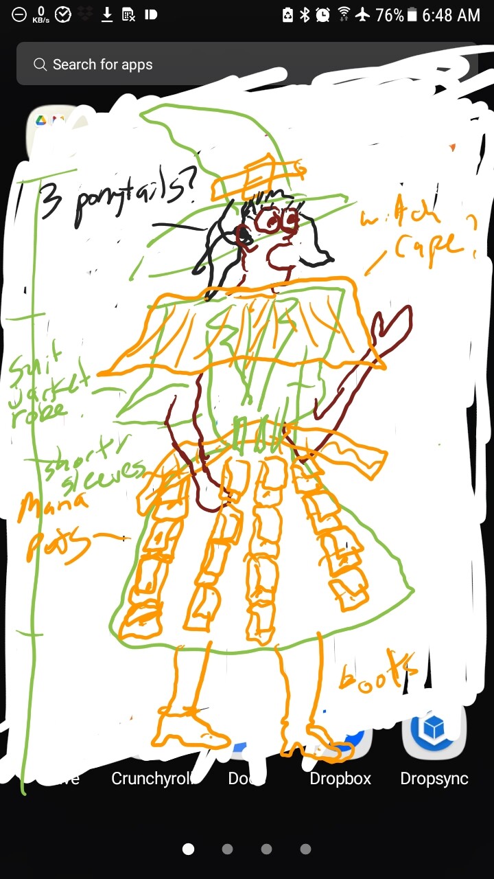
I drew some concept art late at night, just in case I’d forget the colours and design the next morning:
The robe is made to look kinda like a suit jacket, just to be different.
Sleeves are also made to look unique.
The hair is temporary/placeholder hair. Just some old asset I made before.
2nd pic from the left has cavity turned on for that extra touch. Looks decent, but only shows up at the bottom.
It’s a bit tricky to pose the face like in cartoons without deforming the mesh in a weird wonky way. I’m hoping Rigify won’t have too many limitations here.
Funny pose lol.
I have to rig the hat. And fingers. And pockets. And figure out why one vertex that keeps clipping to the middle.
After my first draft of this character, I realized that Link from Zelda used to wear green with a pointy green hat. Or that goat kid from Deltarune. So I changed the colours, to make this character more unique. I aimed for a faded pink colour. Pink, cuz it stands out. Faded cuz I don’t want it to stand out too much.
I made the lines look more hand-drawn by adding an Envelope modifier and set spread length to 3. It needs a subdivision surface of at least 3, tho. Or else too many criss-crossing lines appear.
I’m planning to change the hair, too, maybe. But the hair isn’t the main part, so I prioritized other things, first.
This is a really interesting method with excellent results if you want something more performative, I’ve been having good luck today with the Thickness modifier and a custom curve. Yours definitely has a nice flair though, I might try that (and see if my computer crashes )
Hey your computer’s way better than mine, so you should probably be fine.
I did use a custom curve, but this envelope modifier makes it even better imo.
If you zoom in, tho, there still are criss-cross lines. My guess is: more edges leads to less criss-cross lines.
I forgot where I saw it, but someone used an envelope modifier or something. So I tried it and it’s not bad!