How can I improve this?

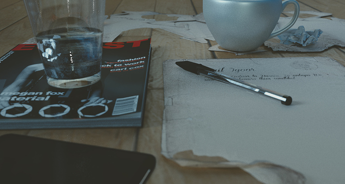
The bottom of the paper were it is sorta folded looks off… dunno why but try experimenting with adjusting that.
The thing in the bottom left corner needs work… i dunno what it is.
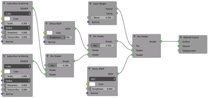
The cup shader is not very good. For ceramic stuff i use this
Apart from those 3 things the scene is brilliant!
Attachments
Thank U bro
I’ll try this and make another render ty ![]()
I like the style of the image and the composition very much.
Things that could be improved imho are the table and the paper behind the cup. It seems like you added an image texture to a plane for the table, because the gaps between the single wooden bars don’t look 3D. For such a closeup it should be modeled.
It’s not quite clear to me what the paper behind the cup means. Are these the remains of some cutouts?
I love how everything is a bit out of focus and the desaturated colors.
Everything is good except the cup needs a better material having better reflections. Even for ceramic the reflections are definitely off. A texture on it could make it even better. In fact it you can give it a story from the pic and the writing in the paper.
Is that a phone on bottom right?
the pen paper and magazine look fab. The pen can work with a little more contact shadow.
Also when I look at the image, I don’t know what to focus on. Maybe a higher camera angle looking down at things would help. Else you could try putting an element of main focus somewhere. Drive the eye for some excitement.
Very nice render quality.