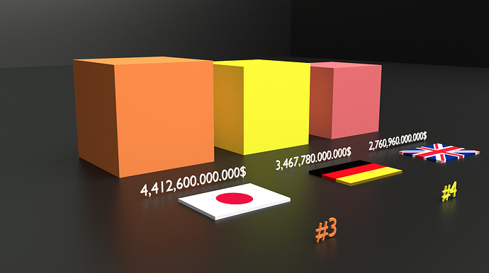
Yay DataViz! Looks cool with the 3d text and flags.
I think the $ sign on the right looks awkward. Maybe that’s a US thing, but it’s somewhat distracting over there.
For the sizes, with US being roughly 7 time the UK, it’s somewhat hard to visualize since it’s a 3d volume. If you removed the numbers would the UK cube look 7 times smaller? I think people will compare the front face size only. I think here a boring old column chart would show the information more dramatically. Or - maybe split those cubes up into small boxes and have them animated while filling up at the same rate - thus the US one would take longer to fill, which would get across the much larger size. (maybe have them all filing at the same time).
One last picky thing I didn’t get enough time to see all of them together at the end.
Isn’t the dollar sign always on the right though? After all, nobody says “dollars 30” instead of “30 dollars”. Not sure exactly what you mean by that.
As for the rest of it, I agree with cadaei. If you’re going to compare using a 3d scale, you should at least shoot from a diagonal angle instead of head on so the audience can focus on all 3 dimensions. But yeah, a column chart would be the most effective way to show your information.
It is impossible to understand quantities you’re showing since there’s no measure, no scale, nothing to relate to.
Reason why (info-) graphs have legend on it.
IMHO Visually, a pie chart would much better represented the relations. Global economy as a full circle, sliced by countries, continents or whatever. Thus quantitative relations become obvious even to illiterates.
Keep blending 
But there is a form of measurement. What else would the numbers below the boxes refer to?
Cube volume?
Otherwise, numbers and currency symbols are just an abstractions. In statistics/math we always need to define (specifically describe) what’s it all about…
Through educational process, mathematical answers have always bothered me, since i am a fast & correct solver, but sloppy at explaining results (love drawing graphs tho). Got lesser grade just because, yet now i understand why. 
ie: informative, easy to understand without any extras
(anyone can easily comprehend relations even without numbers)

