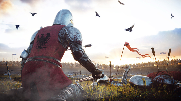
Hey everyone, just wanted to post my entry for the current Weekly CG Challenge topic: Knight. Also, thanks to everyone that helped me over in the Focused Critique section, appreciated the feedback! Thanks for looking!
Thank you so much!
Beautiful!
Awesome job, great lighting! The only thing that looks kinda strange is the raise hand of the dead body in the middle, as if ready to high five  OTher than that loving it…
Haha, I see your point. My intent was that he was severely wounded and reaching up for help, but I can see how that might not be immediately evident. Appreciate the kind words.
Great work,congrats.
Great job! Maybe sky is overexposed a bit
Btw, is it Chivalry: Medieval Warfare reference? 
Yeah, I do agree on the sky. I used one of the HDR maps from Pro Lighting Skies and it’s very overexposed by default. I should’ve chosen a different HDR or substituted it for an image in post, but I couldn’t find a suitable replacement in time to meet the deadline for the competition. Maybe now that the comp over I can go back and tweak it a bit.
Haha, no, not a reference from Chivalry, but I have played a few hours of Kingdom Come: Deliverance, though I can’t say it was a direct influence. Also, I really like the oppressive atmosphere from the Dark Souls games, that might’ve come into play.
Is it 3D OR 2D?
What are you referring to specifically, Nifler? Everything was modeled in blender, with the exception of the crows and the troops on the ridge. Those were taken from images that I found on pixabay. The troops were mapped to planes and rendered in the scene, but the birds were added in post.
I featured you on BlenderNation, enjoy ![]()
It’s an honor, Bart, thanks!
yeah hey, typical me saying something extremely late to a thread and you probably dont want to go back and change this now but i thought i’d mention it. Is the sword too reflective? (Edit: the sword the not-dead-knight is holding)

