First post in this category! 
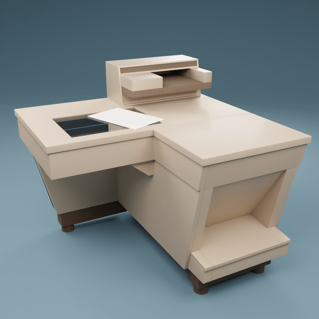
I  love mid-century modern design, and I think this machine is very sexy, so for one of my first projects, I decided to model it.
The cabinet design went through several revisions after initial release, but I’m sticking with the original config (and feet), but with later standard coloring.
Still have a ways to go: the top control boxes, the copier cover, the doors on the hidden side, and the seams on the module edges, but here’s a look at where I am so far:
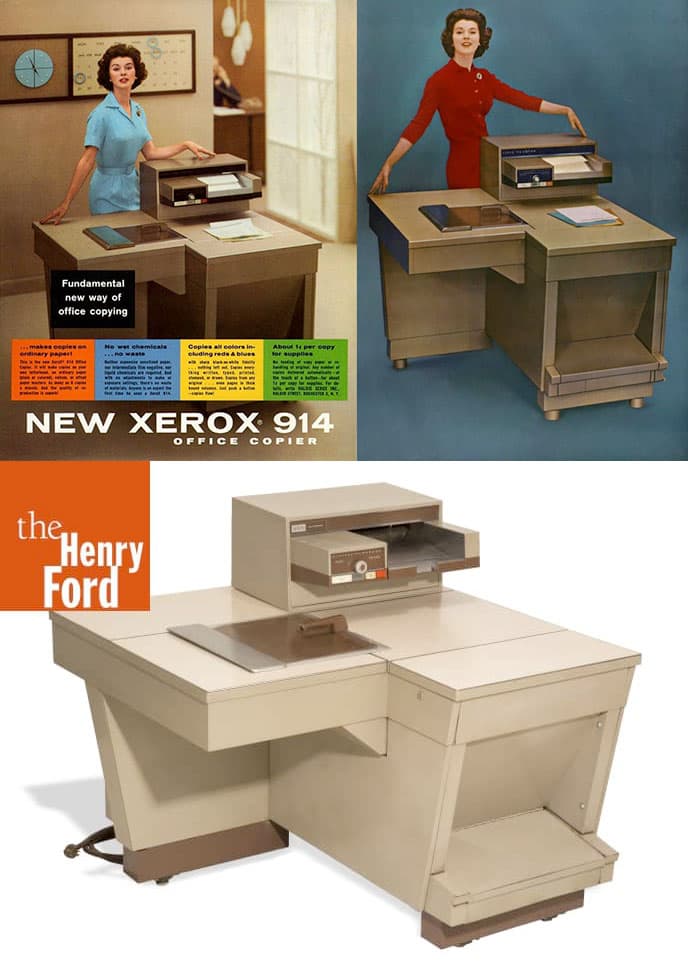
And here’s a sample of some of the many reference pix I’m using to figure out the specs:
Once I get the machine right, I may go ahead and model the office from the ad.
2 Likes
Looks good the model is awesome you can add some more papers and books too so it will look more awesome
But it is a great model overall
Slowly Making Progress
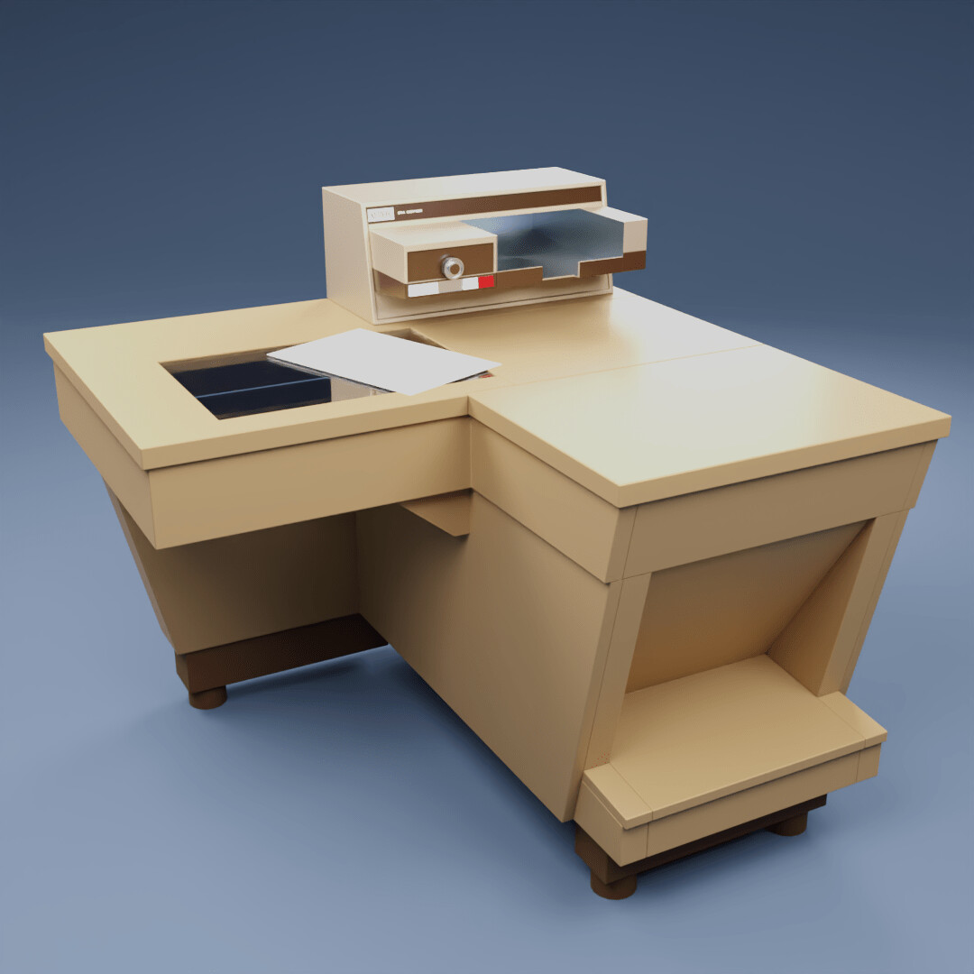
I don’t get back to this model very often, but I’ve added more to the top paper tray.
The trickiest part has been finding the period-correct logo and identifying the correct fonts.
Best I could do for the logo was the 1961 version, so while the machine design is based on the first generation model, the logo/name combo is from a few years later.
As for the fonts, modern digital versions are not the same as the old hot-metal and phototype designs of the period, but at the small size in the render, who will even be able to read the buttons, let alone notice that the version of Futura is slightly off?
Still To Do:
- Add labels to buttons
- Model scanner cover
- Power cord
Optional
- Armature for scanner cover and doors
- Right side door
- Internal machinery
1 Like
nice beginning
you should add real walls around with a floor ect.
to get the feeling of a room around
need to add real wheels under the printer
and some other small details
top had some thin plates over with darker edges ect
happy cl
1 Like
Thanks, man!
I love the vintage machines you’ve got in your portfolio. That page of sexy WWII radios and tubes is fire! 


I’ve seen a version this machine where someone hacked some wheels to the feet so they could wheel it in and out of trade shows, but IMO it kills the lines. (Although some outrageous Rat Fink or Big Daddy Roth style wheels would be hilarious.) I’m already cheating a bit with the nameplate and the coloring being from later models, but I want to keep close to the year zero original where I can.
Emphasizing the seams of the paper and toner loading hatches is a good note though.
Once I get the scanner cover done, I’ll pepper it with some documents, some sheets in the output tray, maybe even a coffee mug! 
And when it’s far enough along, I have some great references for late 50s office decor, including a really nice sample of a Bigelow carpet. That’s a bit of a cheat as well, since no one would put this on a carpet because of static electricity and toner spill damage. But I want to keep with the 1958 executive suite vibe of the original ads, rather than the proto-2001 pure white room aesthetic that became the look of 60’s Xerox ads.