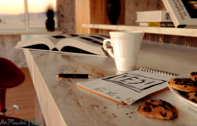
Hi, my first post here, I started learning blender 2-3 months ago. I really tried to do this scene as photorealistic as I could, any remarks would be highly appreciated, as I’m trying to improve. Thank you.
Hi mate!
Really NOT BAD for a novice!!! In fact modeling looks pretty good so lets face others…
-
Marble looks nice but with almost no reflectance so try to make it more reflective - from this angle the reflections has to be much more visible imo
-
DoF is too much in my point of view … cup, pen and notebook are the only things we could se properly (nice notebook paper texture btw
 ) … and yep, maybe one cookie. This makes the whole scene to look somehow “empty” if U know what I mean
 -
as mentioned above, because of that DoF the book, chair, vase etc. has a lack of details (good for avoiding complex modeling but bad if U did that and the viewer could NOT see it). Especially the book looks strange because its really improbable there will be complete dark (black) under that white pages U know?
-
Lighting could be improved but I do not know where are all the windows so its up to U bro ;). What I mean that thru window I could see sunset right? But these things has no shadows
-
More object on the scene to me it RICH

Good job nontheless in fact … if U R capable of doing this after 3 months what do U plan after a year? KEEP IT UP!
Sincerely, JayM
PS: Those crumbs make a GREAT detail in the scene!
-marble top edges bit too straight line…bend em/deform the line slightly (and some ever so slight bumps on top face as well)
- desaturation/lower contrast in distance
-cup gloss too uniform- add some dirt/roughness/ maybe few bump artefacts here and there…
-don’t like that stool chair, too dark/ dominating in the image - change colour to something less distracting, maybe light grey? - book edges also very straight (nothing is a straight line:D !
- also pages edges facing colour is quite a block of white
-cookies, notepad, pen all absolutely great and no changes here for me
…but GREAT start !! keep it up  I like the general style.
To me it looks really good. The DoF doesn’t seem to harm the scale much; it’s heavy yes, but it doesn’t make it look like a diorama scene. The chips/raisins in the cookies perhaps look a little too dark and dense, but otherwise I have no issue with it. Nice work.
good job.
I take care of the existence of many black spots in the scene (vases, book and pen) is a little strange … a lot of light in the scene and still many black spots … if you work more with dark tones but still keep color information .
Thanks everyone for feedback so far, it really means a lot to me. Next time I model, I’ll make sure to use all of this awesome advice of yours 
What is the field of view of the camera? It looks pretty wide angle for close ups. Making it seem a bit unnatural.
Thanks everyone for feedback so far, It really means a lot to me. I will make sure to put all of your advice to good use on my next piece ![]()
Currently, I’m not at a level to actually do technical stuff with particular parameters, and have no technical background with photography, so I just went with something that looked fine for me;
Yeah, for black spots I probably went a little overboard with post processing and gamma…
For lighting I used HDRi and HDRi only, at this time having a hard time controlling lights from HDRi’s, I’ll make sure to look into that more, do some testing. And these crumbs are something I’m really proud of ![]()
It looks really good and besides the marble surface not being reflective the chocolate chips on the cookies look more like spots that were just burnt rather than chunks of chocolate.
