Young realistic-anime-ish style base mesh. Any form or topology suggestions?

Hi!

So I somehow ended up as the character modeler for a small game project that we’re making in Unity. We decided on a somewhat realistic anime style, somewhere in the mix of things such as Kingdom Hearts, Final Fantasy, RWBY, and others. Age-wise our characters will mostly range from 12-17, and so I’ve been targeting around 14 years old for this base mesh.

I’m wondering if you could provide me any tips regarding form or topology that could help me improve this base before I start on the actual characters in the middle of next week? I’m not real strong on 2D art nor sculpting, so keep that in mind when suggesting things.

I didn’t bother adding detail to the stomach or feet as those will be either covered or require special attention.

In regards to topology, I know 6-sided poles are generally bad, but I’m not sure how to get rid of the ones I have (between the shoulder and the chest, between the butt and the leg, and between fingers), nor if I really need to get rid of them. I’m trying to keep vertex count low to make weight painting easier down the road. This is for a PC game so having a subdivision surface level or two won’t affect performance.

Here’s an image of the head. Full body is in the blend file. (Warning: base mesh made in nude, non-genital)


Blend file: http://pasteall.org/blend/index.php?id=45802

Let me know your thoughts and suggestions! Any criticism welcome!

From the image , I don’t see that you are following the style you have chosen, can you show us the references you are using?

I unfortunately cannot upload the character concept art, but I can upload my poorly drawn orthographic approximations. They are also correctly placed in Blend file if that is worth anything. For the front view, the eyes were in the wrong spot, and in the side view, a lot of the face structure was wrong, so I ended up looking up a lot of cut scenes and stills from Kingdom Hearts, Final Fantasy, and some other indie titles to help fill in the pieces.

As for the style itself, we were mostly going for realistic with some anime touches. The first touch is the four lines that shape out the side and bottom of the face. The second is that the face is very smooth, having little to no detail wrinkles. The last is the eye size. You probably know better than we do, but we had tried calculating actual human eye sizes and anime eye sizes. We found human eyes ranged from 15 to 33% of the height of the nose, whereas female anime characters ranged from 30 to 90%. For our game, we decided to target 33-50% and so the ratio for this base is approximately 5:13. And of course there were other considerations for the rest of the body.

The front and side view silhouettes for the head are correct according to our concept artist. Where the issues likely exist is in the volume of the cheeks and around and on the nose.

Here are the references I had to draw up to get me started:


Yeah it is pretty bad, but it got me a lot closer to my goals than had I not done this.

For an example of some of the things I’d be looking at when diverting from my poor artwork, here’s some Kingdom Hearts stuff:

And during initial discussion of our game’s art style, when I asked our concept artist what he was hoping our good would look like in 3D, he sent me a picture and told me it he wanted something like it except younger and simpler: http://www.wallpapermaiden.com/image/2016/08/19/re-zero-kara-hajimeru-isekai-seikatsu-rem-semi-realistic-crying-tears-face-portrait-anime-4528.jpg

And I have no idea if the bottom of the chin is supposed to be flat or pointy. He hasn’t said anything yet as the first character he designed had the chin covered by a scarf.

The topology and the form is quite terrible. I’ll stick to three and focus on the face.

  1. The jaw line. Starts bellow and behind the ear. I indicate it with a line:


  1. The space between the mouth and chin should be larger. Maybe you can move the mouth higher, like this:


  1. clean the neck. I know that it would be covered by a scarf but it is just a mess.

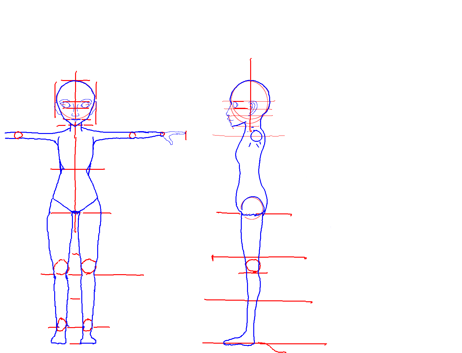
Have you considered trying to look up more references to use? Most of your references seem to be only used as guides to focus on your art style instead of detail or accuracy. In addition, your only orthographic reference is one that you drew yourself by hand, which contains many anatomical inaccuracies, especially in the shoulders, hips, and pelvis area. You said yourself that 2d art isn’t your strong point, so if you plan to handdraw references, you should study anatomy and practice more if you want to integrate it with your 3d modeling.

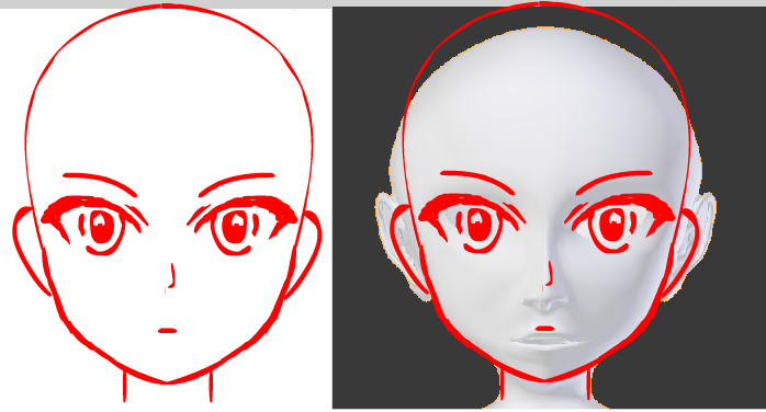
I took the time to create a rough anime sketch on my new drawing tablet (they help with drawing a lot) to help show the differences that your model attempts to capture with the anime style. It was pretty quick and hastily done, so there are still some minor errors in my example, but it should get the point across.


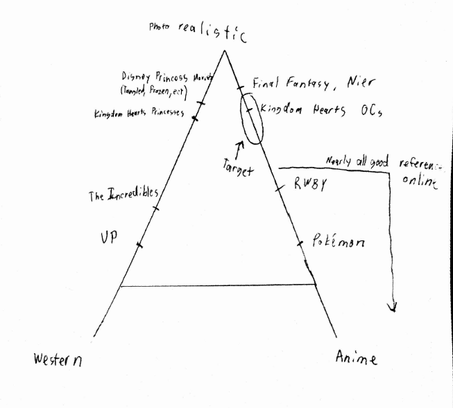
I believe that a large part of the errors made are a misunderstanding of how you perceive anime proportions. If you’re going for something anime-like, you need to understand the style and gather more anime references. Anime isn’t an easy style to master, and is still reliant on many of the rules that realistic human proportions follow.

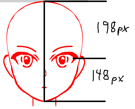
For example, the eyes rest approximately halfway on the head, and anime hair tends to obscure most of the forehead, making it seem like the eyes are actually higher up than they actually are.

Also, the eyes are approximately as far away from the center of the head than they are from the side. The proportions can be obscured with the anime style having naturally larger eyes, but in your example, the eyes are too close to each other.

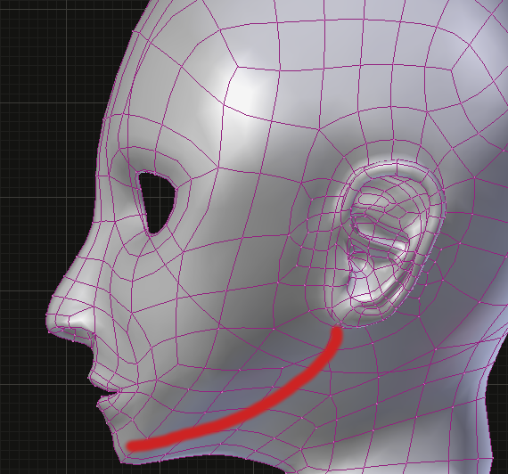
Another mistake is the sharpness and angle of the jaw. While anime does have a sharper and distinct jawline, there is still some roundness to it, and not just perfectly straight lines and angles. If you look at Rem from the third example link in your post, you don’t see these “four distinct lines that shape the face”. You see smoothness that shape the jaw.

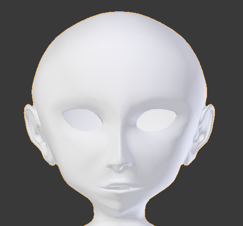
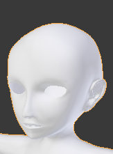
The nose is really sharp and sticks out while anime noses are more smooth and subtle than that. You should edit the topology so it is less dense in the nose area. Also, the nostrils should go as anime usually lacks nostrils, or at least texture them on instead of having that dense topology if you want to go for an anime/realistic hybrid (which I don’t really recommend).

The shape of the eyes themselves look like you had trouble trying to decide between a realistic eye or an anime one. Perhaps you should round them out more and make the corners less sharp. Also try to get around to eventually modeling the eyelashes and pupil.

There’s a lot more that you can work on, but I’ve already said enough with this wall of text and I’m pretty tired, so I’m gonna wrap it up here. The main point here is to practice drawing more, and gather and study references.

Thank you so much for the feedback! It is nice having people who actually know what they are doing point things out for me! Can you tell I’m a math guy?

Anyways, I will try to get the head cleaned up after I knock out a WebGL project. I have to have at least one full character modeled, rigged, and animated by this weekend, so hopefully I make it despite my lack of skill and practice!

Ralmon Meril:

  1. Yep! That’s the line I was missing! Thanks for pointing it out!
  2. Yep again! I did some measurements on some references I do have. Currently the ratio from the chin to the bottom lip and from the top lip to the nose is 2.0. It should be more like 2.5.
  3. Wait…those loops aren’t supposed to be flat along the y-axis, are they? (Facepalm)

The Omnilord:
First off, I’m very jealous of your talent! How did you make something that good so quick? (Don’t bother answering that)

But regarding references, actually yes. I’ve been looking quite a bit for more references. The problem is that the typical anime style most 2D artists draw and the style my team is targeting are a bit different. Rather than try to explain it in words, here’s a quick recreation of a graphic made during one of meetings when our team was trying to decide on a style. It’s a bit of an oversimplification, but hopefully it gets the point across.


Couple that with the fact that we are trying to do younger characters, not fully grown, and that we are trying to avoid over exaggerating features, and maybe either you’ll understand my struggle or know an artist that I should be looking at. (Probably not, but it would be awesome if you did)

I do have a drawing tablet. It is a Lenovo tablet with an LCD that my more artistic friends are able to do amazing stuff with. When I use it, I hit the undo button a lot. I mostly used it as a means to plot out proportions I was able to figure out, and then tried to guess at the ones I was unsure of. I actually knew the part of eyes being right in the middle of the head vertically. And in fact, typically 2D anime styles push them down on the face a little, as you drew:

As far as the eyes’ horizontal placement, I’m guess I had them too close together because I was missing the jaw volume. Hopefully fixing that will give me a better idea of what I want to do with the jaw from the front. I will definitely smooth it, just not sure how much.

So the only other questions I have regarding the head (which I might just need to dig deeper for) are the appropriate height to width ratios of the head without hair for a younger character and the curve of the nose above the nostrils looking from the top. I’m hoping once I work out all these head issues the head will at least be passable enough for an alpha proof of concept build.

Any tips on the body so I can fix everything at once (to some degree) on Tuesday?

Again, thanks for all the help! You guys are amazing!

Dirty study on a kingdom hearts character: (I think you should do this kind of things)


1 Like

You guys are giving incredible advice - I’m following.

Dreaming381, don’t measure squishy features that can move up and down and side to side (except the belly button I guess), measure the structure that holds still. So that eye corner you looked at…, measure by the BROW, it’s more central than you think. Same thing with the jaw bone.

My constant problem is diving into squishy details because it’s exciting. And I never get anything done. Don’t be like me. You’re a math guy, right? Lay out your structures first; general to specific - and leave pixel counting to the end. Begin with ratios and placement.

I’m very fond of your comic-style chart up there! Stylistically, my desires are on the Western end above The Incredibles and below KHP’s. So I’ll hush up now. Good luck!

“Jealous of your talent” - Oh you, stop it! blushes playfully.

More on topic, when looking up references, don’t just limit yourself to the specific niche category that you’re looking for. If you’re making a strawberry banana smoothie, you don’t ignore anything related to strawberries or anything related to bananas. You use both in combination to create the blend you’re aiming for. So why would you limit yourself specifically to Kingdom Hearts realistic/anime hybrid references when you have the entirety of realistic and anime references at your disposal? You need to be really comfortable with creating realistic AND anime characters and know how they work before you can even think of trying to tackle a combination of both.

As Hello said above (better than I could have), don’t try to calculate everything into mathematical proportions. Focus on getting the basic form done before you try to get advanced and play around with details. A large part of drawing/3D modeling is to train your gut instinct to recognize features automatically through repetition. I always ask myself when drawing or modeling, “Does this look right?” Of course if I’m ever unsure or want to double check something afterwards, I always have references to help me with that.

If I have time later today, I might add more and probably might do a sketchover. I’m curious to see how your group project will eventually develop. Hopefully we can see more updates to come in this WIP thread.

Also keep in mind that if the reference images aren’t enough, you can always download a ripped model and study it. That is what I would do if I want to get the shape right. Of course, just use it as a reference as you develop your own topology.

Hello everyone! Super sorry for taking so long, but I’ve got updates on the project.

Basically, that WebGL project I mentioned took a couple of days longer than anticipated. And then after that, I realized I wasn’t going to make deadlines, so I instead worked to rearrange the order we would build things for our game to buy myself some more time. This included designing our animation state system and finding a better solution to handle our particle decals. After that, I spent some time recruiting a couple artists. Our current concept artist was also falling behind, so we found another one who happens to perfectly understand the style we’re going for. I also found a guy who is a really good texture artist. So now my real goal is to get one of the characters ready for testing in three weeks. That’s still pretty tight, but we don’t need it to be perfect, just decent enough to not detract from the gameplay. I’m hoping to start on the actual character at the end of this week.

So after all that, I finally got some time today to sit down and actually work on this base mesh. All your advice has been really helpful. I still do not have the time to fully invest in learning the anatomy that I probably need to get things exactly right (maybe in a couple years as I do more projects like this that will get better), so I’m going to be sticking to my mathematical approach of trying to get things close enough (and probably failing at it). And don’t worry, I’m not going for absolute perfection with the math. The pixel counting was just because that was what my measurement tool spit at me. But math aside, I do think this next revision looks a lot better.


Blend: http://pasteall.org/blend/index.php?id=45986

So I didn’t actually change any of the topology other than add a couple of loop cuts around the knee. I’m not sure if the jaw line requires a new set of topology or if just adding volume was enough. I also learned after finding some proper sources that it is the top of the eye sockets that are at the center of the head, not necessarily the corners. So after adding volume to the jaw and the top of the head and cleaning up the other things on the face that were discussed, some of the other issues became a little more apparent.

But anyways, I’m greatly looking forward to all your feedback this time around! Am I on the right track? Are there things that would be worth improving before I start working on the actual game characters? In the meantime, I’m going to see if I can get some splatter decals rendering without hitting DX9s MRT limit.

And one last thing, sorry about the lack of eyes. They are pretty important to our game and the individual characters, so I plan to address them on a per-character basis.

Translating anime (cel based 2D) characters into 3D is very challenging. There are 3D CG anime that lean toward maintaining the anime look, Ajin Demi Human for one example, but it doesn’t look exactly like cell animation. It’s a different esthetic.

I’m a bit jealous of those who are boldly going into this area. I’m still struggling to properly model and texture Gugu’s helmet from Fumetsu no Anata e.