2.8 Default Keymap

I bound Shift F to that camera navigation walk thing. Assume you’re modelling a room and stuff in it. If you zoom out you can end up outside the walls and no amount of zooming can get you back in. Previously I could temporarily switch to wireframe (only) to get back in, but now we don’t have a wireframe mode anymore.

I would be VERY nice to have a camera navigation walk thing that works on the viewport only, rather than potentially ruining the active camera. Anyone have a solution for this?

There’s nothing empty about not wanting a heavy weight mental context switch whenever I switch between software packages. Viewport navigation and selection works pretty much the same everywhere, except Blender.

4 Likes

You can use walk navigation even without being in camera view. It moves your camera only if you’re using it looking through a camera. But last I tried it wasn’t working in 2.8.
@Antaioz
Well even with right click select when you have something selected and you drag with your RMB you move things, so doesn’t prevent you from moving things unwantedly. In 3ds max there’s a specialized tool for selections only (it’s the Q key next to move, rotate and scale). I use it rarely though, because most of the time I make selections with move selected. Blender could adopt this tool for those who are afraid of LMB select.

Also, what is the benefit of RMB Select? it is a genuine question. I would like to know the reason (for the 3d view at least) because using google only gave me one or two and not very good ones. I tried it in the past a few times and it seems that only prevents from accidentally moving stuff around when you try to select? that can be solved by increasing tweak threshold.

Another reason seem to be that the gizmo gets in the way of selection, I consider one of the strengths of Blender to not having to make use of the gizmo. CTRL+Spacebar will hide it.

Supposedly, they claim it separates the selection from action, thus preventing the user from “accidentally” selecting something while they use an action (such as moving the widget). At least that was one of the more recent explanations for it, though it might not have been the original reason behind the design.

Its not a very good one really, since any modifier key on the keyboard could have been used if the need to separate the two was necessary. Other 3D applications showed it wasn’t. Furthermore, it kind of isolated the users who do rely on pen tablets instead of a mouse, by making selection more difficult.

With all that said, the supposed benefits do not really outweigh the cons. Either way, the new alternative keymap should fix that. knock on wood

1 Like

Strange. I’ve accidentally updated so many camera views, but now the normal walk navigation seems to not update if not in camera view (works in my 2.8). That said, now there seems to be a “Navigation View” as well when you search for the command, but I can’t find it anywhere in the menus so I can’t map it. Noob question, but how do I map commands I know exist but aren’t already bound? Trying to search I only find already bound (i.e. my added Navigation: Walk, bound from the view menu itself).

I’m finding it really hard to understand left vs right button select issue. It really should be left select by default for newbies, old time users can set right button select in the prefs. I have had left button select for years now and the setting follows me through to the new versions of Blender. I don’t have to think about it.

1 Like

I found it in View->Navigation->Walk Navigation. Seems to be in the same place in 2.7 and 2.8.

I love how a bunch of users gloss over completely that I actually advocated a way to make LMB select the default without ostracising experienced users. Instead people choose to attack that separating action and selection is actually useful, even when it sounds like they haven’t ever given the workflow a try to the point where they got used to it and were actively leveraging the benefits.

A good deal of the benefits revolve around removing ambiguity over what a single click will do in any given context. With the ambiguity gone you’re free to continue to your next action even before the previous operation has gone through, instead of interrupting your workflow to make sure what you wanted to happen, did happen.

Think of it this way, You have a bunch of objects that are all more-or-less behind one another. You want to select the second one back, so you find a bit of that object that’s sticking out - but it’s only a sliver. When you click to select it, do you go straight into your next action? No, you wait a second to make sure you selected the right object, because in the context, clicking to select was ambiguous, it might have and unintended outcome. In this metaphor, seperating action from selection is like using the Alt-Select menu to get a list of the objects under the cursor and selecting the one you want directly, if you do that, you continue onto your next action immediately because you know you definitely selected the one you wanted.

Right now you can even read the first few posts on the thread which talks about the dope sheet style additions in the timeline - there were people wondering if it would be easy to accidentally move keyframes. This issue is entirely irrelevant to anyone which has action and selection separated.

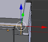
Increasing any kind of threshold in an attempt to reduce ambiguity slows down the workflow because the user then has to position the mouse much more precisely. Notice how in Blender you can select a vertex from halfway across a face?.

Other benefits include the workflow in weight paint and other painting modes. You select faces or bones through the exact same control as you normally would, it is standard between editors. Whereas when you combine action/select onto LMB you need to have a modifier key, ctrl I believe at the moment, in order to select something - This isn’t standard between editors.

I want to take this time to point out that this is particularly a non-standard way of doing things, yet it doesn’t seem to get berated constantly for not following industry norms.

That’s technically not true. The mouse itself wasn’t designed so that you have to use the first button for most functions and only rely on the other buttons for operations that are less commonly used. Its just that everything from the OS to the software in the OS adopts the “first button for most things” convention.

This convention seems to come from old apple computers which only had one mouse button. According to different sources I’ve seen and read in places, the early designs for windows heavily borrowed from interaction designs the Apple OS had in place. I’m going to guess that instead of rethinking how interaction could work using a mouse with more than one button, they chose to just use that extra button as a quick way of accessing the less often used menus.

Take this with a grain of salt, I haven’t personally used either of these versions of these OSes. This is just what I’ve pieced together from different anecdotes on the design of early windows and apple OS. However, at the very least, we can say that if mice were built around most actions using the first button, then the other buttons would probably be smaller/in less prominent positions, or both like the forward and back buttons some mice have.

1 Like

Why would you assume that he only uses right-click select because he got used to it? No one is forced to use that. Since no other program uses right-click for select, everyone is bias against working that way at first. Is it really that hard to imagine that there are advantages to using right-click to select? My opinion here is that using right-click select does represent an improvement when working as long as you don’t mind getting used to it.

Here is a portion of a CG Cookie live stream where Wayne Dixon explains why he uses right-click select:

And here is a video where Sebastian Konig lists a bunch of the other reasons:

I’m not saying we should force everyone to use right-click select because its the best solution, it doesn’t make as much sense when you use a tablet after all. I’m just pointing out that there are legitimate reasons why the 3d view uses it. I’d also like to address blender not consistency using right-click for select everywhere. Blender is like this because it’s only enforcing that rule where there is an advantage. Would you rather be forced to use the right-mouse button on the node editor for the sake of consistency?

I completely understand the argument that it’s harder for beginners as well as pros who have to jump between programs. How does this justify removing right-click select as an option? Even if it isn’t the default selection mode, the option does need to exist.

Well, I forget what book I read it in, but basically the whole point of a mouse at Xerox was to “point at/push” GUI buttons. Typically you’ll use your index finger to do that.

I haven’t seen the design of any of the old xerox computers, but that sounds like they had a single button mouse in mind. I mean, with the modern mouse, I don’t think its fair to say it has an index finger centric design.

Designs that are focused on one button tend to make the extra buttons harder to use. For example, tablet pen buttons are hard to use because they expect you to draw for most interactions.

  1. I’m sorry, was this thread all about you? Are your words or intent supposed to have so much weight behind them that everyone has to snap to attention? I’m sure we all feel absolutely horrid for supposedly glossing over every utterance of yours, and not including your personal beliefs in topic specific responses. I’m sure you realized by now that there was probably a better way to word your dislike for what was said in regards to left mouse click.

That said, I acknowledge you feel differently on the subject and therefore am here to personally give you some validation. Isn’t that wonderful? =) Here is a sticker: :unicorn:

  1. “I want to take this time to point out” that other applications generally offer something similar in fact. You should try them sometime. In Modo for example, just activate the action and drag across the screen, even hold down control to lock an axis into place. Maya lets you trigger the value in the attribute editor before sliding across the viewport, ignoring any said widget. Both, with a hotkey can let you hide said widgets, though It was never really a big issue and thus no one makes a big issue of it.

  2. https://code.blender.org/2018/04/tools-toolbar-and-tool-widgets/

Have a good one and keep it classy!

Xerox Star mouse had two buttons. I don’t know why Apple decided to go with one.

Either way, it’s sort of off-topic. 99.999% of software, everything from Starcraft to File Managers uses LMB to select stuff, LMB+drag to box-select, so on and so forth. I’m for breaking conventions if there is something better, but I don’t consider Blender’s selection paradigm better. It’s so complicated you can’t even put it in a clean chart.

Speaking of Xerox, time to go back through memory lane… Was the right mouse even used heavily back then? Looking back on the interactions, they seemed to have relied more on specific hotkeys. Interesting stuff…

Add: Seems the move to one button for apple was that it was supposed to be “easy to use”, they wanted to keep it simple. https://web.stanford.edu/dept/SUL/sites/mac/primary/interviews/ideo/button.html

Starcraft and much of the RTS genre in general is also an interesting observation, never really thought about it before but in retrospect, they also separated the selection from the action. Only the left mouse was for selection and right mouse being action.

  1. I included a message about the advocated way of making LMB default because it was relevant and related directly to this topic thread. The argument about whether separating action and selection has benefits is less topic-relevant.
    Also, I had quoted the post recently, and the recent set of posts were directly related to my recent set of postings regarding the mouse.

  2. To be honest, I genuinely did not know that. I still maintain that other packages seem to revolve more around the ‘active tool’ style workflows much more than Blender does, and as a result the widget typically plays a much larger part.

  3. I’m not sure what point you’re trying to make by linking this.
    For what it’s worth it seems like for the most part some decent features, and should help users transition from other software packages. the only point of contention is if it hides or makes harder to access any common useful items that were on the toolbar, but the devs are aware of that and I believe they’re working to find a good balance.

After looking at the link, do you still feel point 2 cannot answer point 3? =) They are directly related. The difference is not as drastic as you may think, it was just that the widgets in other applications were never really seen as a problem.

Do the widgets and selection areas in other applications have a smaller activation area than Blender?

I find that often Blender’s widget gets in the way of setting the 3d cursor, I can only imagine it would get in the way similarly for selecting. But I beleive this might be due to the large activation areas they each have. The separation of these into individual modes I suppose solves the 3d cursor issue somewhat, but if you use the new tools, you’re probably still going to be selecting things near the manipulator gizmo while in the ‘move’ tool.

image
In this example, it’s currently difficult if not impossible to select 4 out of 6 of the nearby vertices. This hasn’t changed in 2.8 if you’re in the ‘move’ tool, likely worse if you’re in the ‘transform’ tool.

It’s also possible other software solves the issue by having click->drag activate the manipulator whilst click->release selects the item under it, I’m unsure if this is the case.
But I do know the likely reason Blender doesn’t do that at the moment is because the design principles favour immediate responses and thus shies away from using release events to start operators (thus the latest change to tab and pie menu).

For me personally, I still kept the manipulator on for one reason: Even though I didn’t actively use it, it showed the current local or normal orientation, which is useful. I’m not sure how I’ll handle that in 2.8

In other applications you can still click through and select components, either one by one or with drag select. They also allow you to resize the widget, generally with the + and - keys.

As for Blender, the image you showed you can just toggle the widget on or off, drag select, paint select, or zoom in if the said widget wont select you single select, though I have never had that problem personally. Additionally, I have installed: [Input] Custom Blender Setup | Silo/Maya- esque
Which shows that even with a widget in the way, holding down shift + clicking selects through the widget for the component. Its all possible as Blender stands now.

I doubt it will be a problem with 2.8, such as that the widgets will not be a problem.