Imo, the only weird thing about the active tools is the inclusion of the right click in it’s operations. Everything should be done with the left mouse button only, the right click is totally unnecessary there.
In fact that’s how I’m trying to set up all my active tools to work, and it actually works, with some glitches but works… It would be nice if they fix those issues… Also at the moment we can’t save our active tools custom keys configurations, so it’s hard to play with it.
2 Likes
Campbell removed brush popover in Particle Edit mode. It was repeating the toolbar.
Topbar looks empty in this mode because brushes are very simple and there are really few options.
In fact, some options are not really mode options.
Drawing of particles should move to a popover dedicated to display in this mode.
People were not satisfied by black hair guides. Now, in 2.80, hair guides are colored by their direction.
It is problematic if color is too close to particles material used by children. In that case, contrast is lost between two types of hair particles.
And currently, no weight is visible when weight brush is activated.
So, more display options are needed for this mode.
ShapeCut is a modeling tool.
So, if these things are moved and deflect emitter become a brush option as planned, there are just 3 options that could be fit into left space and be directly accessible from topbar.
In 2.79 or master, you have access to pivot point but you can not left click to place 3D Cursor although a None brush button was created for that. By the way, it was noted that none button was useless and will be removed in 2.80.
In 2.80, you can position 3D Cursor where you want. But pivot point popover was removed.
In 2.79 or master, you can make basic transform operation on selected hair guides : grab, scale, rotate
But also a To Sphere, Shear, Bend.
But in 2.80, it does not work. A simple grab can be a disaster.
But seriously, it would be great to keep this aspect of particles editing and expose transforms as active tools in this mode, too. Being able to make a simple Bend on hair guides. Who does not think that would be a pity to loose that ?
Why they don’t make selection commands (loop/ring etc) as active tools as well?
Like:
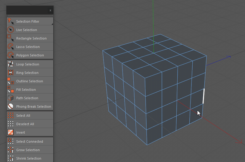
Even without component highlighting, it would be great. ![]()
By the way, while we are at it, path selection is a very interesting concept… blender should have it…
Or blender has it hidden somewhere? ![]()
7 Likes
Yeah, I thought this extrude behaviour was new, since the default is so useless when you have a complex selection. I would normally use alt+s to move along normals after extrude without moving 
I hope the default tool behaviours are also investigated for 2.8.
1 Like
For transform /constraint axis I find it a bit too crowded, I agree with you that this shouldn’t lead to an over simplification of all the settings of tools, because indeed the redo panel is super useful.
Maybe that panel in the 3D view can have essential settings (that are always used) and the F6 panel can all the more occasional settings.
It is called Pick Shortest Path.
Select first element. Then press Ctrl while selecting last element. → Everything is selected in between.
It is not exactly the same thing. Using circle with a small radius does not give same result because perpendicular edges are selected, too.
Campbell did something close in first try of polybuild tool.
As active tool that would make sense.
Circle, Box and Lasso are obvious ones, working in any situation.
In 2.7x, there were some problems to perform some actions with some selections.
So, some action operators were restricted to select mode to force user to make a valid selection for them.
But now, I don’t remember which operator and what kind of selection, exactly.
It looks like loop selection have problems with vertex select mode in 2.8.
There are probably some fixes to provide before giving a try to more additions of select tools to toolbar.
It is solution I would like to see. Currently, redo panel shows the same thing from every way to call it.
Without creation of two different versions, a short one and a long one; it is the same panel, too short or too long, everywhere.
Im in for Loop and Shorterst Path on the Selection side bar icon.
Yeah, it is not.
I’m aware of the shortest path, c4d has this too, but the path selection is much nicer, and there’s no keyboard involved in it, which is great. ![]()
+1000
Selection commands as active tools would be AMAZING… 
1 Like
Ctrl+click on vertex
vs
Move cursor to sidebar
Select “pick shortest path tool”
Click on vertex
I cannot follow your reasoning guys
Please expand
He said no keyboard. We are talking about using the tool with a tablet.
And if you take attention to kind of path demoed , here, to obtain same thing : you have to make more than one Ctrl Click.
It corresponds to 3 or 5. To make them, you will realize same path with your pointer.
So, efficiency is equivalent to other select tool available as active tool.
1 Like
Oohhhh tablet as in touch tablet ! Sorry was not following.
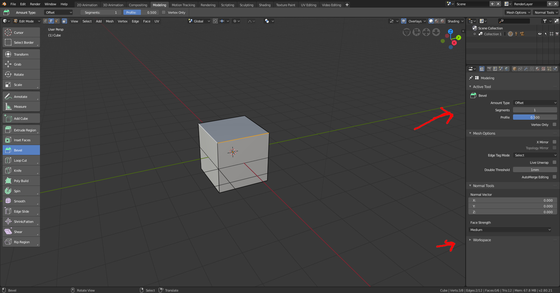
Tool settings in the properties panel. Seems to duplicate what is in the topbar at the moment. Workspace tab was merged with the tool settings. Also edge selection is slightly thicker.
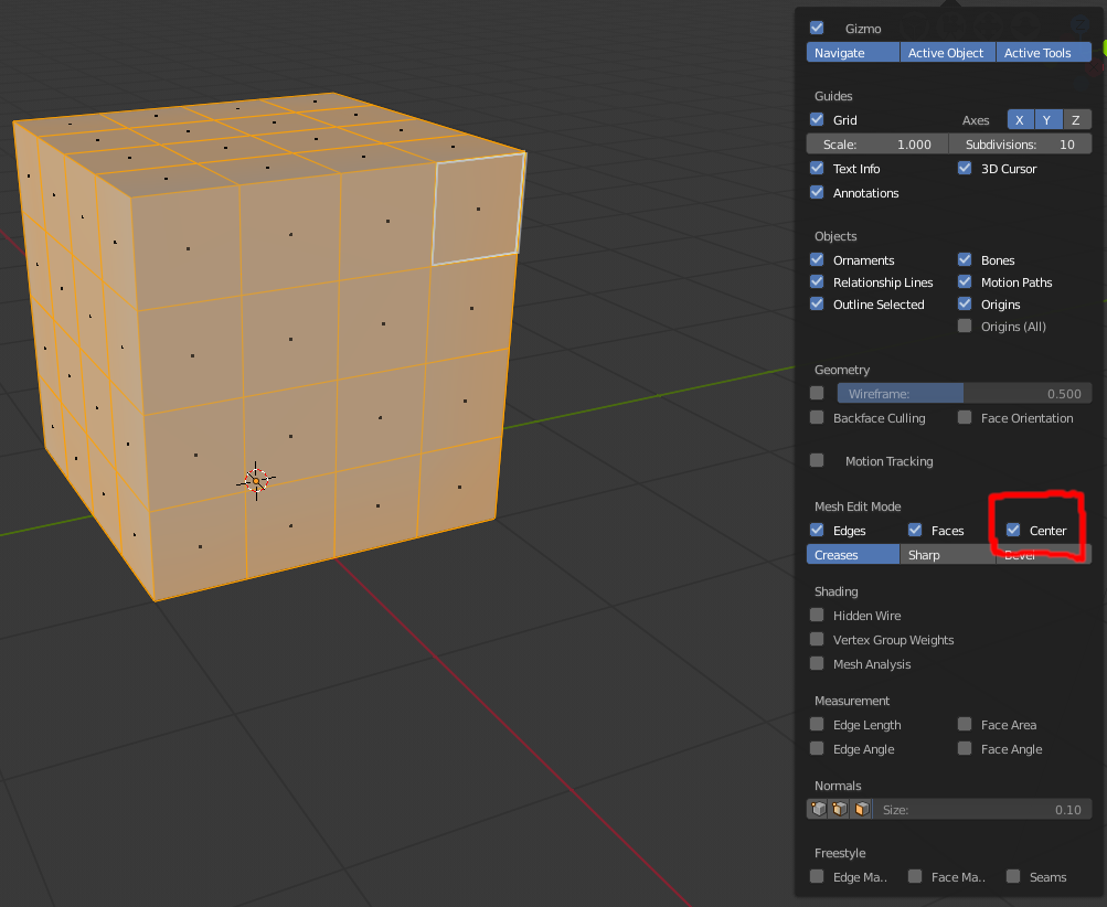
Face Center is now an optional overlay:
2 Likes
Cool stuff…
So that panel that used to pop-up in the bottom left corner of the viewport doesn’t show up anymore, right?
No. Problem is still here.
What you have in this tab is nothing furthermore than what is in topbar : Settings to define modal rules before using the tool.
All settings and options relative to accomplished action (which are more numerous) are still only present in left bottom corner of the viewport.
Hope to see all the settings for each active tool on the right tool panel. Seems like a good place to work.
2 Likes
Seriously? Too bad.
I don’t understand why they like to separate things for no reason. All the tool settings should be available in the properties editor.
1 Like
I am very much in the minority here, but I kind of hate that the are there in the first place the settings for a tool you are using in one editor shouldn’t be appearing in another editor it just seems so disjointed.
This is not just an “another” editor, it’s the Properties Editor, therefore it must display the properties of everything you’re editing. This is how it works in every software, otherwise everything would be a mess.
1 Like
The Right panel is the best place to put all settings for all tools, including addons. Some addons does have a really big interface. If everything stays on one place, everything is consistent. Can’t imagine how bad would be to have a big panel open on the left just for one addon in use.