Make the highway guy’s eyes look at the camera, and, um… make him point at the sign. You should also make the car sound less loud and maybe add some background sound (birds, bugs, the wind?, etc…)
Thank you for the information guys. I will hopefully have another update soon.
I have changed up the sky and added a subtle yellow and blue to the lighting. Let me know how this looks.
Colors are looking much better. I’d suggest you heighten the brightness and contrast of your sky texture. You might also try using a very, very slight mist to create atmospheric perspective.
Here is another update. Lowered the volume on the car and changed up the sky image. I noticed that the striping didn’t come up but that will be easy to fix.
OK! Maybe not as easy as I thought. The striping is there in the object mode, textured in texture mode but when I render it disappears. The only thing I have done different is update to the 2.58. Any suggestions?
I had to delete and redesign to fix, still not sure what happened but oh well.
How do I ad mist ?
The character animation could do with some more movement - nobody can stand completely still, and he seems to be isolating his mouth and eyebrow muscles from the rest of his face.
It’s a lot of effort, but if you’re looking for decent animation, I would suggest you add subtle things like the body swaying slightly, or hands moving around a bit more. maybe he could look at the camera, and smiling is often a big factor in adverts.
It’s coming on well though 
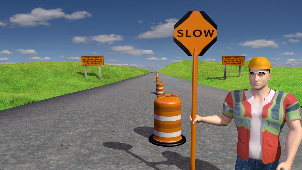
The gesture with his left arm is too slow and the grip he has with his right hand looks a bit odd. Having him look at the car, while somewhat realistic, distracts from the message. It should only be done if it enforces the message (like reminding us that cars are dangerous, if he looks frightened). The shadows could look a lot nicer, if they were a bit soft. Is the sign completely 2d? If so, it should probably be given at bit of thickness.
Here is another update and yes I addressed the movement of my character.
you are doing good progress!
just a note from mine: do not let the eyebrows jump around the whole time he moves the lips.
I used the lip-sync add-on and the eyebrows move with the mouth, in fact the forehead moves and his face also but it is not as noticeable with the hard hat on. If anybody knows how to alter the eyebrow movement let me know.
Here is another update. I have worked on the car some but I still think it still looks to cartoon like but I would like to hear from you guys.
Hello lking,
I have viewed your progress on different versions, and would like to say you have made some great progress.
For advice I would add some wear and tear to the signs, they are often weathered, and worn. I am sure you probably have heard that.
Another thing would be to make one side of the road look under construction, to give a reason for there to be barriers or markers up. Additionally I would add shoulders to the road and put some blended some dirt, loose gravel to the sides.
Highway guy looks a little ridged, I would drive by a construction zone sometime and look at the posture of a high way worker, remember if he has been working all day he may not look like a total couch potato but he will be in a stance which is adapts to fatigue.
Hat looks like it is floating on his head, slow sign looks to stright up and down, and straight on. I understand if you are having trouble modeling the cars, but would suggest colouring various colours so you don’t have the same one with same colour, makes it less obvious that it is the same model going passed.
I know this is a work in progress, so I will leave it there, I think you have made great progress and would like to see you keep at it.
I agree with the above comments. I would like to add that his eyebrows keep going up and down along with hi forehead. That is not realistic. You are doing a great job and have made alot of progress. Keep it up!
First of all, the car. It seems to be driving too close to the center of the road/the guy/all the cones. I’d move it a bit to the left. It also appears to slide sideways more than once. While this would be useful sometimes (parallel parking), it is not realistic. I’ve been referring to the multiple cars as “it” because they all look exactly the same, and follow the exact same path. And also, it seems to be going a bit fast for a one lane road with a flagger with a “slow” sign! Slow it down or throw in a cop for entertainment. On second thought, no, don’t add a cop, it will confuse/distract the viewer, which is not good. Just slow the car down to a good 15mph.
Second, the thing that everybody has been commenting on, the thing that is very difficult: the character, specifically his movement. The eyebrow movement is too prominent, but there’s still not enough elsewhere. The arm movement near the end looks forced and fake. Whenever I see someone standing in one place explaining someone like that, I automatically associate it with Matt Smith playing the Doctor in BBC’s “Doctor Who,” and think “this would be so much better if the Doctor was standing there saying this.” Watch some DW (series 5 (the current one), seasons 5 and 6) online, and pay attention to the times when he’s standing in one place explaining something/telling a story.
Third: the voice. it is flat, bland, and bored. It needs some variation, a voice actor who sounds excited (not overly so, of course). Again, here I think of Matt Smith.
Fourth, the company logo and other information overlay in the top left during the last part is ugly. I don’t watch a whole lot of TV, but get a lot of the video advertisments before a video starts on sites like YouTube. So here’s my suggestion. Starting around 0:15, when he says the company name, cut to a full-screen image of that. And make the web URL a lot bigger. People aren;t always right in front of their TVs/computers, and even up close, that was hard to read in the small video in the BA thread. When he says the company name, cut to the logo(s). When he says “you can visit them online,” fade in (a very, very quick fade) the URL into the image. “Or use their convenient 800 number” fades in (again, very, very quickly) the phone #. Continue showing this until the current time @ which just after the car has passed the road sign on the left (to give some time for the info to be read/sink in), then cut back to the highway guy saying his last line. Keep the contact info small (just text, no background box) in the top left (where you currently have it). Have the car go by after the guy says his line instead of before. Again, this is just my suggestion.
Finally, I agree with Perefim that the road needs to look more under construction. As is, it looks like the highway guy is being a jerk blocking off a perfectly good bit of road. Add in a good hole, and some construction equipment.
TL;DR:
- Car is too fast, too far right, all look same
- Character movement is not good. Watch Matt Smith in “Doctor Who.”
- Voice is monotone, flat, bored. Listen to Matt Smith in “Doctor Who.”
- Company logo and contact info is ugly. actually read that part of the post.
- Road looks in good condition, shouldn’t be under construction. make it look bad/being fixed.
Really like your guardrail. There’s just something about it…
Thanks guys for your information. The idea is that the road has nothing on it (striping, guardrail, signs, etc.) which is why he is on the road. The different elements that show up represent the construction, showing a finished road by the end of the ad (tried to keep it simple and not adding too much detail). I will work on the ad using suggestions that I have gotten here and will post an update. Again, Thank You for your help.
you should have him shift his weight from foot to foot from time to to time, and have him look at the next car before it passes, he seems to turn his head too fast, clouds would be cool, maybe telephone poles, birds in the distance, trees, maybe move the camera slowly and inch or two during the whole shot,
How do I set it up to do cut away scenes or zoom in and out with the camera ,or do I need multiple cameras? If so how do I switch them in the animation frames so that it renders from the multiple angles?