Your main character is way too stiff, make move around abit, even a slight sway will do.
Your main character is also emotionless… I see you already made some shapes for the mouth, add some to his face, 3 or 4 different expressions.
Dont make the eyebrows bounce so much.
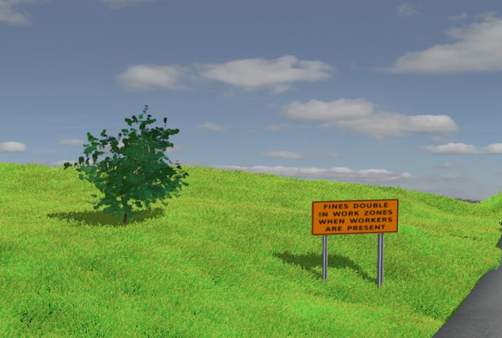
Your composition is off, you have to make a clear focal point, My eyes are drawn more to the stop sign than anything else.
Your grass isn’t bad, but it can be way better… Check blenderguru, Andrew has made some nice grass tutorials.
Add more to the background, things that make a balance, but dont lead the eye away from the character, like trees.
Your logo is very badly placed, when you make it appear, it should be the new focal point, such as in the middle of the screen.
Apparently nobody reads the posts and the questions that I have asked so I will ask them again.
I used the lip-sync and papagaya to do the mouth movements. The eyebrows, forehead and face all move when he talks but the eyebrows are the most noticeable. How do I fix it?
Everybody tells me to do some cut-away scenes. I know how to move the camera but how do you set it up to zoom in and out with the specific frames? Do I need more than 1 camera, and if so how do I get it to switch between them during rendering? The tutorials I have found only show how to move the camera along a track.
The character does move but apparently not enough because nobody notices it but me, so I will work on that. I agree that the background needs some trees and I’m currently working on that. I have changed up the cars so that it’s not the same car every time.I will hopefully have an update soon.
I unfortunately have never used papagaya, So I wouldn’t know… I recommend a more direct approach to your lip syncing, such as custom phonemes using shapes.
The easiest way to do this is to set a key frame, go up just one frame and move the camera to where you want, and set another keyframe, so the camera moves in just one frame, almost like a switch.
I went to the site mentioned in that video, and it just might be the ugliest website I’ve ever seen.
Yellow text on a gray, tiled background is probably what causes the most eye strain.
You need to redo your site if you want any visitors.
Which web site? The www.timestriping.com is for our contractors and shows what the company offers. The www.timesignsmfg.com is our sales website that handles most of our traffic for purchases. The older web site (timestriping) is going to be overhauled in the future.
Now, how does the ad look? What else could be improved? Any suggestions on the ad?
I have added a tree using the tutorial by David Ward on Blender Cookie (Manual “tree from curves plugin”). Let me know what you guys think. I will work on adding some emotion to the main character and thinning out the eyebrows (at least I finally got them to stop jumping around with the talking). Thank again to all who have helped me here.
Ok first of all i want to say that it is looking very good, the light and modelling look great! About the animation, the first thing i noticed during your last update was that you had his hand moving along the pole but the pole wasn’t moving, and it looked really weird. Also the pole turned without his hand moving, which also looked unnatural. Finally, instead of just having the logo appear, i would add an animation to it
The flagger pole does move slightly ( when his hand goes up the pole leans to the right and back to the left when his hand goes down) and I have been in his shoes. I used to work on the road crews and spent many hours flagging traffic. When your out on the road the slightest breeze or a car going by will make the paddle turn unless you have a death grip on the pole.
What kind of animation would you add to the logo? I know some people don’t like the gradient on the logo, but it is the company logo and I have to use what they use.
What kind of animation would you add to the logo? I know some people don’t like the gradient on the logo, but it is the company logo and I have to use what they use.
But that’s not your problem, as long as you mention it to them, then there’s nothing you can do
For the expression and emotion, a quick tip I just remembered is that IT’S IN THE EYES!
Forget similing and frowning, concentrate on his eyes and cheeks.
Good luck.