Albedo value of snow - How to get 80% white in Blender

On the wiki pages, (and heard before) I see the snow has an albedo value of 80% white.
What is 80%?
I can set my R, G and B values each to 0.8
And if I check then what the Value is (as in HSV) than I see it’s 0.906332
And if I put the value (as in HSV) on 0.8 instead, all the R,G and B values are each 0.603827.

I remember @troy_s suggested to get mid-grey, to give in 0.18 for each R, G and B value. So that is mid-grey. When I look then to the Value (HSV) is shows: 0.461356. So that doesn’t give me a clue on how to get an albedo value of 80% white in Blender either, I think.

Any Idea?

Albedo of 80% means it reflects 80% of the energy that it recives. It’s a physical property and Im not sure if it is even used like that in CG.
I might be wrong though…

Remember that when you set a color in the shader editor it is in RGB color mode. and if you want to have a realistic render you shouldn’t use RGB color management. So it’s even more complicated then that.

1 Like

I did and I’d forward that with a huge caveat.

Having done a bit of drilling into albedos over the years, the source information datasets are rarely if ever, coupled with information on how they are derived.

I would echo @jerzygorskiart’s point that albedos are radiometric ratio measurements ultimately. Using a photometric approach as luminance is dead wrong in this instance, and therefore would counter what I have outlined. Sadly, the various values available online aren’t exactly ideal nor clear in terms of derivations. Some game / 3D folks can be found to use photometric approaches from cameras, for example.

  1. The RGB model is already not entirely radiance based, given it is anchored on the CIE XYZ model.
  2. Albedo datasets are notoriously flakey. Did the author use a converted to greyscale approach to derive the data or some sort of radiometric measurement system?
  3. When considering radiometric ratios of visible light, it is extremely challenging to consider the entire visible light range and bake it down to a single percentage value.

Given the above limitations, I believe:

  1. If the albedo value is based on a photometric value such as a conversion from greyscale, the photometric luminance approach is the derivation. Albedos shouldn’t be based on photometric values, but here we are.
  2. If the albedo value is based on radiometric values, then the most appropriate value is likely an average of the RGB radiometric-like linear data ratios.

I wish there was a cleaner answer, but I don’t believe there is.

The HSV picker is garbage. When applying albedos, the only proper input is the linearized RGB input.

1 Like

Thanks @jerzygorskiart and @troy_s

So an attempt to start with plausible albedo values as reference designing materials and build the rest of the scene is not that easy. First, the available data is not reliable and some other caveats related to (conversion of) color models. (well, that later one is a bit above my head so far).

The reason I am looking for plausible albedo values is that I need some reference. So far, mid grey and false color is the only reference I have. Before filmic, I was not aware of plausible albedo values and all my materials had a higher albedo value. The result was, that the ratio between albedo value and specularity (I mean the specularity slider in the Principled BSDF, for example) was different than it is now (I use lower albedo values nowadays). So that means that at that moment I suddenly saw my materials having way more specularity (very glossy, not sure what is the scientific term). And that also means that when I render something out, it had a more washed out look.(unless using metal), because specular reflections are colorless, or white.
And there are more reasons my render often look washed out:

  • I like to use DOF, doesn’t that blur the colors, and therefore make it look more washed out (greyish)?
  • Somehow I am scared of using (over)saturated colors and don’t go quickly above the 0.8 saturation (as in the buggy HSV picker, ahem). Maybe I’ve seen it on a TV a few times watching sport-news: for example when someone wears a red cap, so saturated that there were no details to see. So that’s why I am a bit scared of using pure red for example. Scared to loose details later in the pipeline.
  • I also use Filmic. Tried one time to go back to Default view and immediately decided to go back to Filmic again. Owh my, how I realised that moment that Filmic is much better. But… I think after a render, I need to post-process elsewhere, namely the Levels (you know that tool we see in most editors, well I use Gimp then, but I suppose Level is ok for when you want to post your render on the internet like Twitter). And when adjusting the exposure in Blender (render tab), I think I better not go above the highest line in the scope > Waveform (I know, probably also broken, but it gives me a little bit off reference: I don’t trust enough my own eyes sometimes). Or maybe even better: half way that wavescope. This because the higher I go, the more the highlights get compressed and desauturated which contributes also to the washed out effect.
  • I have the idea that there is more that contributes to to the washed out effect in Blender but I didn’t figure it out yet. Maybe it is the Filter Size in the Render TAB > Film > Filter Size.
  • I discovered that if you have a red carpet and shine a cyan light on it, you can get grey if you do it well. So there is then also the art of choosing the right colors and right color for light.
  • Sometimes I like to use mist/fog and that could contribute to a greyish or washed out render.
    So all those things together, that is almost a grey result, sometimes.

To show what I mean, here is a very typical render from me. (not post processed).


So actually it’s all about: how do I get crispy, bold, vivid renders.

So far I think would be good for us if there was a way to check if our albedo values more or less plausible. I bet that many user try to compensate it with adjusting strength of lights, and that affect all other kinds of other ratios.

Same way you do when photographing a relatively dull apple i.e. You make the scene interesting. You adjust the lighting as best you can if you can. You frame it. You take the photograph. Then you process it; initial sharpening, tone curving, tone mapping, apply filters, color adjustments, sharpen for delivery media. Filmic replaces tone mapping but looses saturation in the high end - however it is a no brainer no effort to use. Cameras only record the raw data the sensor sees, but the usual method to bring back details “lost” to exposure is to tonemap it. Sometimes this “lost” data is actually lost and cannot be recovered. Filmic doesn’t have this issue (at reasonable levels), but “suffers” saturation loss like old film cameras. You don’t get the noise associated with excessive exposures though.

1 Like

@CarlG
Ah yes, you are adjusting my expectations now a bit. So post process is (absolutely) necessary. Most of the time I was to lazy and tried it in blender’s compositor, but that is not possible unless you load the render back in and then use default view (talking here about rendering for social media, internet, webpages, not scene refered space or .exr files).

Well, actually now I think of it. Post process in scene refered space might be very interesting if you have enough data. I could change the color of light afterwards, and all kind of things. Well, up to the next stage then.

But still, I wonder how to get a reference point of a green leaf.

  • I look up the albedo values of which I don’t know how they got that data.: wiki: Meadows, between 10 and 20% albedo reflection
  • load a texture of a leaf, plug it in to the color socket nah.
  • load an HDRI, try to find out where the camera was and find a leaf in area where there is same amount of light?
  • Just look at my screen (which is not calibrated, and my brain is playing with me since I just came from the bathroom with blue tiles) and get a default scene, put the light on 50W in a room of 5 by 5 and adjust the albedo and compare it with a leaf on my desk?
  • I use the grey card with false color so I know at least what is middle grey and use that as reference point to adjust my green leaf.

This because if my green leaf is to much off, then the rest is also messed up.
It feels a bit I am lost in reality with no reference.

I apologize for the length of this post. It’s longer than I’d prefer, but given the folks involved, I’m sure that the shreds of what I’ve reiterated elsewhere would probably gain from being collected specifically here, with the hope that some folks reading might be able to elevate their control over otherwise slippery software / application interfaces / nightmare confusion.

Bear in mind that the idea of “middle grey” is the connection between the radiometric-like quantities of light and some sort of “fully adapted” thing. That is, if we stare at a display with a block on the right that is emitting 100% sRGB R=G=B light, and a block on the left emitting 0%, 0%, 0% light, a value in the “middle of the two” is approximately 18-20% emission in radiometric terms from the display.

That is, it’s an anchor that is the only viable one, as the upper and lower ranges within the scene can vary tremendously.

Takeaways:

  1. Displays output radiometric light ratios. Always.
  2. “Middle grey” is a photometric evaluation of light. That is, fully adapted, it “appears” halfway between the maximum and minimum adapted values, but in radiometric terms, the display would be outputting 18-20% emission.
  3. “Middle grey” is not 50% of the display’s emission for this reason, and 50% radiometric albedo is radically different than "halfway light between the maximum and minimum output of you display.

Phew. Moving along…

Mixing pixels depends on the pixels around them. If you mix a very high intensity with a very low intensity, the result will be somewhere between them, but relative to other pixels around that result, the contrast may increase or decrease depending on what the value is around it! More on that below.

Nuanced observation! This is likely due to gamut mapping mishandling from a camera. More on that below. Your willingness to “hold back” is absolutely wise, as hopefully I can clarify below.

Remember, I described it back in 2016 as a “desaturation” as that was language that at the time made the most sense in my mind. It has always been a gamut mapping approach. The Filmic in Blender is not “just a tone map”, but actually a gamut map. More on that below.

This is a fundamental element of the RGB encoding model. The opposite mixtures of any of the primaries will pull the value towards the achromatic axis in a well defined RGB colour space, of which sRGB is one. That means that mixing purely saturated sRGB green and blue will pull the sRGB red value directly toward the achromatic point.

Believe it or not these sorts of issues have been around forever. For example, in the oldschool bleach bypass processing, the result was exceptionally contrasty, and as a result, when lighting, people had to hold back and account for such. Same applies in the opposite direction with things that decrease contrast.

Performing grading on scene referred ratios is mandatory to emulate how light transport would behave. There are some exceptionally rare edge cases where display linear manipulations are required. I can expand on this if anyone is at all interested, as it’s probably another long-ish exploration.

See above. Keep a clear distinction between the photometric domain of what we process in our magical psychophysical systems and the radiometric domain that is the stimulation of that process.

It’s actually a gamut question ultimately.

It’s wise to evaluate what the RGB in practical terms. For example, an sRGB-like device is useful.

If we fire three equal energy sRGB lights onto an albedo, and the albedo is 0%, 0%, 100%, the blue channel will reflect back what the energy is. But what happens when that energy escapes the gamut volume of the output device? Answer - it just sits there as the most intense blue. So there’s a cognitive “reading” of imagery involved; the blue just sitting at the exact same display referred output intensity because that’s the limit of the output gamut volume.

Likewise, if we have a ratio of lights, such as 0%, 50%, and 100%, now we have another gamut volume problem. As we increase the intensity of the three equal energy sRGB lights we fire into the scene, what happens when our input energy exceeds the display’s gamut volume? The answer is that our ratios skew; we lose the intention of the original scene values, and eventually the complete wrong mixture results where the sRGB display outputs 0%, 100%, 100% emission, utterly detached from the original albedo ratios of 0%, 50%, 100% reflectance. Our tealy-blue abedo here has skewed into a nasty cyan!

So gamut mapping, in the most clearest of terms is not an optional thing. The difference in volumes must be accounted for, and the output value transformed in an attempt to maintain the intention of the scene’s radiometric-like ratios. Do you expect to see the cyan or something closer to the intention in the albedo value? What about heavily saturated and hugely intense light sources? Imagine a hugely bright red or green or blue or magenta light beam. Would we expect that light beam to remain “stuck” at full intensity on the display or skew wildly or something else? I can’t believe I am about to do this, but in the interest of gamut mapping logic…

In order to hit your target, you’ll need to define what those meaningless words mean, in practical pixel concepts, as a starting point. What does “crispy” mean? Contrast? If so, think about what contrast means.

In the simplest case, there are two things that are readily controllable:

  1. Exposure
  2. Contrast

In the radiometric-like domain, exposure is a multiplication of intensities, so the values move away from or towards zero. Contrast on the other hand, in the most simplest case, can be described as pushing values away from or toward each other.

In both cases, as we push values away or toward, the overall intensities may collapse well under or well over the display / output gamut volume. This means that both exposure and contrast come with trade-offs; we can’t expect to keep the values in the gamut volume of the output device if we increase them, and if we collapse them too far we can also derive some image problems.

Phew. Ok enough for now. Hope that someone has pulled something useful out of this huge spew of bullshit.

3 Likes

Usally the today PBR workflow textures contains diffuse color Albedos.The Quixel megascans as example takeing Fotos from materials with crosspolarization,to get the diffuse Material color without reflection.The reason for this is,that you want your own Specular or Fresnel reflection based on the view angle and lighting in the scene and renderengine.This way your material is not baked with the reflection if that makes sence.

1 Like

If you are seeking truth in pixels and wanting to have control over what goes into your monitor, it’s a good idea to take control of what comes out of it.
It’s harder to get good contrast in a render if the monitor output is flat, or too dark or over saturated.

Having said that, the render you posted already looks like a decent starting point for post processing.

1 Like

Most folks are well aware of this.

This does absolutely nothing to describe the problem of finding a singular albedo value off of a chart out in the wild, and to try and determine how it was derived. Some folks have made charts that do not fully explain how the values were derived, hence it is unknown if they are using photometric or radiometric approaches.

@pixelgrip
I heard about it once, but probably didn’t pay further attention to it because of limited budget here. (Hopefully Quixel Megascans will make some charts in the future with an explanation on how it is derived. Then there we have a chart, just something to hold on to.

But in case you ever download a texture of their grass, I am curious if an RGB value of 0.049638, 0.066802, 0.008109 is way off or not. And then I mean waaaaay. (Should those values not around 0.1 and 0.2 instead, or 0.4 maybe?).
To get those numbers, I Just looked at my screen, and playing with the color wheel, picking those numbers. I think that must be close. But as I see those values here now, they look ridiculous low. Is that not nearly black? Maybe something wrong with my exposure, strength of light, or my monitor.

I know it’s not that simple as that, because a leaf has darker and lighter part, and which part exactly are you going to choose, etc. But this morning we had our kitchen filled with different kind of plants from our green-house and I noticed that overall the leaves had mainly the same color. It was like I saw one particular green coming from all those different plants. I don’t need very precise numbers, just need to know if I am not playing with ridiculous values.

After picking those values,I tried a new addon (just few minutes ago) that has lights with lumens instead of watts. Instead that it revealed things, I lost now any point of reference completely:
Loading a 5,000 lm LED Car Headlight and an my green leaf two meters away from the light, with an exposure of 0 gives me this:
carlight

I created my grass (nice block) in my usual light setup of which I think that it is quite a good reference point: (if it looks well, it will look elsewhere good as wel, is what I hope). Here the same leaf:
Usuallightsetup

I can also adjust the exposure until I see the green I wanted to see, but that doesn’t really help. Someone else will then load the material and have completely other results.

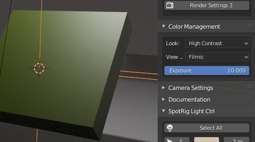
What the heck, here I had to set my exposure on 10!
And the light is a 240,000 lm Stage HID Spotlight IES
Look at the exposure setting here:
exposure10.PNG
That light is 4 meters above the object. (the same leaf).

This can’t be correct, at the default exposure (0) or on 1 the light is not visible anywhere, not even when touching nearly a surface.

So, yeah, I don’t have a clue at the moment what RGB values I have to give my leaf. (some where around 0.05 and 0.5)

It’s not about very precise numbers, just need some reference. Like: how many Earths could fit inside the sun? Fifty maybe, Two hundred? Thousand? Ten thousand then. Well it seems to be one million times.

depends also of the type of leaves!
yours look like a pure diffuse green and no gloss !

did you look at a specific leave or just made up ?

happy cl

ehj? I am talking about plausible albedo values.
Update: Ah, I see the confusion and updated my text to “we had our kitchen filled with different kind of plants from our green-house and I noticed that overall the leaves had mainly the same color”
(I don’t need specifically the color of a leaf, can be anything that is useful).

as i remember there is no albido as such in blender
so this has to be converted to something blender can understand

but there are ways to get that diffuse type

see these

https://blender.stackexchange.com/questions/58482/what-is-albedo-and-how-to-use-it-and-how-to-prepare-materials-for-games

happy cl

Oh great thanks.
I just think I am lost, not only in Blender, but completely disconnected from everything now.
It’s ok, just a matter of keep on breathing and let the thoughts come and go.

For those looking for an albedo value for grass: the following values are not ridiculous and can be a starting point:
R: 0.018786
G: 0.037145
B: 0.005787

So my initial thougth was not so very bad:
R: 0.049638
G: 0.066802
B: 0.008109
I mean, it’s not around 0.5 or so.

And the addon with lumens didn’t play nice with EEVEE at that moment.
On the left what I thought , on the right the values from a source I believe he did more research than I did:
grasscompare
Ofcourse a render doesn’t say much about albedo values, but shows a bit how far I am off from guessing. So I guessed a bit to bright but thats ok.(younger leaves I had in mind).

And below albedo values from a chart I found a few months earlier, which is indeed waaaay off:
grasscompare2

It works like in Cycles Base color in the principled shader.The diffuse albedo is just this…the diffuse color of the material without reflection.Brecht sayed in this Blender Developer talk (what RickyBlender posted) ,color passes are diffuse albedo.

Here the maps explaned from quixel

exactly,there are dark green grass , dry grass and average green looking grass ect. Like in real there is not only one green for plants and grass.

here a video about snow material within quixel mixer, with material form the library as start.

The lighting in Eevee especially the light intensitys can looking very different vs in Cyles.For PBR i would start in Cycles to get the PBR light setup for the materials as good as you can get,then you could try to fit the light intensitys in Eevee from your Cycles setup.

here a topic about the lighting differences in Eevee vs Cycles.(keep in mind, maybe something was patched in the meantime)

edit,The albedo charts in the net are not far off, as you may think.Ofcourse, if its not explaned how they get the data, you can only assume.But…if the Albedos are from perpendicular taken fotoshots(in the same angel the light came from, or very diffuse light conditions),then the F0 reflection of dielectric materials are only around 2-4% added to the diffues albedo.

For example if fresh snow has a albedo of 85% then you can substract roughly 3% for the reflection.because snow is made of water ice crystals,and they have a F0 reflection of around 2-3%

1 Like

I was mostly about how it relates similarly to real world exposure using film vs digital:

Which addon? The one I tried did an automatic conversion on insert when used with Eevee (also color temperature was converted to color instead of a node). But I don’t use Eevee so I never really tested it.

I don’t use quixel, what kind of grass model is it? Grass is a crazy test case, as translucency is part of the mix, and maybe comparing flat representation of a grass field to real geometric grass - where the former will always be “brighter” due to flat specular reflection of light. Also, albedos are reference ratios, not hard values. Grass species, where in the life cycle, cut or wild, humid or arid, healthy or sick - those things matter for getting an absolute value. Think of PBR as a guideline to setting up materials in correct relation to each other in a way that lighting doesn’t matter - only exposure, and it will by magic “look right”. Nothing prevents you from adding artistic nuance to it. Compared to earlier when we might use “bright bricks” texture for indoor use and it would fail to work properly in outdoor lighting and a separate texture was needed. So with PBR, snow, grass, and bright bricks work together no matter the lighting.

1 Like

Thanks for all the engagement here.
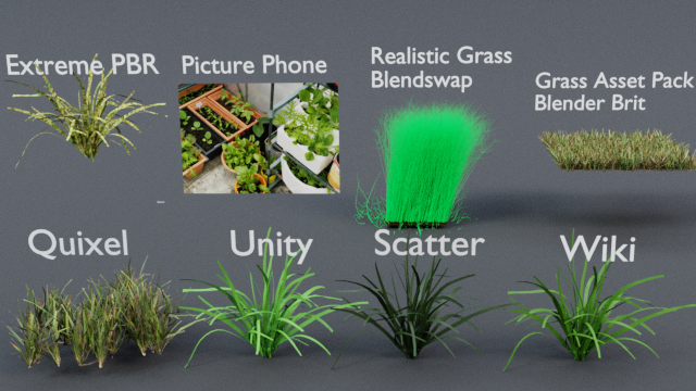
So I bought a Quixel Megascans subscription. Then made a comparison of all kinds of grass products:
BA_GrassCompare

So what we see here.
The variety of albedo values over the products is to huge. Scatter is a good addon and no-one complaint that it’s grass is overall to dark. If we don’t mind the Realistic Grass from Blendswap for a while, its a bit better, but still the variety is to big.

Of course we have leaves from different plants, and in autumn they can turn red, and if they die then get brown. I worked in an ecological farm for 3 years, doing some research about herbs. Look at my picture from the phone. There are different plants, and yes some have dark leaves etc, but overall you see quite the same value.

Simply, the variety of albedo values for grass I find on the internet is to huge. And why is that? That is because we have no reference. What is a light of 50 watt for example? Blender documentation says:

“Power of the light in Watts. Higher values increase the intensity of the light. Negative values can be set, but should be avoided for predictable and physically based result.”

Ok, and what is Watts? Wiki: The watt is a method of measuring the rate of energy transfer of an appliance.

And if you read: https://blendermarket.com/products/extra-lights its getting more interesting.

So we are completely lost.