I was trying to make a stylized version of the seashore, without using any fluid sims. This is what I came up with!
I was trying to make a stylized version of the seashore, without using any fluid sims. This is what I came up with!
Hello !
This is great !
I’m not 100% sold on the rendering, but the dynamic of the water looks quite convincing !
Any chances that you can share a bit of the process and maybe a wireframe animation if that makes sense ?
Well done !
Hey!
Thanks for your reaction and feedback!
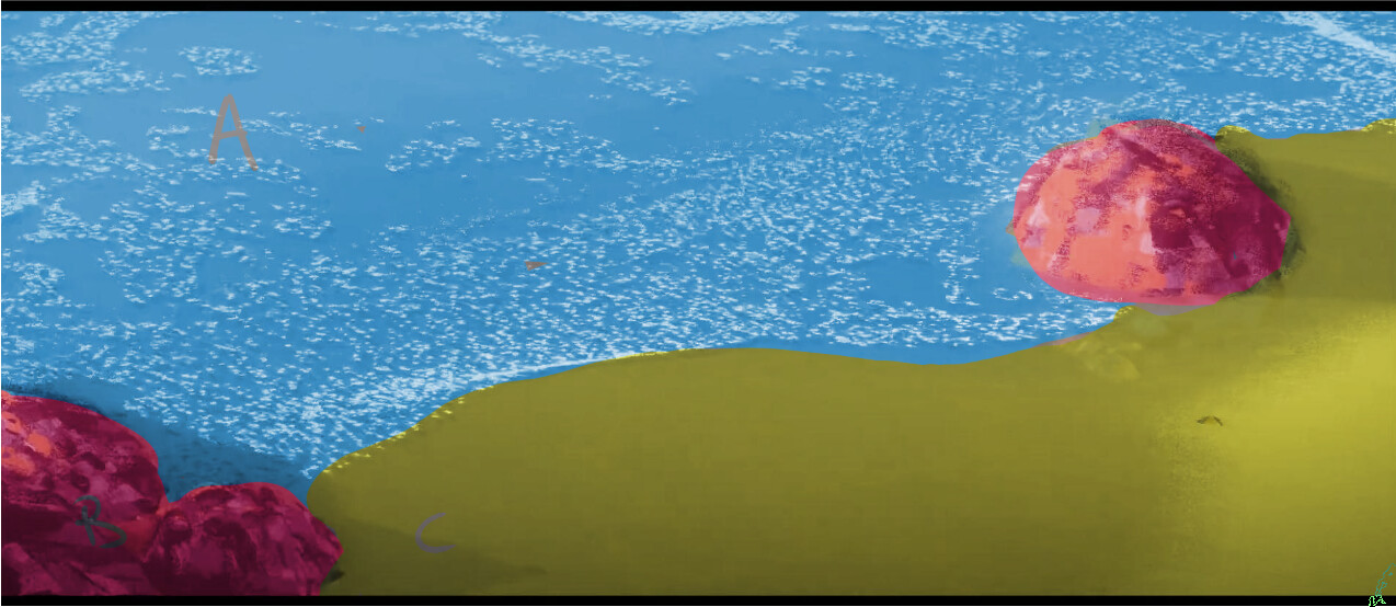
Here’s a non-shaded render of the piece:

For the water I’ve added a bunch of points on a face with geonodes, made them go in a sea-like movement by using a sin wave, and used noise to distort it afterwards. Then, in shading, I’ve added an animated cloud texture to get a few more “holes” in the foam to make it look a bit more sparse.
The rocks are a bunch of points distributed over simple geo also, with the seed of the points animated.
Just like with the water, these points are instanced with planes, which in shading has a black and white stroke texture for their alpha.
I’ve used dynamic paint for the wetmap, to both have the sand change colour and have the sand reflect the stone more when it’s wet.
For motion blur I’ve rendered the vector pass in Cycles (because Eevee does not support it). In the compositor I’ve multiplied the vector pass with a noise texture before using it with the vector blur node, with the eevee render as an input. This way the motion blur becomes stylized also.
Again, thanks for commenting, which part of the render are you not sold on?
Cheers!
Ah and in some geometry nodes I’ve used the geometry proximity node to make the points behave differently when they’re close to the rock!
Thanks a lot for your answer !
It’s quite interesting, TBH I’m currently looking into how to make a stylized sea-shore myself and I’m a bit stuck about how to do it, it’s always inspiring to see other’s ideas !
About the overall style, there are a lot of good ideas, it probably needs a bit of polish, here are a few things that comes to mind.
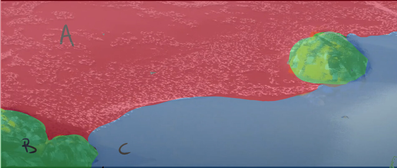
1/ Currently there are different style within the image, each with their own rules :
A is more realistic, the white dots looks like tiny brush strokes, but these you don’t find in B and C.
And C is a very flat surface without any details or “strokes”.
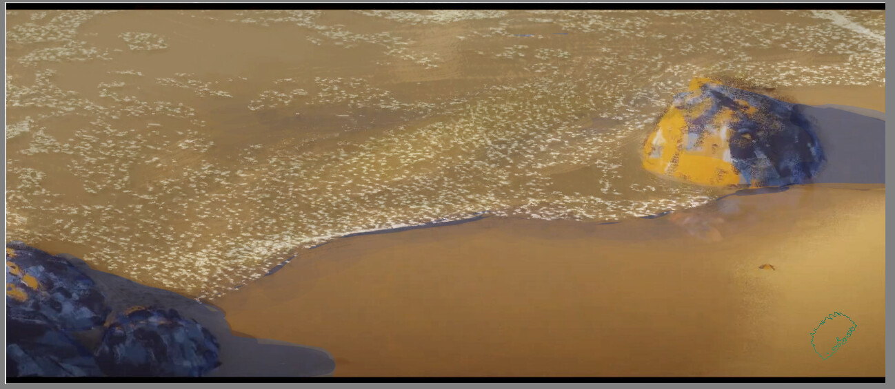
I did a little test by trying to match the colors from the rocks everywhere else :
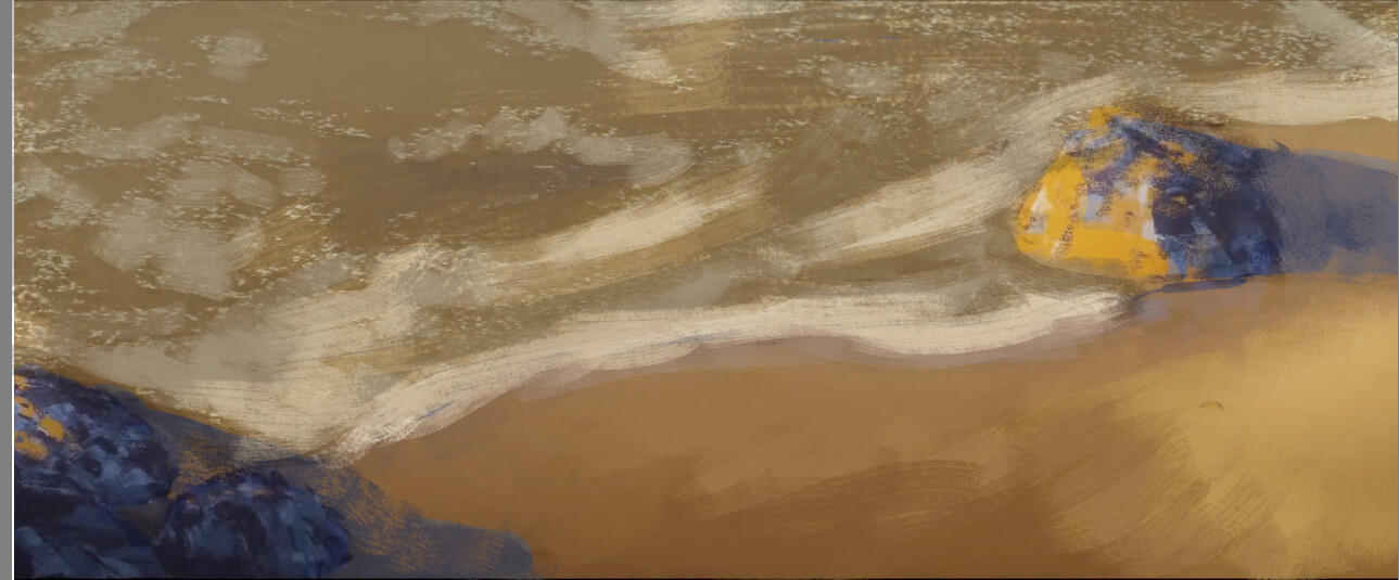
This is another test where I tried to put brush strokes everywhere :
Basically, if you can write down the rules that dictates the visual style, then it’s easier and therefore you can make sure the same rules apply to everything.
It’s also possible to have different elements get different rules as a rule, if that’s the case you might need to exaggerate things more.
Hope that helps, maybe try to get different feedback and if a comment comes back several times then it’s probably worth looking into it !
Thanks for your detailed answer! I much appreciate it.
Though I do like the clash of styles, I agree with you that it does not feel unified enough. I really like what you did with the first test, matching the colours of the beach more to the colours of the rocks. When I have some time on my hands I will try and see if I can match the colours in the scene as you did. I’ll post an update if your interested ![]() Also, adding some subtle paint strokes in the beach texture might do the trick!
Also, adding some subtle paint strokes in the beach texture might do the trick!
I’m working on a new film with loads of beach shots, so still figuring out what would be best visually. All feedback is great!
I’d love to see your take on the subject, are you using FLIP fluids?
Cheers!
All the rendering style questions put aside, I like the water & whitewater movement a lot, it is pretty convincing, at least from that distance. Any kind of trick to avoid full simulation is great, and this one, I guess, is the best I have seen so far.
Indeed some variations might be really cool, I think as long as there are little hooks between each styles it should work better.
Don’t hesitate to post updates it’s always cool to see how it evolves !
I’m not using simulations, it’s just like you : shader tricks and geometry nodes.
For now I’m more into waves and I left the shore aside. The technique I use is very similar to ( and a bit inspired by) this : Crashing Wave Rig
It’s part of a commercial project so I won’t be able to share stuff until it’s released, but I hope I would be allowed to share some breakdown since it’s quite complex and it’s hard to find a lot of examples of stylized water.
Ah sick! That looks really interesting, gonna delve into that also.
Looking forward to seeing your take!
Thius might be of use to you. Its a gumroad listing from a blender user who is pretty good at geometry nodes. https://nuggetblends.gumroad.com/l/xJuXcl?layout=profile
Damn that looks great, exactly what I’m looking for. Thanks for the suggestion!
I featured you on BlenderNation, have a great weekend!