Totally agree! I’m one of the fastest modellers in my office… I just use the standard ctrl e ctrl v ctrl f and w menus with things like extrude, bevel, knife, inset etc as direct shortcuts. I also switch between blender, maya, max, zbrush, substance painter/designer and in house tools/ game engines. (though blender is my favourite) They all navigate differently and have different shortcuts etc. Knowing where to find stuff is greater than muscle memory everytime and looking never slowed me down. I’m liking 2.5 as it’s already looking tidier for where to find stuff
zbrush is a total pain with it’s chording and shortcut key combo orders… you can be fast with muscle memory but it goes quickly whenever you spend time in another app
Sure, it works - it’s just not as smooth as it could be. I made my own menus and I am pretty happy with them, but agree it would be nice to have them by default.
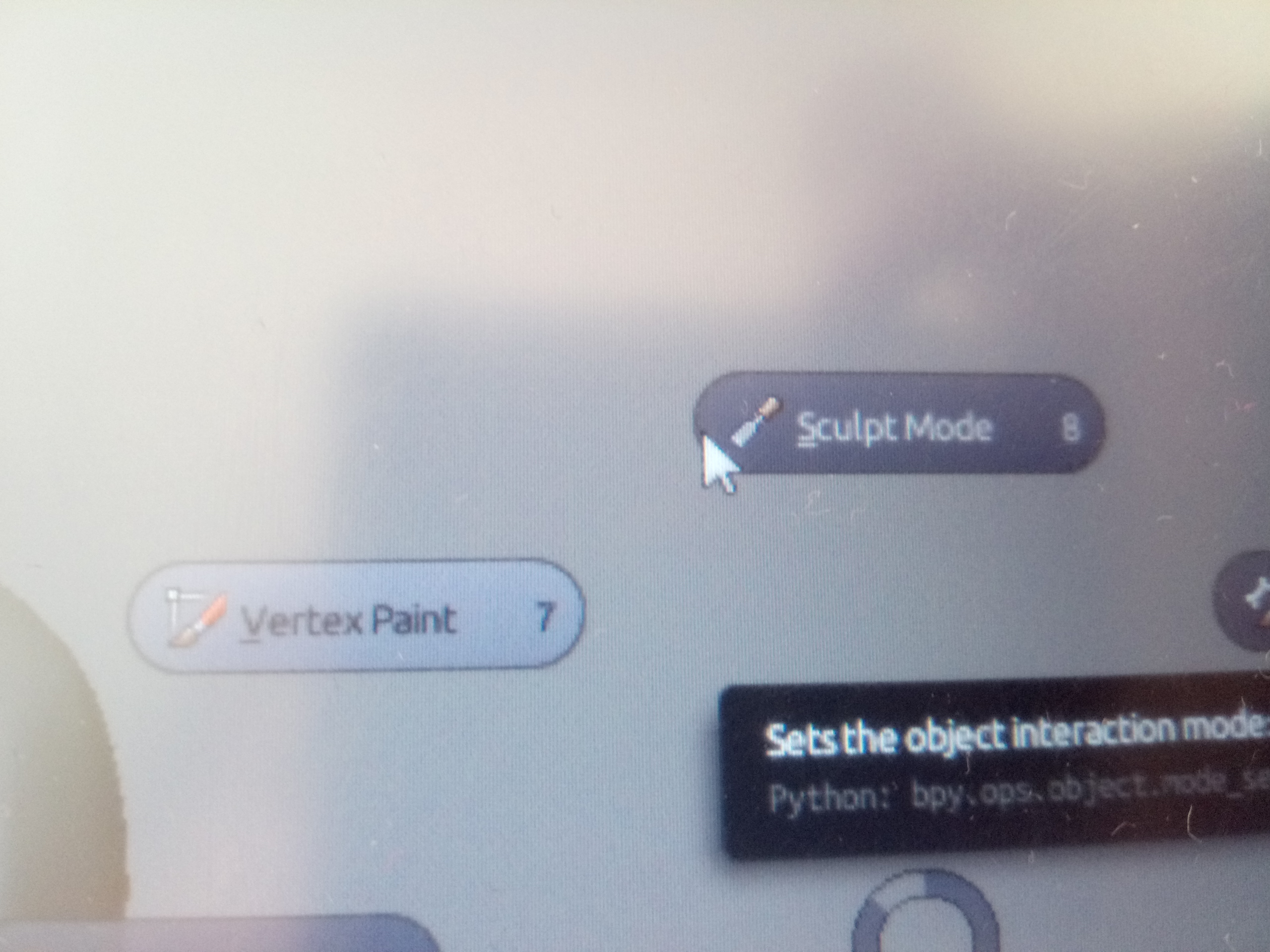
And pie in blender are not pies, but big square buttons, it can select wrong thing. Ex - mode pie, i select scult, it selects vertex paint, despite cursor being on the edge of sculpt button. Hope they change it already
I wondered about this also. If you look under branches, you will see there’s one for each release of 2.79. I would think they would make a final 2.79 branch, before 2.8 becomes master.
I tested it and I wasn’t happy about it at first, but I think that was just because I was used to Maya’s way. In reality it’s just a slightly slower motion, but I think it can be really comfortable when one unlearns Maya’s way and get’'s used to that. I want to explore this further I think this might be a magical way to be super fast.
I don’t disagree, but i don’t like the gestures in maya they can be annoying… it’s personal. I don’t like pies either. not saying gestures shouldn’t be implemented but its no panacea.
there is a lot of feature request overload here though when clearly the new ideas and systems are only 10%-20% DONE.
Hmmm not sure what you mean by that ? One issue I have with pies is that they’re blocked by the window edge, so that if you spawn one close to it it will immediately close (having selected something). Is this what you are talking about ?
I thinks its not finished jet, but also very difficult to deside in which viewport it should be. But you can disable it in viewports you dont want the toolbars.
Yes, I will hide everything ^^
I was just wondering since the top bar is made in this way.
I would prefer to place the tools in the top bar and maybe at the end it’s what they will do.
I like how they did it, because the big toolbars on top are annoying and use a lot of space. Also the tool settings on top are a good choice, much better then before. I think it will work good for a lot of people.
I personally use your piemenues since i started blender 1 1/2 years ago, and will hope that you will update them ;). Cant work without them anymore.
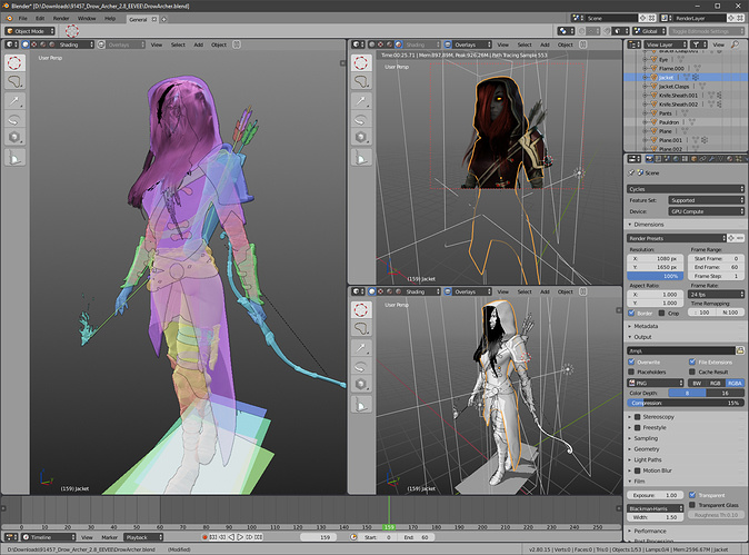
Tried the last Windows build of 2.8 and I’m liking the new interface… BUT… this section here is really crowded and need some work. Also, tool/command settings are almost hidden.