Yeah that’s it, thx I’ll note this down.
Perhaps this could be added to the join/ split menu somehow?
Discoverability seems to be an issue
Be more precise if you want changes in Blender, because what you are writing people are reading it and if a developer reads this, he cannot really help.
There are people using Blender 2.8 in production, this leads us to the question what is your workflow, what kind of production you are dealing with?
How heavy is it and how slow is? since you are transferring your work from 2.7, is it the first time you notice the slow and what happen when you save it as Blender 2.8 does it get faster? How did you organize project? did you use modifier? what is you spec? The undo problem is known issue.
Again what kind of scene we are talking about? Did you use linking library?
What is medium mesh for us to know how many vertices?
Baking code didn’t make it, there is diff in the tracker tackling this. I guess Lukas got busy somehow.
If it is really broken, report it. What is broken by the way?
Did you try customize your shortcut? or relearn the new key map?
Going back is not the solution we develop Blender together if you find some “no good” behavior make it your target to improve it, it doesn’t mean that you have to learn to code but by taking part in development process.
Hope i m not really harsh on you, just wanted to understand your frustration, and help if possible.
3 Likes
I would like to add that passing object from 2.8 to 2.79 and viceversa is quite easy as you only have to copy paste between then, and you can kind of open 2.8 files on 2.79 if use the append menu you can import objects and it will also load it’s materials and who knows what else since I didn’t do it with anything animated.
I got a bug for passing things between 2.79 and 2.8
if you pass a font that does not exit your dead for rendering
and 2.8 crashes hard!
happy bl
To those complaining about crashes, if you don’t report them with an example .blend to the tracker, then they might dog you in the 2.8 official release as well.
Report the bug or prepare to deal with it, mentioning it on this forum is not sufficient.
6 Likes
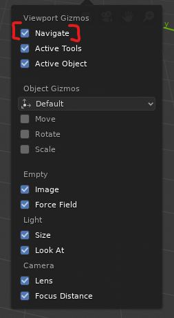
How do I turn off the viewport buttons for disabled people without turning off also the important axis indicator?
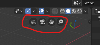
There’s now only one checkbox that turns off both at once? Who in their right mind would think that’s a good idea? O_o
1 Like
Looks like a recent change.
Good news is that the settings are now decoupled and the buttons can be turned off with:
C.preferences.view.show_navigate_ui = False
This also leaves the axis intact without becoming simplified.
Edit: Scratch that. It’s moved into Editors panel in the interface tab 
Yes, thanks a lot. What a mess though. So we have “Navigation” tab in the Preferences, but the “Navigation controls” checkbox is in the “Interface” tab 
1 Like
'logically" it should be in the viewport tab next to the viewport axis dropdown & not the interface tab, u can report it as a papercut for the 2.81 update.
1 Like
This appears to be a bug caused by the Mac System Integrity Protection so it would make sense that some people are having trouble while others like me are not. Go into the recovery manager while your Mac boots up “Command-R”. Then go into the terminal and type “csrutil disable” and then hit return. Reboot and see if your Blender add-ons are working.
If this is indeed the problem, it would be a Blender bug they need to fix. It appears to be some type of permissions related error.
Personally, I think the failure of the new interface. This is Frankenstein, who took everything and nothing at the same time from all programs at once. Even the matcaps and those could not be divided into categories, instead everything is piled up in one pile.
As a result, as you put it, more than two years were spent on a new useless and harmful interface. It looks like a glowing Christmas tree without any functionality.
It seems that the developers have gone on about the users, while the users simply “want it to be like in another program,” and all the topics where there was a clear disagreement with the current vector of development were deleted or blocked for comments.
This is very significant.
2 Likes
Well, the fact that users regularly complain that a lot, a huge pile of functions, or interface buttons, work or are inconvenient.
Two years of development … where? On ivy-render, which without dances with tambourines by default can’t even draw reflections? Curved interface? It’s horrible. This is the least of what I expected from the developers. Apparently, there is some influence of evil agents who urge to make dubious decisions and opinions that “users are already confronting, we will not listen to criticism”. Instead, various bloggers and vendors of educational programs regularly express admiration for the new version, thereby directing public opinion in the direction they personally want, but not in the direction they want for the users themselves.
1 Like
A remember how many people thought 2.5 was destroying the Blender they love, with the end of horizontal panels and the end of buttons crammed together in a small space (because it meant scrolling). A lot of people eventually grew to no longer want to touch 2.4x and it significantly boosted the number of users.
Though a lot of people stuck with 2.4x for years afterward, they eventually got their toes wet in Blender post 2.59 and never looked back.
2 Likes
To compare the most disgusting interface (hi the 90s) 2.49 and clear, logical, convenient interface 2.5, and to compare the curve non-functional 2.8 “Frankenstein” with 2.5-2.7 of course, a very interesting task.
1 Like
in this I can only agree with you.
There is the feeling of not being strong with one’s own identity and having to plagiarize “the various brothers who are in fashion” and are “industry standards” …
Perhaps next time we will have the courage to make a strong and coherent ui that is truly functional without having to plagiarize other fashions.
5 Likes
Well of course this was going to happen its part of trying to attract new users. After all the UI was one of the biggest complaints about Blender pre 2.8, even from me.
However it was never about the way it looked or the colour, shadows, style whatever, it was about the way it functioned. It was seen to be all over the place, to many clicks or keyboard to get to where you need to be. Now that has improved but still has a way to go.
If Blender wants to do its own thing and try and change industry standards, then i wish them well, but in many cases it wont work. That was the problem for many of us from other 3d software when using Blender, its almost like it went out of its way to be different all the time, like we were all of a sudden going to go “Wow we have all been doing it wrong for the past 15/20 years, thanks Blender for showing us the right way”
Of course right click was a prime example, but there were and still are others, collections for example, we have been calling them layers for years and years, why now change, it pretty much says what it is.
I agree that Blender should do it the way it wants and come up with a coherent UI, who knows maybe others will look at it and go, wow that really is a neat way of doing it There is no software out there that has the best UI, mostly its what you know and are used to.
Choice is good, but overwhelming choice can be bad and lead to less productivity in the long run.
1 Like
Very happy with Left-Click-Default too, but disagree with you about Collections – I think that’s better than calling them Layers, which makes far more sense in 2D programs and always seemed counter-intuitive to me in 3D. But Blender’s pretty much the only 3D program I have any experience with outside of DAZ|Studio (if you count that), I never bought any of the pricey ones.
Well layers of course came from 2d programs first, or at least i recall on early versions of Photoshop it was layers.
Layers can equally apply in 3d programs as well, layers are pretty much a standard on most 3d programs, C4D, Modo, LightWave, Maya, Houdini and Max all have layers. Indeed its just a word but its a familiar word, i can ask anyone in the 3d industry what a layer is and they know what you are talking about, ask anyone outside of Blender what a collection is and they probably dont know or understand what it is.
Its no biggie but it does underline what i said about the UI in other threads, especially before 2.8, in the fact that Blender almost seem to have gone out of their way to be different and for no discernible reason, which is why people coming from outside Blender had a real problem with the UI.
Now Blender has changed and tried to make its UI more shall we say friendly to those who come from other 3d programs.
I will give an example from a few years ago. Now of course this is not Blender 2.8 but it can still apply.
We had an intern, they had learnt 3d on Modo, at the time Modo was still relativly the new kid on the block, but dont forget it was written by ex LightWave users and programmers. We were looking periodically at Blender from 2.4 or around there i think.
So we got the latest version and sat him down with Blender, Maya, Houdini and C4D, he had never used any of these programs before as this was his first time working at a 3d graphics design company.
We asked him to create 2 boxes, round all the edges of the boxes, then we wanted him to boolean union both boxes at one corner of each. Nothing hard at all and easy to do with most of the packages he had.
He started with Maya which was our in house 3d program at the time, he finally achieved the job after a bit of time on the UI, next C4D, again roughly the same amount of time, then Houdini, this took a little longer because of the procedural way that Houdini works. Next came Blender, now this took him a bit longer than all the others.
Of course he was doing a lot of mouse hovering over icons to find out what they did, not a problem in the previous mentioned 3d programs but some issue with the UI in Blender made it hard to understand what each icon did, this and the fact that Blender used a lot of keyboard shortcuts meant that it just took longer.
Now we were looking at using Blender more and more at the time so we asked his opinion of all of these programs and especially Blender. The short answer was that whilst very capable it was confusing in terminology and where things were. There seemed to be some missing logic in how things were laid out and organised and he felt like he had to click twice as many times to achieve the same goal.
Blender is a very good package and whats not to like, its free. I hope that it will be a wake up call to many of the more pricier software out there, to show them what can be achieved with great devs and good planning that need not cost the earth.
Of course now we have 2.8 which is a vast UI improvement over the previous versions and i hope it goes on from strength to strength. I hope the 2.8 cycle will yield the results we want, edit mode and sculpting is still slow in some instances with high poly models and i hope this is sorted out.
2 Likes
collection has some differances to layers, that i think warent the new unfamilier name . the fact that one object can exist in multibe collection. In a way this make it into a tagging system.
really all you need is a veiw in the outliner where you can view and assign them as tags and search them as such offcourse