We all agree. That does not make sense.
IMO, pablo mentioned that just to explain that placement of decorators have to be cleaned up like panels in general.
Just to explain why I insist when the same thing has been said already : I feel compelled to voice my opinion, even though in some cases -like this one- I see a consensus, to be certain that it’s heard loud and clear on the developer side. 
I didn’t see a discussion on this, and I thought this is especially useful to know for a thread such as this…
For those who don’t know, rightclickselect.com now allows sorting by “Rating”, which finally makes it appealing for ideas and proposals because they won’t just get buried for being a couple of days old.
Also:
2 Likes
testing the daily builts of 2.8 i wonder about a few things.
Why is the scrollbar gone? it gives the user feedback about navigation. How do you know now if there is something to scrolldown? eg: now in the user prefs you need to scroll around just to discover if there are more options… why remove those basic stuff?
Another thing: while changing mesh edit modes (vertices/edge/face) without the facedots its hard to read in which mode you are in. Now you need to look at the icons or try to select somthing just to discover in which mode you are. In 279 it was much easier to read for your eyes…
and anyone knows why the render buttons are gone into menu?
Hope they don’t remove scrollbars, or pull a “bullshit minimalism” move and hide them until you mouse over the area. I hate that shit.
About the only scrollbars I would be fine with removing are the ones that are always visible in the main node editor area.
3 Likes
It could make sense for setting keyframes via script.
For example you want to set keyframes via script over a time range from 0 to 100.
But for some of the objects you only want to set these keyframes form 0 to 50.
Then you could animate the locking and simply let the script run over all objects at the same time.
I mean, it is not a feature that is essential but if it´s there, why not? If you hide it no one will ever find it.
This is a very wecome addition, thanks for pointing it out. Would be nice if there was a way for features that have been implemented to be marked as such too, so we can see the highest rated unimplemented tasks. Maybe suggestions could have an implementation status with some options such as not planned, scheduled, in progress, initial implementation in , in master, in release . Maybe that is beyond the scope of rightclickselect, but it would be good if we could see something such as the curved edge shader has an implementation that is in master and could test it out before submitting feedback.
2 Likes
It is not gone. It is smaller and hidden until you place mouse pointer on the right or bottom of editor to scroll.
Now, no more space is permanently lost for this feedback that is only interesting to have when you open file or once after 4 hours of work.
You have a doubt. Just move mouse pointer and you will have your reply.
Explanation done is that face dots are disturbing wire readability on a dense mesh.
I agree that if readability of wire is important user could switch between edge/face select modes.
When user will select faces ; he will zoom on boundary of area to select anyways.
So, face dots were not a real problem in 2.79. What was problematic was lack of responsiveness in edit mode on meshes with a high polycount.
It is true that now. We don’t know if we are in face mode or edge mode.
Probably to gain space because single column layout.
Today, additional panels of physics became subpanels.
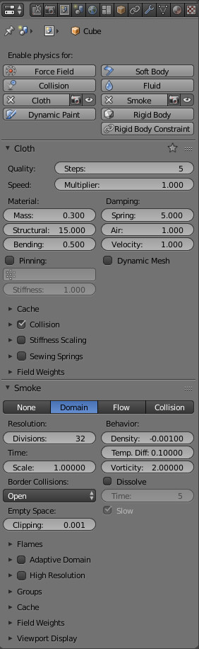
Unfortunately, user can no longer reorder them.
I think that would be wise to put first settings into a subpanel, too. It could be untitled basis.
This way, extending cache of a satisfying simulation would not require a panel taking too much space.
It also reminds me that instead of 5 rows of buttons, we could have only buttons relative to effects added to object.
1 row with a list of effects for this object type. + 1,2,3 buttons rows corresponding to applied effects.
It takes 4 rows maximum. Less than current situation in all cases.
man - language !
1 Like
UI/UX Getting worse by iteration… one used to flow now have to zig-zag and fight it’s way from corner to corner.
You forgot to say “in my opinion”… you also don’t mention what you think is worse.
I am loving most of the changes myself. So much cleaner, better organised, logical…
8 Likes
Don’t worry. They are just trying things out. If they place the header above input fields and sublabels inside the fields (like in 2.79) the new responsive design would take care of the rest. We can have both single and multi-column layouts.
thx for your explanations.
autohide scrollbars: I am not a big fan of those auto hide scrollbars. This info should always be visible, at least as default/option. now i got to make an action first… we got widescreen ratios, and those two pixels are allways left. Exspecially in the user prefs there is more than enough space…
hidden render buttons:
they put the render engine type into properties and therefore the renderbuttons are hidden in a menu, while the topbar is almost empty… not really optimal atm imo
Btw i am not really shure about the upcominng workflows. when do you need to use workbench? Isnt the workbench mode only a submode of cycles/eevee which you select via shade mode atm?
No, workbench is meant to be capable of out performing eevee in terms of poly count. You are supposed to use workbench when you are modeling or sculpting, then move on to eevee or cycles when you are ready to create materials.
Yeah, many of us think the same. I hope that at least this is an option/behavior that the user can choose.
1 Like
yeah, but what is the cycles shade mode without textures than? and what ist it for? why not the powerfull worbench mode there directly in cycles without the need of switching in the render engine type pulldown?
I was kind of thinking they would go in that direction. I mean you don’t want cycles rendered view on all the time. I expect the old “solid” mode to be workbench, and you’d only see cycles view when you select it.
Eevee is more an engine that is in between. It gives you more accurate textures and shading than workbench, but probably won’t be as fast at displaying high poly stuff. A lot of folks who don’t want to render something quickly will probably choose the workbench + cycles combo.
1 Like
I assume that this is the workbench mode. If you are in Cycles or Eevee render mode, workbench is always there for basic view. The pulldown menu is only for choosing the final render output.
the same as i was thinking. so we dont really need to switch that render engine type pulldown that often!
So therefore:Please return those renderbuttons:)